Wall Art for Narrow Hallways: Size, Shape & Placement Guide
The best wall art for a narrow hallway is usually portrait-format, slim-framed and hung at eye level, with the boldest piece saved for the end wall. Tall shapes suit tall, narrow walls; shallow frames keep the corridor clear; and a single strong focal point at the end of the hall draws people through the space instead of making it feel cramped.
Hallways are tricky because you rarely see their walls head-on. You walk past them, close up, often in poor light. This guide explains how to choose the size, shape and placement of art for that kind of space, wall by wall.
Why Narrow Hallways Need a Different Approach
- You view the art from close up. Often less than a metre away, so detail and print quality matter more than in a living room.
- You see it at an angle. Most of the time you approach side walls obliquely, which makes wide, horizontal pieces feel stretched and reflective glass more noticeable.
- Space is tight. Deep frames, sculptural pieces and shelves can catch shoulders and bags.
- Light is limited. Many hallways have little natural light, which flattens dark or very subtle art.
Portrait vs Landscape in a Narrow Hallway
Below is the same stretch of hallway wall, with a slim console, shown with portrait art and with landscape art.
Portrait
draws the eye upwards; feels tall and calm
Landscape
overhangs the console; reads as wide and heavy
Same wall, same console: the portrait piece sits comfortably within the furniture’s width, while the landscape piece overhangs it.
Portrait art suits most narrow hallways. A tall rectangle echoes the proportions of the wall and the doorways, draws the eye upwards and needs little width. It also looks better from the angle you usually see a side wall.
Landscape art works on a long, uninterrupted side wall that can be viewed from a little distance, such as a wider corridor or a landing, or as a slim panoramic piece above a long bench. In a genuinely narrow hall, a large landscape piece tends to feel squeezed.
The End Wall: Your Focal Point

The wall at the end of a hallway is the one place you see straight on, and from a distance as you walk towards it. Treat it as the hallway’s focal point.
- Go larger here than on the side walls. The end wall can take a piece roughly half to two-thirds of the wall’s width.
- Choose art with depth or a vanishing point. Images that lead the eye into the distance make a corridor feel longer and more open. Our Canyon Passage print, which looks down a narrow sandstone canyon towards light, works exactly this way.
- Keep it to one piece. A single strong image reads more clearly from a distance than a cluster.
Side Walls
On side walls, think rhythm rather than statement.
- Use slim, portrait pieces between doorways, spaced evenly so they read as a sequence as you walk.
- Align them on a shared centre line so the eye moves smoothly along the corridor.
- Leave some walls empty. Negative space, the empty area around and between pieces, keeps a narrow hall from feeling crowded.
- Use shallow frames and avoid deep box frames or sculptural pieces that stick out into the walkway.
Art Above a Console Table
A narrow console with art above it is one of the most effective hallway arrangements, creating a small, finished vignette.
- Width: aim for art roughly two-thirds to three-quarters of the console’s width.
- Height: leave around 15 to 25 cm (6 to 10 in) between the top of the console and the bottom of the frame, so the two read as one group.
- Shape: a portrait piece, or a pair of portrait pieces side by side, usually suits a slim console better than a single wide landscape.
- Layer if space allows: a small lamp, a ceramic vessel or a tray of keys softens the arrangement without cluttering it.
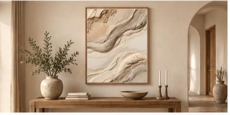
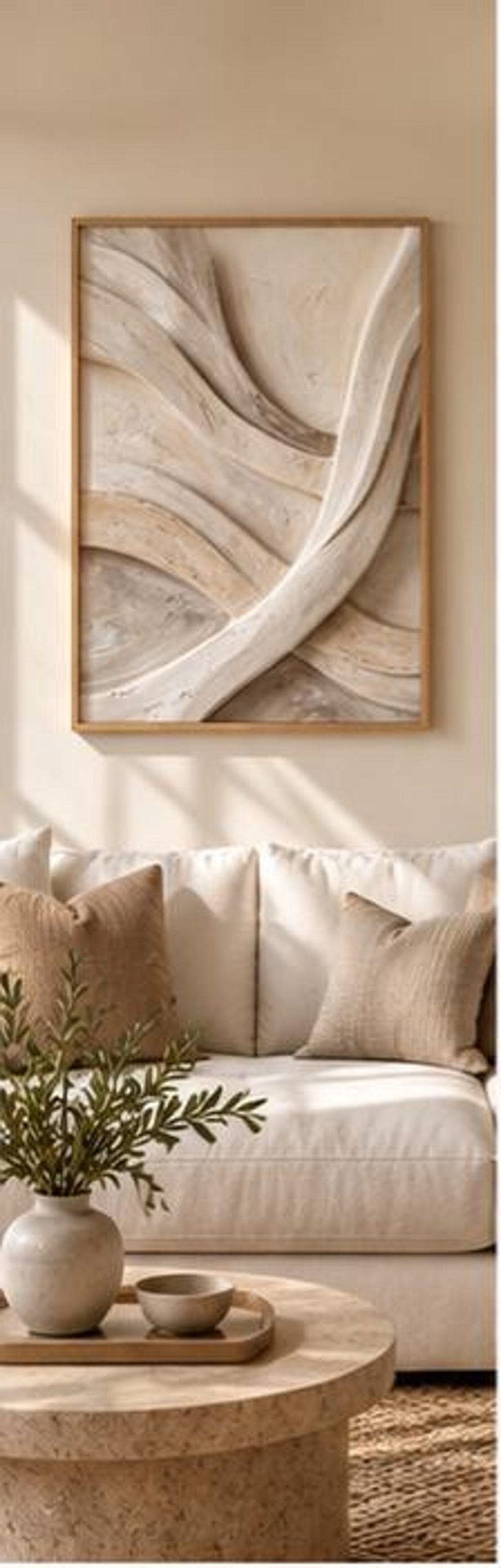
A tall, slim piece such as Soft Sand Contours or Sandstone Flow Texture suits this kind of space well. For more on art and furniture proportions, see how big wall art should be.
Gallery Walls in a Narrow Hallway
A hallway gallery wall can look wonderful, but it needs more discipline than one in a living room, because you see it up close and at an angle.
- Choose a linear layout. A single row of frames, or a neat grid two rows deep, suits a corridor better than a sprawling organic cluster.
- Keep frames consistent. The same frame colour and mount width make a long run feel calm rather than busy.
- Space frames evenly, typically 5 to 8 cm (2 to 3 in) apart.
- Use a unifying palette. A set of neutral or tonal pieces reads as one composition as you walk past.
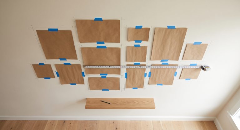
Our guide to how to plan a gallery wall layout covers measuring and paper templates in detail.
Hanging Height and Spacing
- Hang art with its centre at around 145 to 152 cm (57 to 60 in) from the floor, the standard eye-level guideline used by many galleries. In a hallway this keeps art comfortable to view as you walk.
- Above a console, follow the furniture rather than the eye-level rule, keeping the 15 to 25 cm gap.
- Keep a consistent line along the whole hallway, using either the centre line or the top edges of the frames.
- Leave clearance around doors and light switches so frames are not knocked.
For more detail, see how high to hang wall art.
Colour in a Narrow Hallway
- Lighter art brightens dark corridors. Warm whites, ivory, sand and soft beige reflect what light there is.
- Warm neutrals feel welcoming in an entrance hall, which is the first space guests see.
- Use one darker accent sparingly, perhaps on the end wall, to give the space depth without closing it in.
- Repeat a tone from the floor, runner or woodwork in the art to make the hallway feel connected to the rest of the home.
Our Neutral Abstract Printable Wall Art Collection includes several portrait pieces in this warm, light-reflecting range.
Lighting Hallway Art
Poor light is the main reason hallway art disappears.
- Use matte paper and low-reflection glazing, because glare is more noticeable at the oblique angles of a corridor.
- Add a picture light above the end-wall piece. Rechargeable, wireless picture lights avoid any need for new wiring; see how to light artwork without wiring.
- Choose warm white bulbs to flatter neutral and earthy tones.
Print Quality Matters More in a Hallway
Because you stand so close to hallway art, a soft or low-resolution print shows. If you are printing your own art, print at a size the file supports at full quality. Our guide to how big you can print a 300 DPI image explains how to check.
Common Mistakes
- Hanging one wide landscape piece on a narrow side wall, where it feels squeezed and is seen only at an angle.
- Too many pieces on both side walls, which makes the corridor feel narrower.
- Deep frames or shelves that catch shoulders and bags.
- Dark, low-contrast art in a dim hallway, where it disappears.
- Inconsistent heights that break the line as you walk.
- Ignoring the end wall, the one place a statement piece really works.
Final Thoughts
Narrow hallways reward a simple plan: one confident piece on the end wall, slim portrait art in a calm rhythm along the sides, and a small vignette above a console if you have one. Keep frames shallow, hang at eye level, choose light, warm tones and give the art enough light. The hallway will feel longer, calmer and far more finished.
For more ideas, see minimalist artwork for small spaces and neutral wall art ideas for every room.