How to Match Artwork to Your Interior Colour Scheme
“Does this match?” is the wrong question to ask when pairing art with a room’s colour scheme. Matching, in the literal sense, an artwork’s blue exactly copying a cushion’s blue, often looks stiff and overly coordinated. What works better is a relationship: something shared, but not identical.
This guide explains how to build that relationship deliberately, whether you want art that blends in or one piece that stands out on purpose. For the fundamentals of colour in art, see how colour changes the feeling of abstract art.
Why Exact Matching Often Looks Wrong
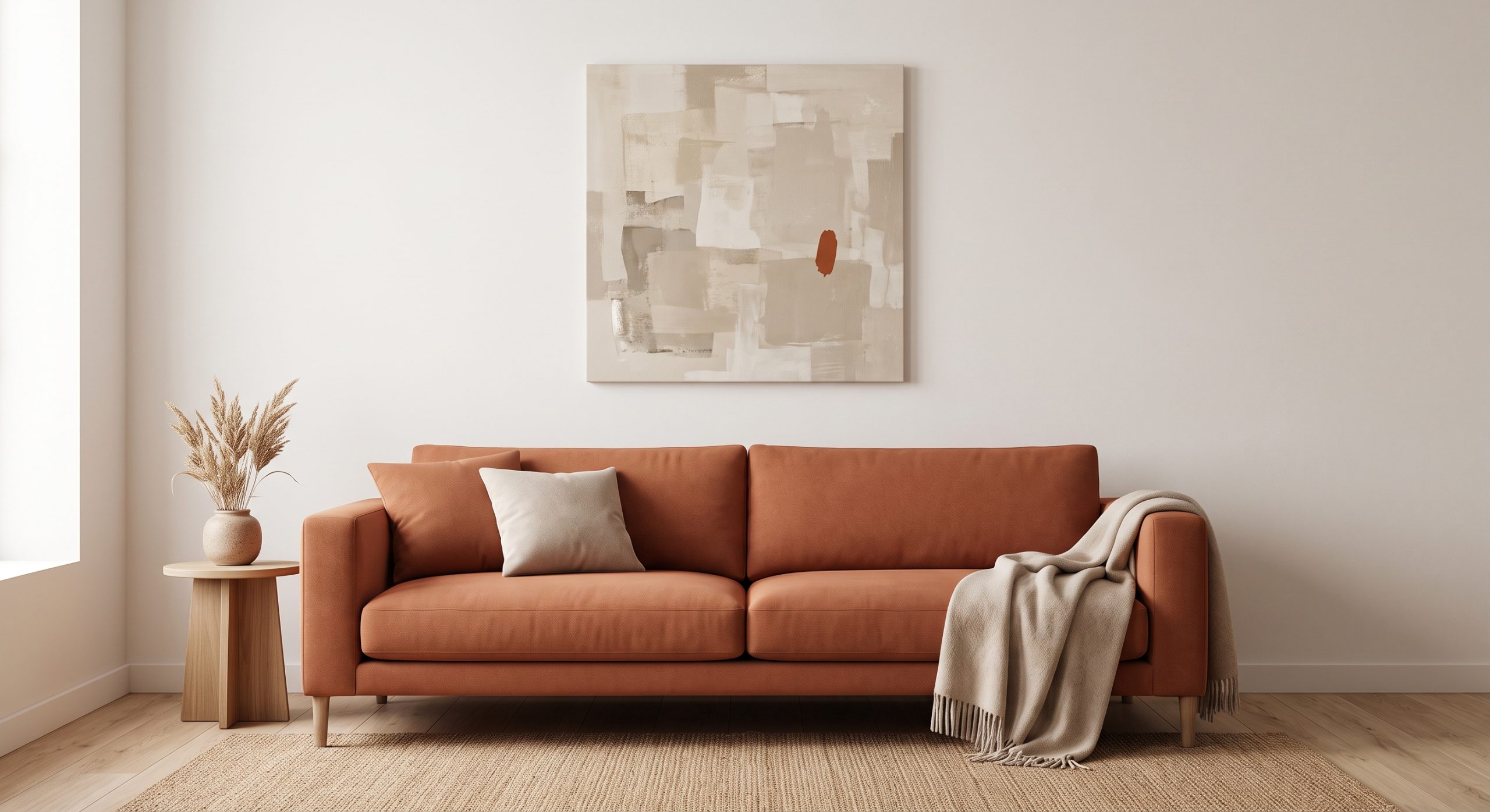
When an artwork’s colour is identical to a nearby cushion, rug or piece of furniture, the eye tends to read it as coordinated rather than considered, the visual equivalent of a matching tracksuit. It can flatten a room instead of adding depth.
A looser relationship, echoing without copying, tends to look more intentional and more expensive, because it suggests the piece was chosen for the room rather than ordered to match a swatch.
Three Ways to Build the Relationship
1. Echo a supporting tone, not the dominant one
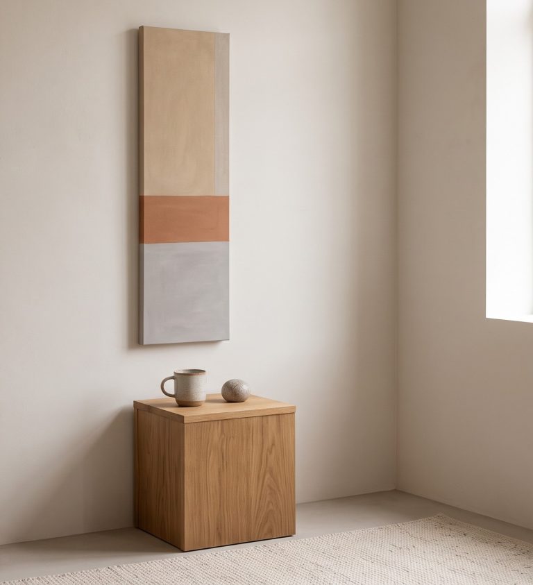
Instead of matching your sofa’s main colour, look at a secondary tone already in the room: a piped edge, a cushion, a lamp base, a wood tone. Echoing that quieter colour in the artwork feels layered rather than matched.
2. Echo the floor or the wood tones
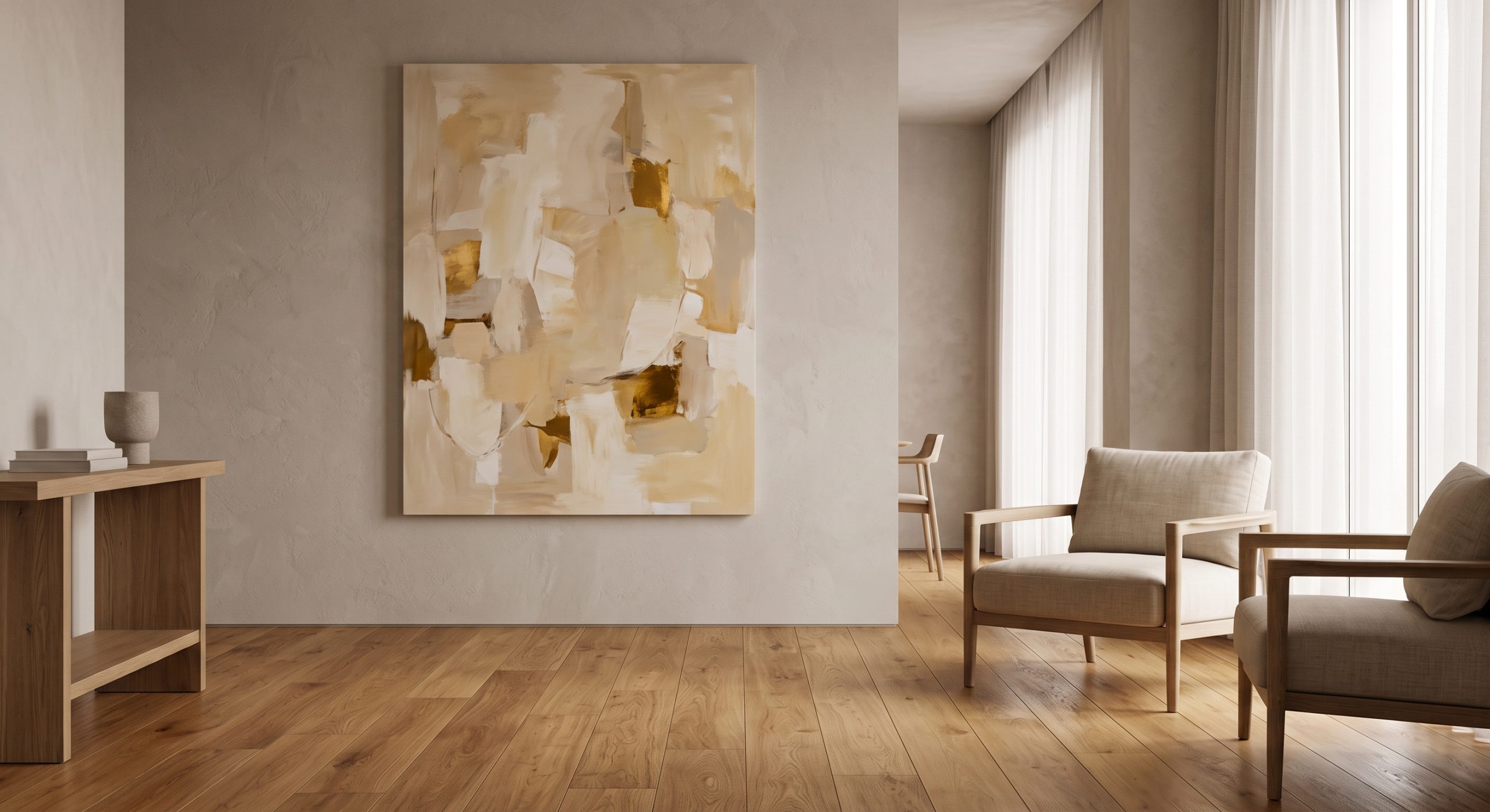
Flooring and furniture wood are often the most consistent colour element in a room. An artwork with a similar warmth, sandstone tones against an oak floor, for example, ties the room together at a level most people notice without quite knowing why.
3. Use deliberate contrast instead
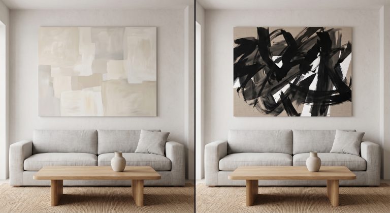
Sometimes the goal is not harmony but a controlled point of difference. A single warm accent in an otherwise cool grey room, or one cool note in a warm room, can act as a focal point precisely because it does not match.
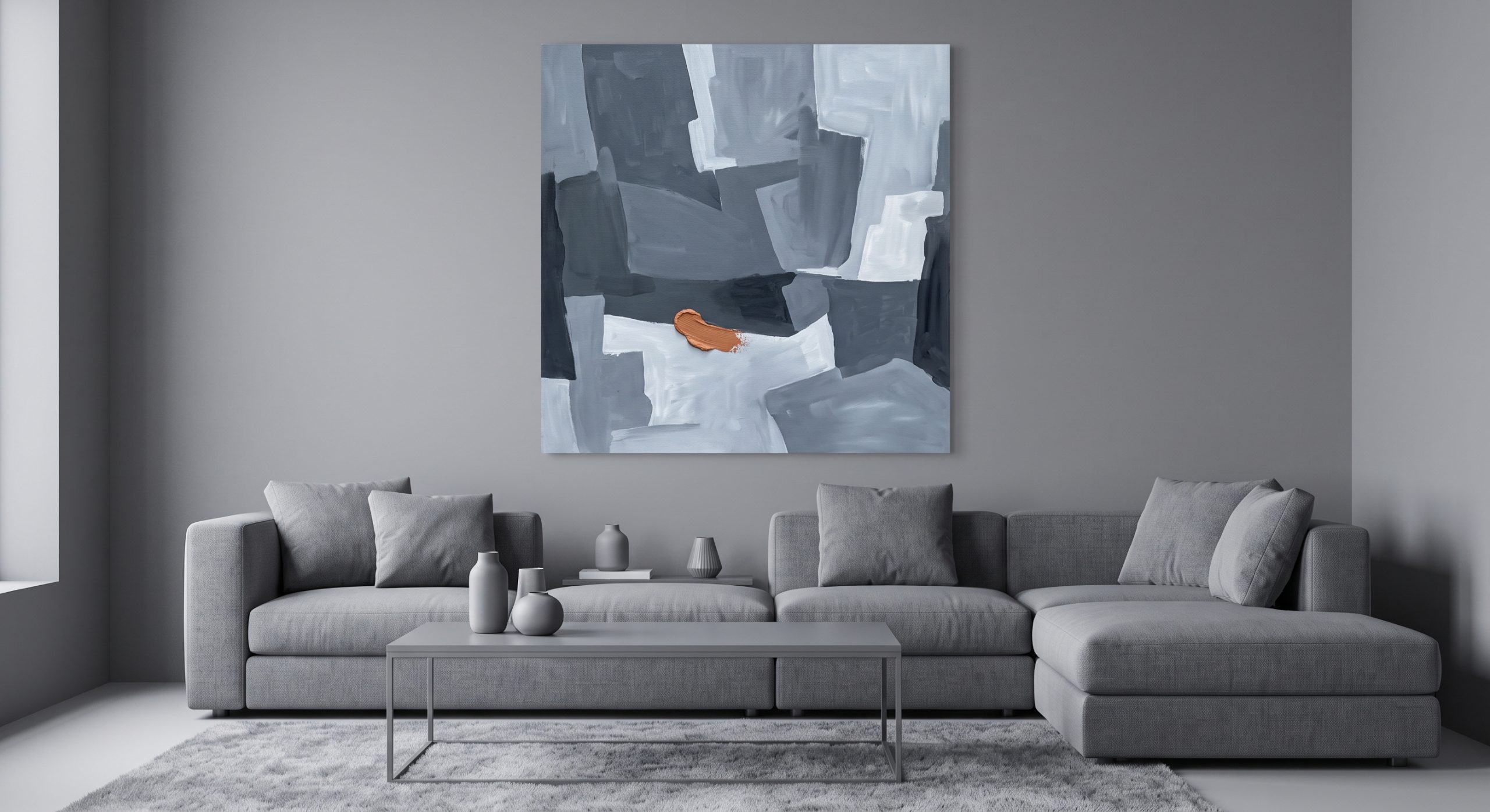
Undertone Still Matters
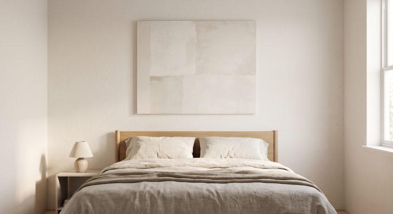
Whether you’re echoing or contrasting, undertone decides whether the pairing feels resolved or slightly off. A warm beige artwork against a cool grey sofa can look muddy, even if both are technically “neutral”. Check the undertones together in the room’s actual light before deciding. See how to mix different shades of neutral artwork for more on this.
A Simple Process
- List the two or three most consistent colours already in the room (usually flooring, a large piece of furniture, and the walls).
- Decide whether you want the art to echo one of them or to contrast deliberately.
- If echoing, choose a supporting tone rather than the most dominant colour.
- Check the pairing in the room’s actual daylight and lamplight, not a product photo.
Matching Across a Whole Room, Not Just One Wall
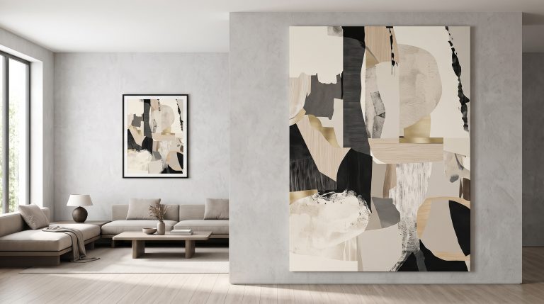
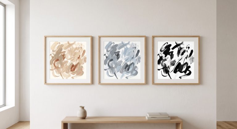
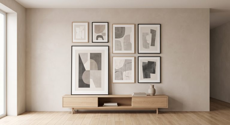
If a room has several pieces of art, they do not all need to relate to the same colour, but they should feel like they belong to the same conversation. A shared undertone across pieces, even in different formats, holds a room together more reliably than trying to match every individual item.
Common Mistakes
- Matching an artwork’s main colour exactly to a large piece of furniture
- Ignoring undertone when attempting to “match neutrals”
- Choosing art from a screen without checking it against a fabric or paint sample in person
- Trying to relate art to every colour in the room at once, rather than one or two anchor tones
Final Thoughts
The best colour relationships between art and a room are felt rather than noticed. Aim for an echo rather than a match, check undertones carefully, and be willing to use contrast on purpose when a room could use a clear focal point.