What Is Neutral Wall Art?
Neutral wall art has a reputation for being safe. Look closely and it turns out to be one of the most demanding kinds of art to get right.
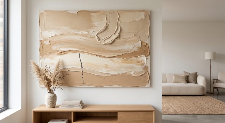
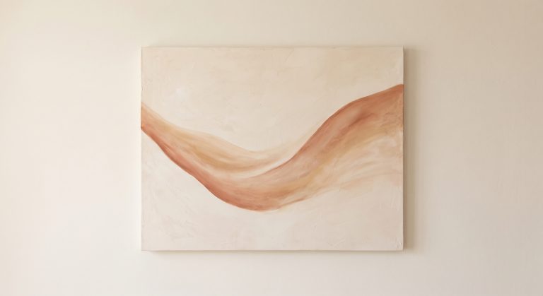
Neutral wall art is artwork made mainly in soft, low-saturation colours: ivory, cream, sand, stone, taupe, greige and charcoal. It is defined by its palette rather than its subject, so it can be an abstract painting, a line drawing, a photograph of dunes or a botanical study. With no strong colour to lean on, everything else has to work instead: tone, texture, shape and the space around it. That is why the best neutral pieces feel so calm, and why the weakest ones simply disappear into the wall.
Below, you will find what counts as a neutral, the main types of neutral art, why it is so popular, and how to choose it without ending up with something flat. For the wider context, see our pillar guide to what abstract art is.
What Is Neutral Wall Art?
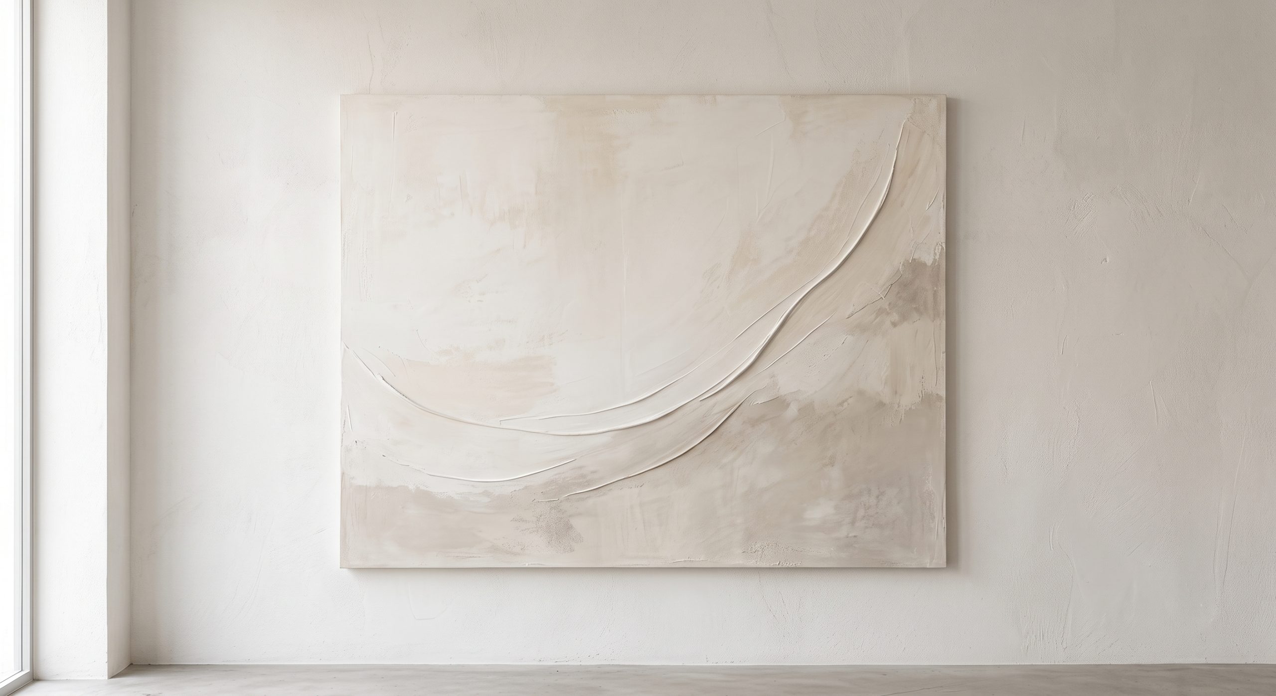
Neutral wall art is artwork made mainly in neutral colours: the soft, low-saturation shades that sit comfortably alongside almost any other colour.
Because it is defined by palette, not subject, the category is wider than it first appears. What links a pale abstract canvas to a misty coastal photograph is a restrained colour range that calms a room rather than competing with it.
What Counts as a Neutral?
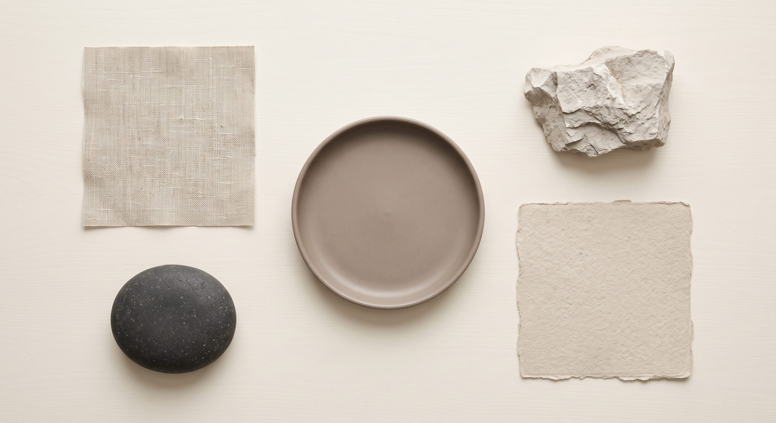
Neutrals are a broader family than most people expect.
- Whites: warm white, ivory, cream
- Beiges and sands: oatmeal, sand, stone, buff
- Browns: taupe, mushroom, soft brown, camel
- Greys: pale grey, greige, ash, charcoal
- Black as a grounding accent
Muted, desaturated versions of other colours, such as faded sage or dusty clay, often behave like neutrals too. That is why they slip so easily into neutral schemes.
Warm and cool neutrals
Every neutral has an undertone. Warm neutrals lean yellow, peach or red; cool neutrals lean blue, green or grey. The difference decides whether a piece feels cosy or crisp, and whether it sits happily with your walls and furniture. We explore how palettes shape mood in how colour changes the feeling of abstract art.
Neutral Is Not the Same as Monochrome or Minimal
These terms overlap, but they mean different things.
- Neutral describes the palette.
- Monochrome means variations of a single colour.
- Minimalist describes the amount of visual content. See what minimalist art is.
A neutral piece can be dense and richly textured. A minimalist piece can be brightly coloured. The two often appear together, but one does not require the other.
The Main Types of Neutral Wall Art
Neutral abstract art
Shapes, gestures and surfaces in a restrained palette. This is the most versatile kind of neutral art, explored in beige abstract art for calm interiors.
Line art
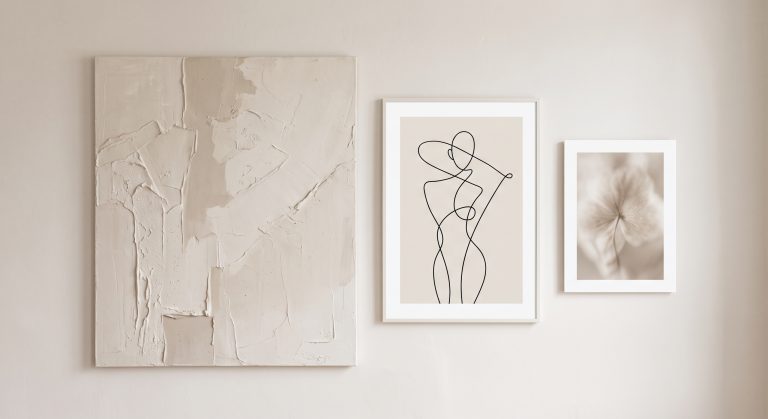
Fine lines on a pale ground, from botanical studies to flowing abstract forms. A single confident line can give a whole wall its rhythm. See minimalist line art.
Neutral photography
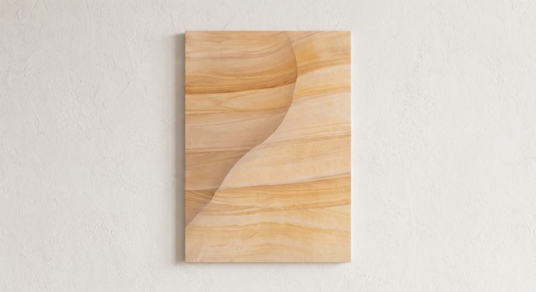
Sand dunes, misty fields, coastlines and architectural details in soft tones, where light rather than colour carries the image.
Botanical and natural studies
Dried grasses, seed heads and leaves in muted colour, with all the delicacy of a pressed specimen.
Textured and mineral-inspired pieces
Work that suggests plaster, stone or sediment. It is worth knowing the difference between physical relief on an original and the appearance of texture in a print, covered in textured abstract art. For printable examples, see our neutral abstract printable wall art collection; these are prints, so their texture is visual rather than raised.
Why Neutral Wall Art Is So Popular
- It is flexible. It suits most colour schemes and survives redecorating.
- It is calming. Low-contrast, muted palettes tend to feel restful.
- It lasts. Neutral palettes date more slowly than trend colours.
- It lets other things shine. Furniture, plants and textiles can carry the colour.
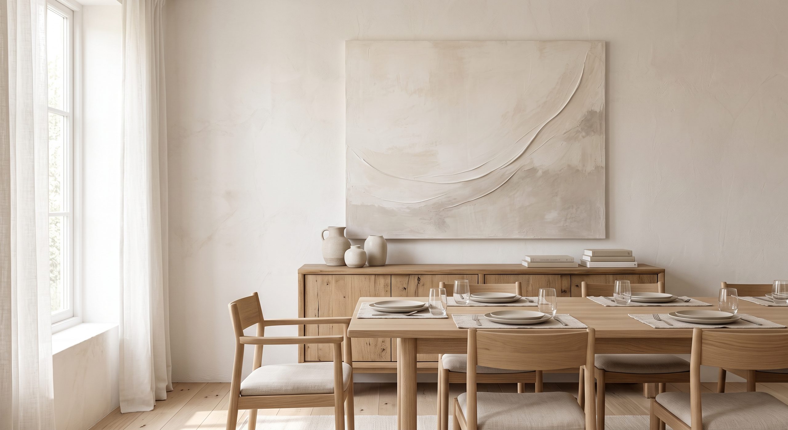
- It suits modern styles. Japandi, organic modern, Scandinavian and warm minimalist rooms all lean on neutral palettes. See what Japandi art is.
How Neutral Art Avoids Feeling Flat
Without colour contrast, other qualities have to create interest. These are the five that matter most.
Tone
Layered shades within one family, such as cream over oatmeal over taupe, create depth. The eye reads the small steps between them as form.
Texture
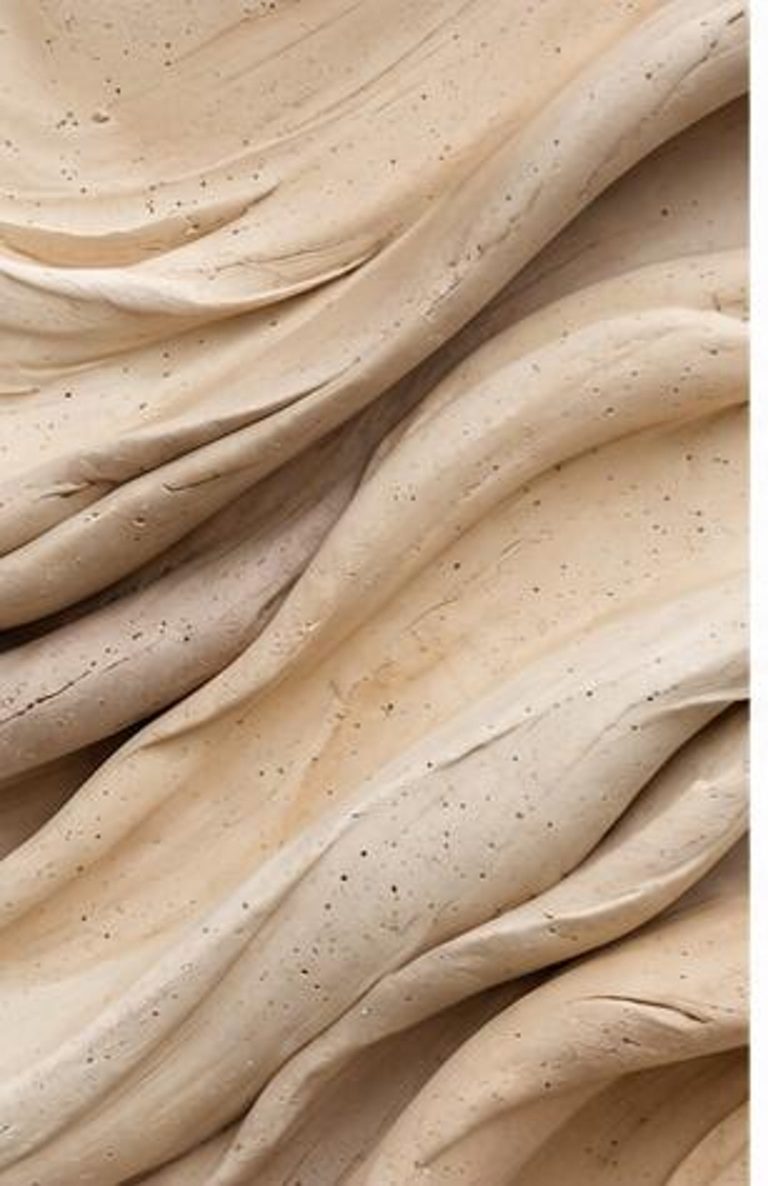
Surface variation catches light and adds richness, even in a single colour. On an original, real relief throws tiny shadows; in a print, the same effect is suggested visually.
Contrast
One darker mark, such as a charcoal line, gives the eye somewhere to land.
Shape and gesture
A confident form or sweep gives a quiet palette structure. See balance in abstract art.
Negative space
Empty areas keep a neutral composition from feeling heavy. See negative space in abstract art.
How to Choose Neutral Wall Art
- Read the undertone. Match warm with warm and cool with cool, unless you are mixing on purpose.
- Look for variation. Tone, texture or a point of contrast.
- Check the scale. Neutral art in a neutral room needs enough size to register.
- Consider lighting. Pale tones shift between cool daylight and warm lamplight, so look at the wall at both times.
- Think about the mood. Soft and hushed, or structured and crisp?
For a full process, see how to choose abstract art for your home.
Where to Go Next
Ready to apply it? Neutral wall art ideas for every room shows how it works room by room, while beige wall art ideas and warm neutral wall art go deeper into specific palettes.
Common Misunderstandings
- “Neutral means boring.” Only if it lacks tone, texture or form.
- “It has to match everything.” It only needs to sit well with the room’s undertones.
- “Any beige will do.” Undertone matters a great deal.
Final Thoughts
Neutral wall art asks you to notice subtler things: a shift in tone, a change in surface, the shape of the space around a single mark.
Choose it well and it does what the best art does in a room. It makes everything around it feel calmer and more considered. For the complete process of choosing, sizing and styling a piece, see the complete guide to choosing artwork for your home.