Understanding Balance in Abstract Art
Balance is something you feel before you can name it.
Look at an abstract piece that simply works, and something in the arrangement feels settled, even if nothing in it is symmetrical. Look at one that is slightly off, and your eye keeps searching, never quite landing.
That difference is almost always balance. It is one of the quiet foundations of composition, and understanding it helps you choose, hang and combine abstract art with far more confidence.
If you’re new to the subject, our pillar guide to what abstract art is is a helpful starting point. This article focuses on how balance works inside a composition.
What Balance Means in Art
Balance is the distribution of visual weight across an artwork.
Every mark, shape, colour and texture pulls on the eye to a different degree. Balance is the sense that those pulls are arranged so that the composition feels stable, rather than tilting or falling towards one side.
It is not the same as symmetry. A perfectly mirrored image is balanced, but so are many lopsided ones. What matters is the total weight, not the layout.
What Gives an Element Visual Weight
Visual weight is not physical weight. It is how strongly something attracts and holds attention. Several things increase it:
- Size: larger shapes generally pull harder than small ones
- Darkness: a dark shape usually feels heavier than a pale one of the same size
- Colour intensity: saturated or high-contrast areas draw the eye
- Texture and detail: busy, rough or intricate areas feel heavier than smooth ones
- Isolation: a single mark surrounded by empty space carries more weight than one in a crowd
- Position: elements further from the centre act like a longer lever, so a small mark near the edge can balance a larger mass near the middle
This is why a small, dark, textured shape can balance a much larger pale, smooth area. It is also why colour choices affect balance as well as mood. See how colour changes the feeling of abstract art.
Symmetrical Balance
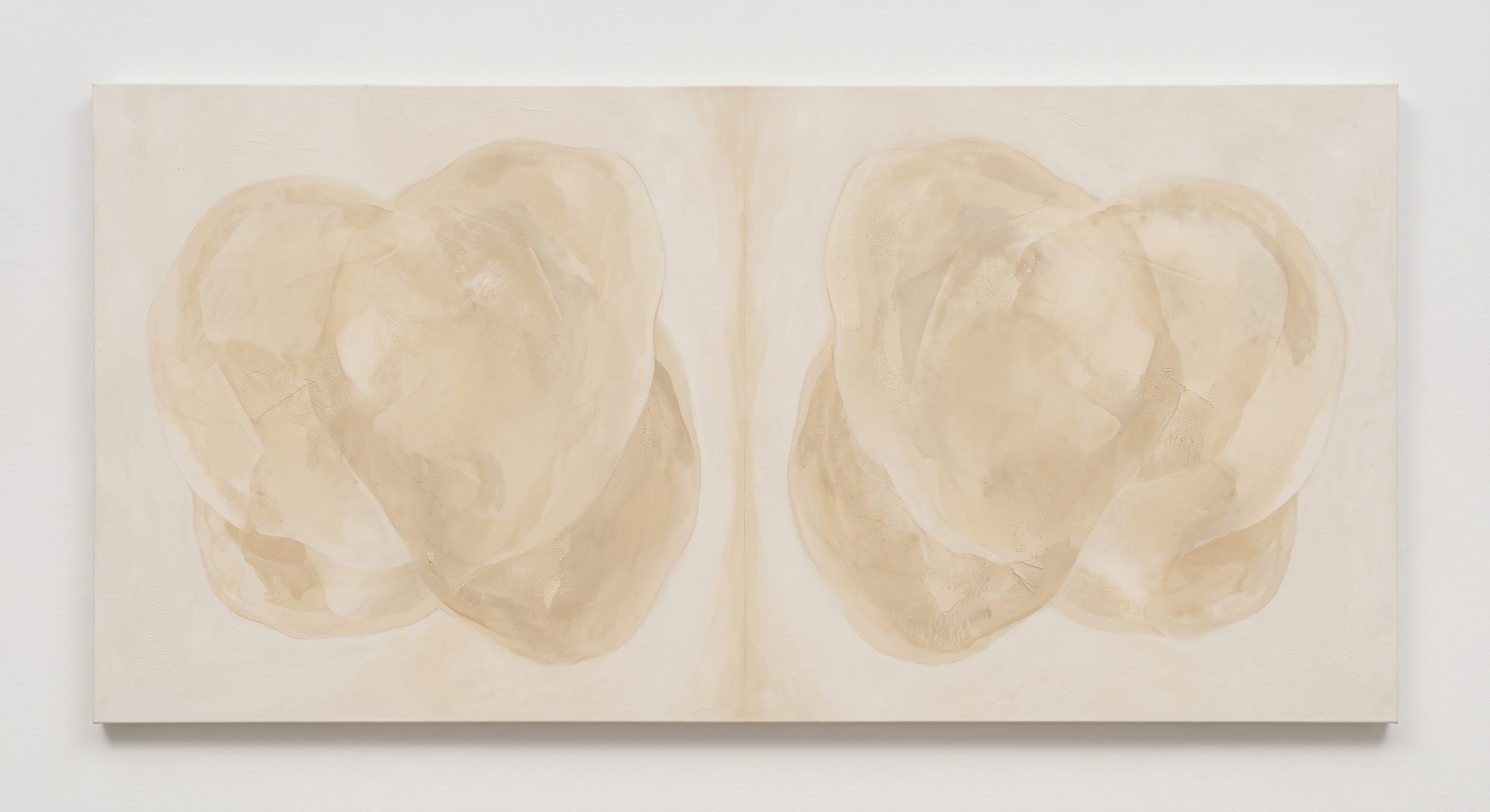
In symmetrical balance, one side mirrors the other, or nearly does.
It feels formal, stable and calm. Nothing is left to chance, which gives the piece a quiet authority.
What to look for: a central axis, repeated forms on either side, an ordered structure.
In an interior: symmetrical pieces suit formal or structured rooms, and they sit naturally above centred furniture such as a bed, a console or a fireplace. The risk is that they can feel static if the room is already very ordered.
Asymmetrical Balance
In asymmetrical balance, the two sides differ, but their weights feel equal.
This is the more common approach in contemporary abstraction, and it is more dynamic than symmetry. The eye has to travel between the elements, which creates movement.
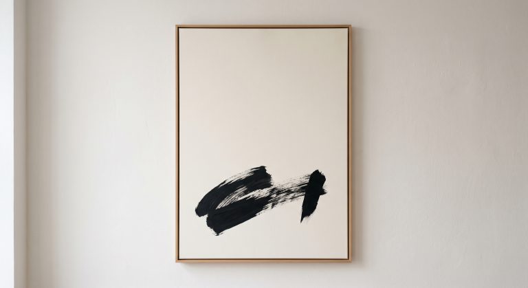
A classic way to picture it is a seesaw. A heavy child sitting close to the pivot can balance a lighter child sitting far from it. In a composition, a large pale area near the centre can be balanced by a small dark mark near the edge.
Painters such as Piet Mondrian are often discussed in terms of this kind of dynamic balance, where the arrangement of unequal blocks and lines feels in equilibrium without being mirrored.
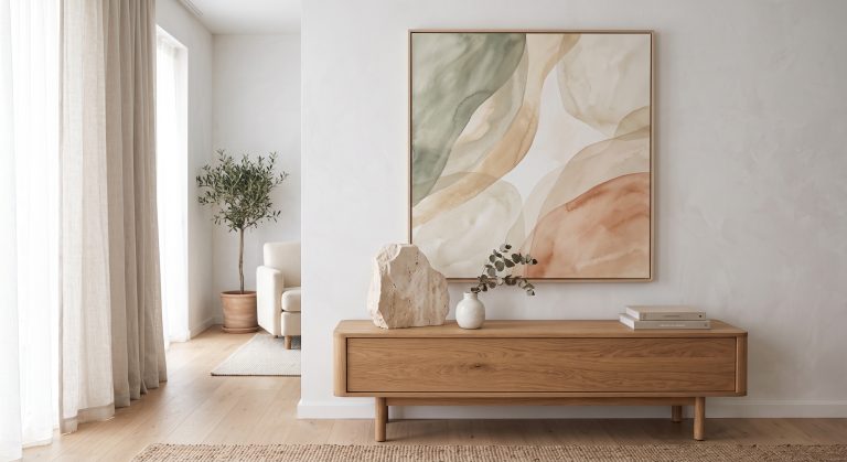
In an interior: asymmetrical balance feels natural and relaxed, and it pairs well with organic modern and Japandi rooms. It also suits organic and gestural styles of abstraction.
Radial Balance
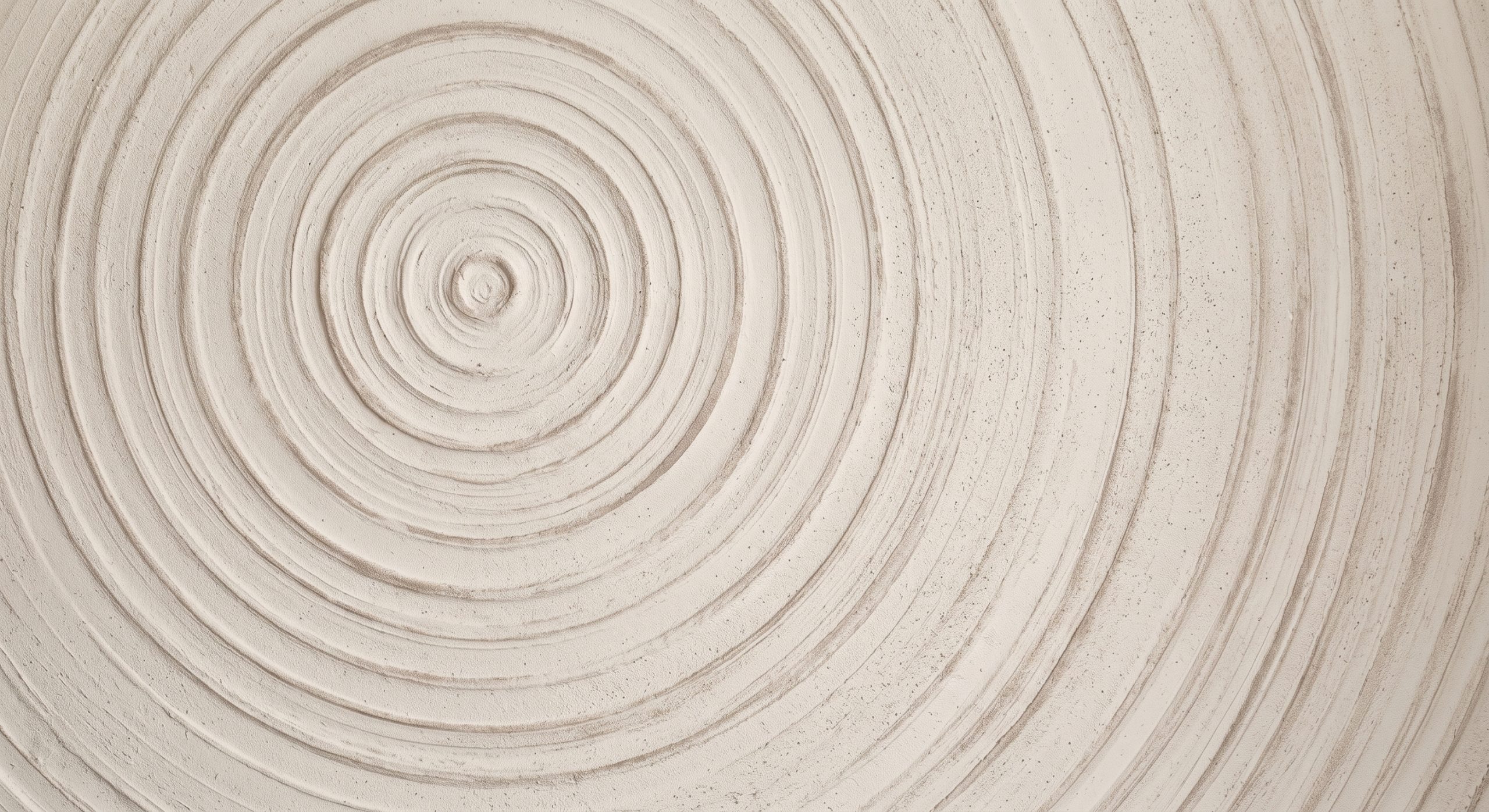
In radial balance, elements radiate from, or circle around, a central point, like ripples in water or the petals of a flower.
It draws the eye inward and holds it there. The result is focused and often hypnotic.
In an interior: radial compositions are less common in wall art, but they make excellent focal points in simply styled rooms.
How Empty Space Affects Balance
Empty areas carry weight too.
A large calm area can balance a small, intense one, and the difference between the two gives the piece drama. This is the relationship explored in negative space in abstract art. When a composition feels crowded and unsettled, it is often because there is no restful area to offset the busy one.
How Texture Affects Balance
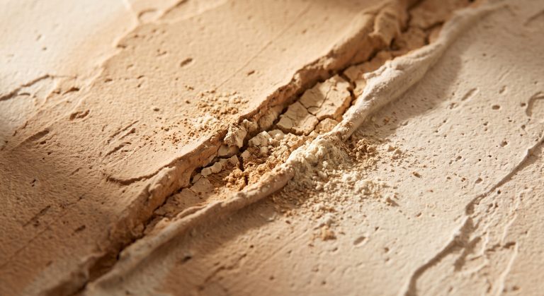
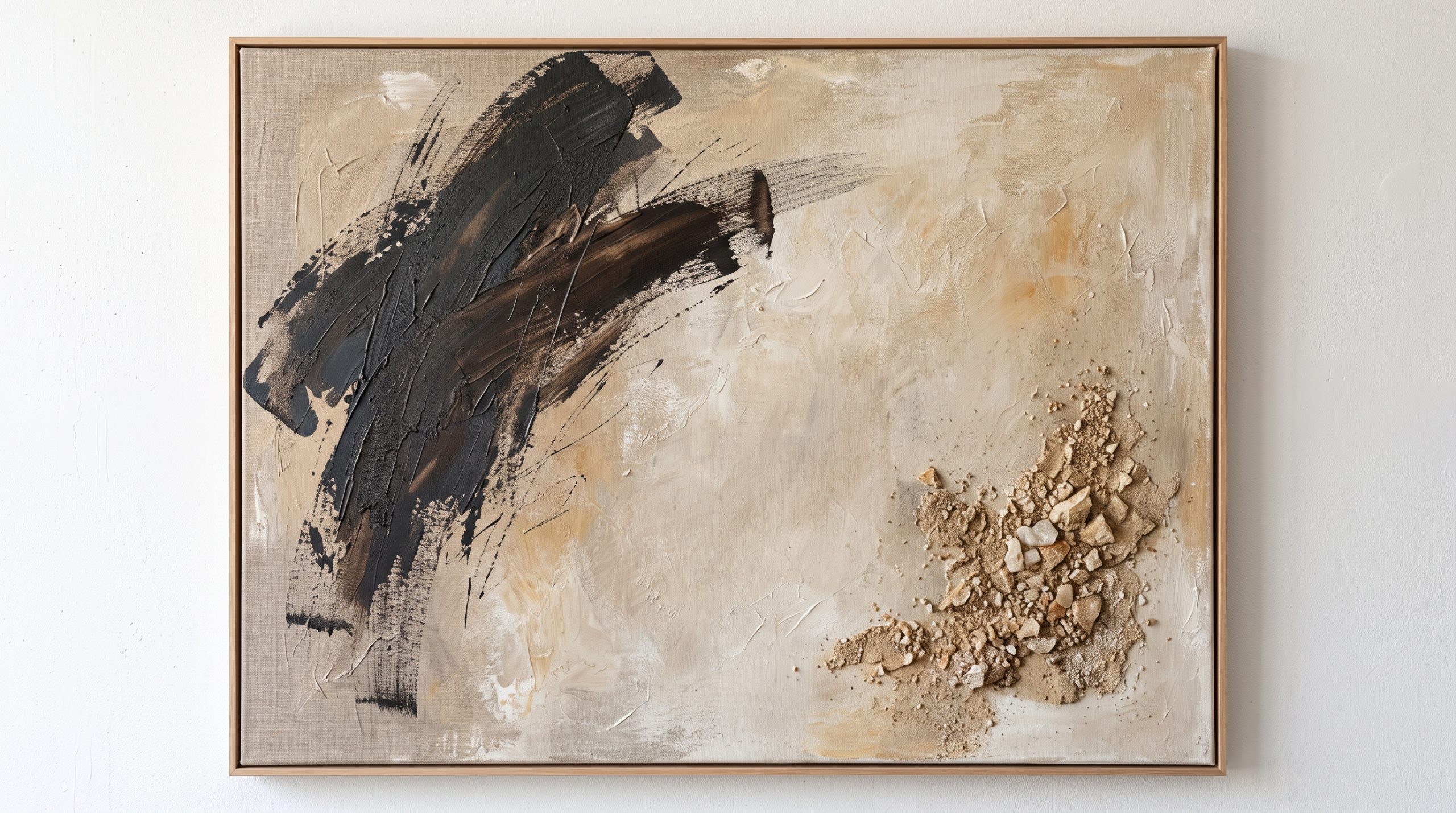
Texture is a strong source of weight, especially in monochrome or neutral work. A heavily textured area will pull the eye even when its colour matches the rest of the surface.
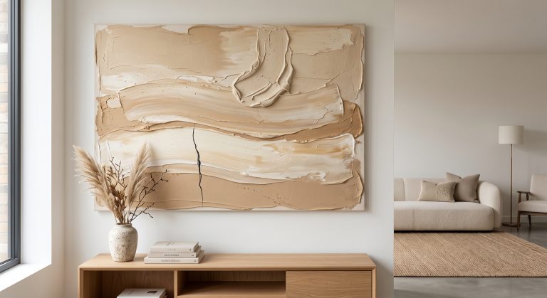
That means a neutral piece can be well balanced through texture alone: a smooth, quiet expanse on one side and a small cracked or raised passage on the other. See textured abstract art for more on how this works.
A Simple Test for Balance
You do not need training to check balance. Try these:
- Squint. Blur your vision and look at the big masses of light and dark. Do they tilt to one side?
- Cover half. Hide the left half with your hand, then the right. Does either half feel far heavier?
- Follow your eye. Where does it land first, and does it move on naturally, or get stuck?
- Live with it. Balanced pieces feel restful after a few days. Unbalanced ones often begin to nag.
Balance Beyond the Artwork: On the Wall
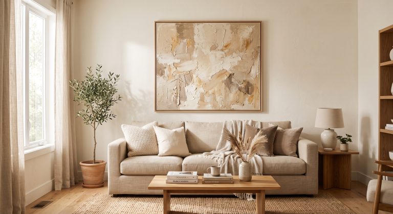
The same principle applies to how you hang art. A large piece on one side of a wall needs something on the other side to balance it, such as a lamp, a plant, a shelf or a second, smaller artwork. Otherwise the wall can feel lopsided.
For guidance on choosing and placing pieces, see how to choose abstract art for your home.
Final Thoughts
Balance is not about perfect symmetry. It is about weight being shared well.
Once you learn to see it, you will start noticing why some pieces feel settled from the first second and others never do. And when you choose art for your home, that instinct is one of the most reliable guides you have.