What Is Abstract Art? A Complete Guide to Understanding Abstract Art
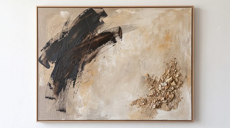
Stand in front of a good abstract painting and something happens before you have had time to think about it. A sweep of ochre pulls your eye sideways. A rough, chalky patch of surface makes you want to step closer. A wide field of ivory feels, inexplicably, like a held breath.
That is abstract art at work. So what is abstract art, exactly? It is artwork that does not try to depict the visible world directly. Instead of showing a recognisable person, place or object, it communicates through colour, shape, line, texture, composition and space. It can be dramatic or almost silent, energetic or deeply calm, and it is one of the most intriguing and most misunderstood forms of art.
In this guide, we’ll explore what abstract art actually is, where it came from, the different forms abstraction can take, how artists use colour and composition, why texture matters, and how to understand and choose abstract artwork for your own home. Chosen thoughtfully, it can change the whole feeling of a room without ever overwhelming it.
What Is Abstract Art?
Abstract art is artwork that moves away from directly representing the visible world. Instead of reproducing a person, landscape, object or scene exactly as we see it, an abstract artist may simplify, distort, fragment or remove recognisable forms entirely.
What remains can be surprisingly little:
- lines
- shapes
- colour
- texture
- marks
- layers
- shadows
- space
- movement
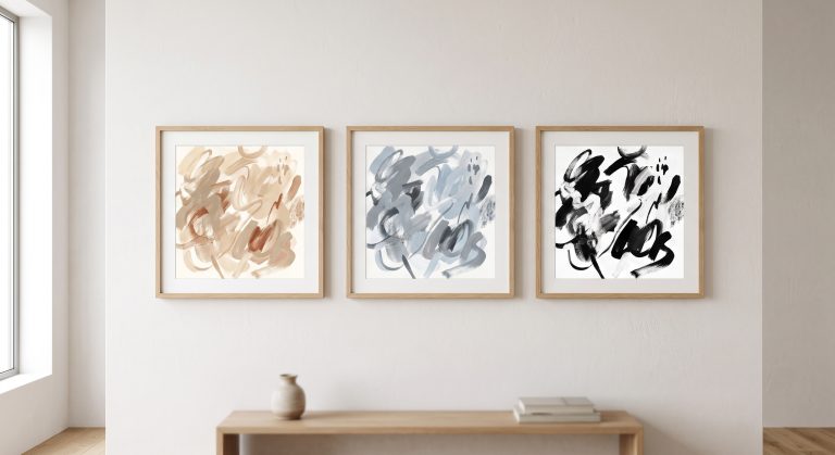
Some abstract work keeps a faint memory of the real world, a horizon or the curve of a stone; other work is completely non-representational. There is no single appearance that defines abstract art, which is why two paintings can both be called abstract while looking nothing alike. One might hold energetic black marks across a warm ivory ground. Another might be softly layered sandstone tones, another geometric blocks of colour, another almost nothing but surface and texture.
The common thread is that the artwork does not rely on recognisable subject matter to speak to you.
Abstract Art Doesn’t Have to “Look Like Something”
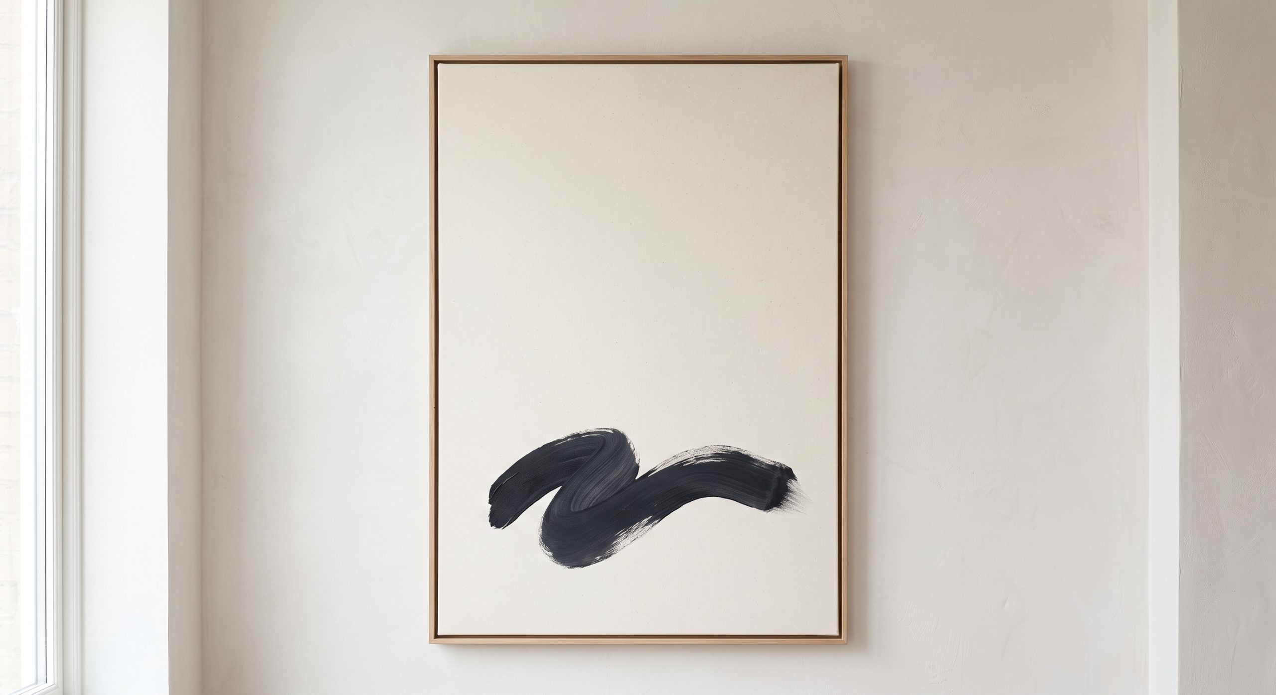
The question people ask most often in front of abstract art is simple: “What is it supposed to be?” Sometimes the answer matters. Often it doesn’t.
Abstract art invites you to respond to what is actually in front of you rather than to identify an object. You might notice the weight of a dark shape, or follow a curved line across the composition. You might be drawn to a particular colour combination, or to a rough, raised area of surface that catches the light. Or you might simply find that the piece makes a room feel quieter.
There isn’t necessarily a hidden object to decode. The experience of looking can be the point.
A Brief History of Abstract Art
Artists have experimented with simplification, symbolism and non-realistic representation for centuries, but abstract art as a major modern movement developed most strongly during the late nineteenth and early twentieth centuries.
Artists began questioning the idea that painting had to reproduce the visible world. Photography had changed the role of representation: a camera could record a person or place in extraordinary detail, which left painters freer to explore other possibilities. Colour, shape, gesture and composition could become subjects in their own right.
The pioneers arrived by very different routes. In Sweden, Hilma af Klint painted the vast, softly coloured canvases of The Ten Largest in 1907, although her abstract work was not widely exhibited until long after her death. Wassily Kandinsky, often credited as a founder of abstract painting, moved into fully abstract compositions in the early 1910s, treating colour almost like music. In 1915 Kazimir Malevich showed his Black Square in Petrograd, reducing painting to a single geometric form, and from around 1920 Piet Mondrian pared his compositions back to black lines and blocks of primary colour. After the Second World War, painters in New York took abstraction further still: Jackson Pollock with his poured, gestural canvases, and Mark Rothko with his glowing, soft-edged fields of colour.
The result was never a single movement with one visual language, but a wide range of approaches that still feel distinct today.
The Different Types of Abstract Art
There is no universally agreed list of abstract-art categories, but several broad approaches are useful when learning to recognise different styles. For a closer look at each one, see our guide to the different types of abstract art.
Geometric Abstraction
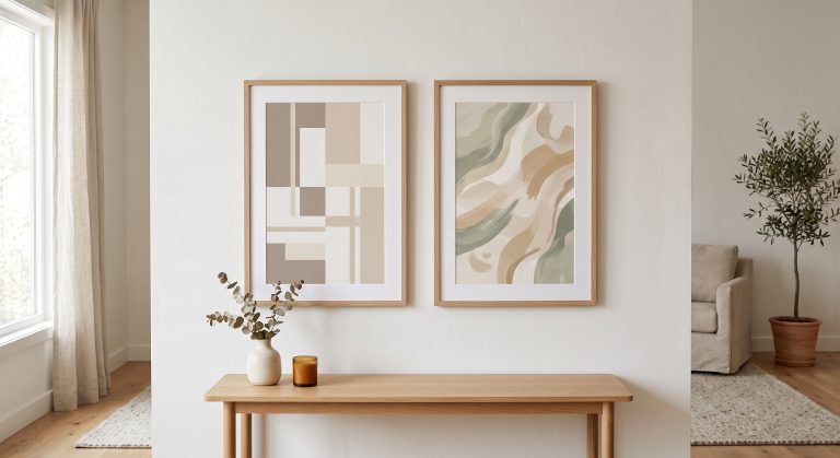
Geometric abstraction uses clearly defined shapes, lines and structures. Circles, rectangles, grids, blocks and repeated forms create a sense of order, and the result can feel architectural and controlled. It often sits particularly well in interiors that already have strong structure and clean lines.
Organic Abstraction
Organic abstraction takes its cue from natural forms without depicting them literally. Shapes might recall:
- stones
- water
- leaves
- shells
- landscapes
- clouds
- geological formations
The forms are softer and less rigid than geometric abstraction, so organic work brings a natural, unhurried quality into a room without becoming a literal botanical or landscape print. We explore this further in organic abstract art and why it feels so calm.
Gestural Abstraction
Gestural abstraction puts the emphasis on the movement and physical action of making the work. Brushstrokes, sweeping marks, splashes and energetic lines stay visible, and you can sometimes sense the artist’s arm moving across the canvas. The result feels spontaneous, expressive and alive.
Colour Field Abstraction
Here colour itself becomes the subject. Large areas of carefully considered colour sit beside or overlap one another, creating atmosphere without any recognisable imagery. The emotional effect comes almost entirely from how the colours meet.
Minimalist Abstraction
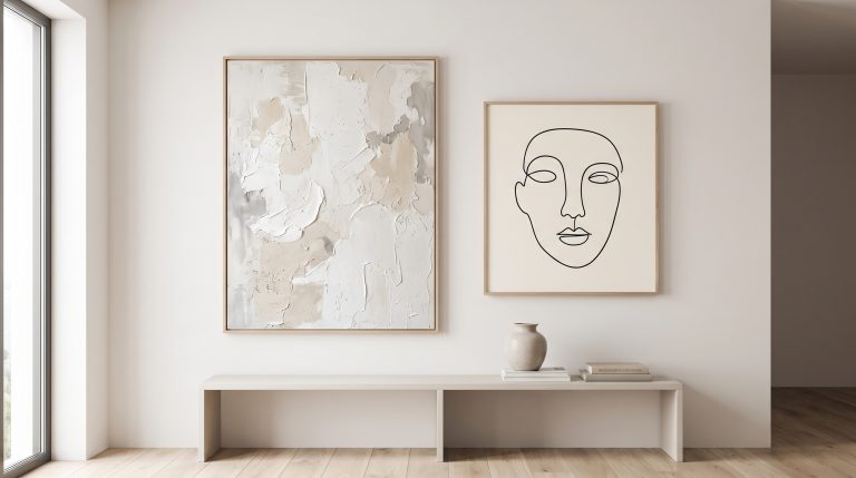
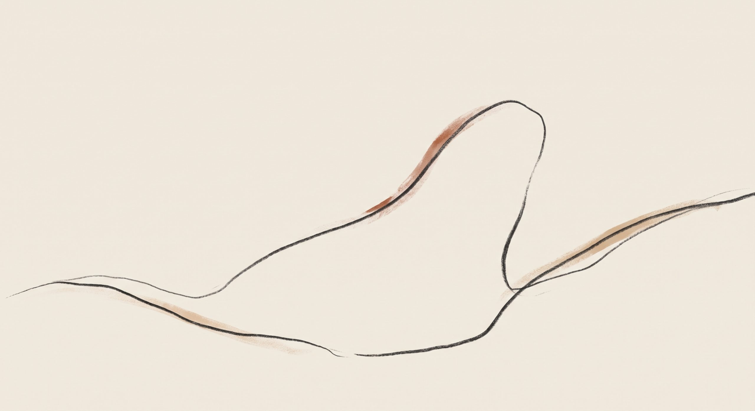
Minimalist abstract artwork reduces its visual language to a handful of carefully considered elements: a few shapes, lines or tones. That doesn’t make it simple. Minimal compositions often demand more thought, because every element carries more weight, and a single line in an otherwise empty field can become the whole focal point. To explore this approach further, see what minimalist art is and minimalist line art.
Textured Abstract Art
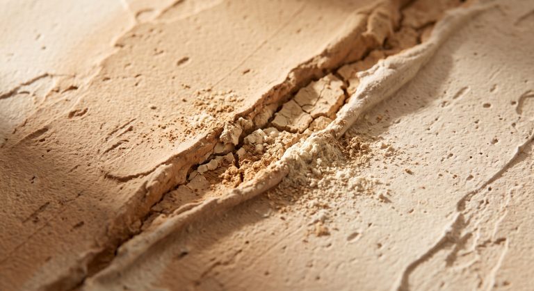
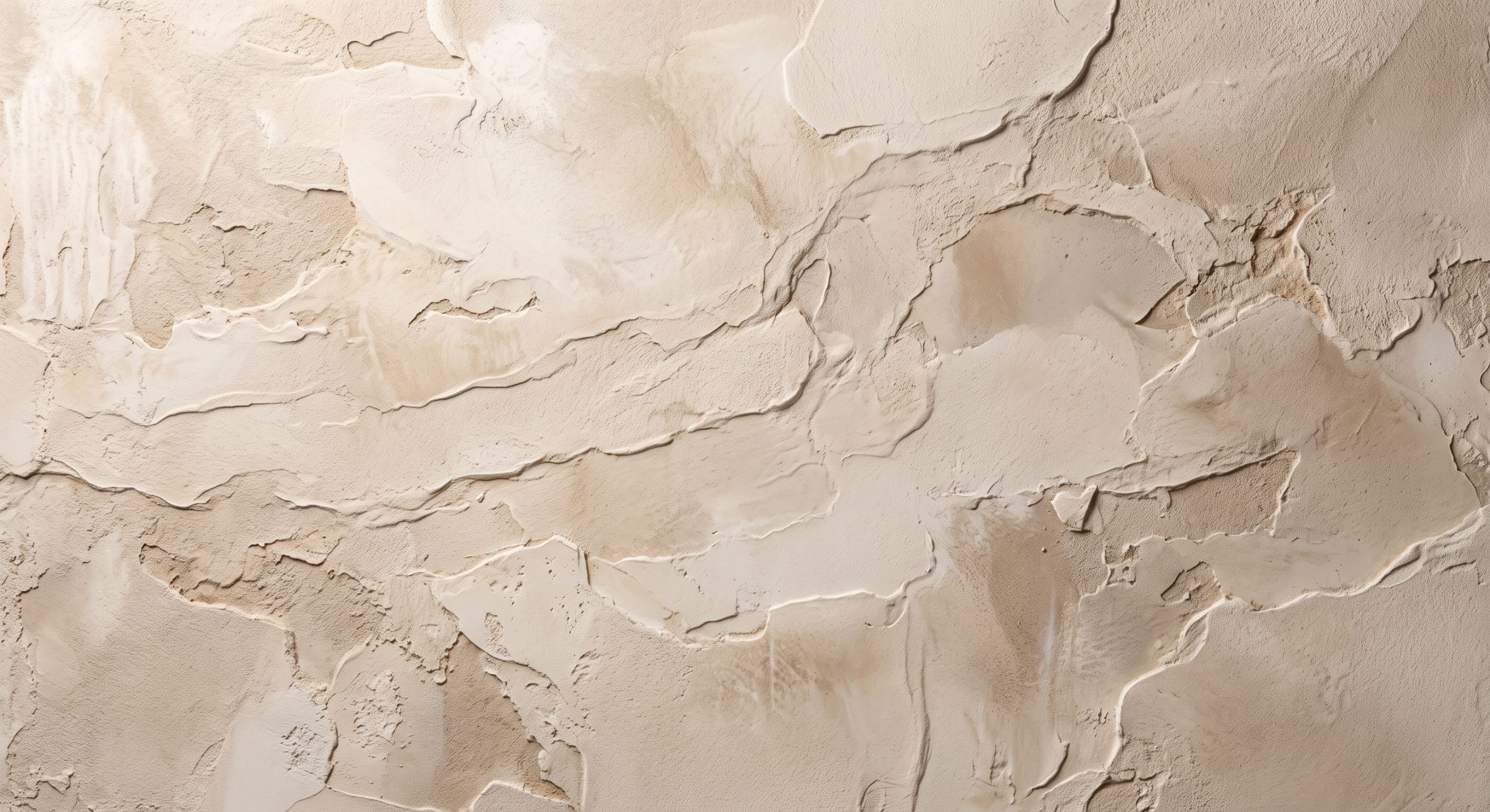
Textured abstraction makes the physical surface part of the artwork. Raised plaster, pigment, mineral-like surfaces, scratches, cracks, ridges and layered materials create a depth that colour alone cannot. Texture can make a piece feel tactile even when you are only seeing it on a screen.
This matters especially in neutral interiors, where subtle changes in surface stop a restrained palette from feeling flat. Our guide to textured abstract art looks at this in more detail.
Why Texture Matters in Abstract Art
Texture is more than decoration; it changes how we read a surface. A smooth area feels calm and uninterrupted. A rough or fractured one introduces tension. Raised sections catch light differently from recessed ones, and fine, powdery texture reads as delicate where deep marks read as weight.
All of this gives interior art something particularly valuable: visual depth without the need for strong colour. A warm ivory piece can hold enormous interest if its surface varies enough, because the eye keeps moving between smooth and rough, light and shadow, raised and recessed. It is one reason textured neutral artwork works so well in calm rooms.
One distinction is worth keeping in mind. An original made with plaster or texture mediums has real physical relief, while a print of textured work captures the appearance of that depth on a flat surface. Pieces like those in our neutral abstract collection are designed around that visual depth: the look of carved stone and drifting sand, printed flat.
How Colour Works in Abstract Art
Colour doesn’t simply make abstract art attractive; it can change the entire character of the work. (For more, see how colour changes the feeling of abstract art.)
Warm neutrals such as:
- ivory
- cream
- sand
- beige
- clay
- taupe
create a softer, grounded feeling, the warmth of plaster in afternoon sun. Cooler greys and mineral tones feel quieter and more architectural. Deep charcoal or black brings contrast and visual weight, and muted greens connect a piece with natural materials and plants.
The important thing isn’t simply choosing a colour you like. It is understanding how colours relate to one another. A small amount of a darker tone can have more impact than a whole canvas of strong colour.
The Importance of Composition
Composition is the way the visual elements are arranged, and it decides where your eye travels.
Picture a composition with one dominant shape placed slightly off-centre. Your eye goes there first, then finds a smaller mark elsewhere, and the movement between the two gives the piece its life.
Negative space is just as important. An area holding very little gives the eye somewhere to rest, and that matters most of all in minimalist and neutral abstract art. Empty space isn’t wasted space; it is an active part of the composition. You can read more about balance in abstract art if you’d like to explore how artists distribute visual weight.
What Is Negative Space in Art?
Negative space is the area surrounding and between the main elements of an artwork. It is easy to overlook, because attention naturally goes to the marks, yet it often decides whether a composition feels crowded or calm.
A strong abstract composition usually depends on the relationship between:
- mark and space
- texture and smoothness
- light and dark
- movement and stillness
What is left out can matter as much as what is there. Our article on negative space in abstract art goes deeper.
How to Look at Abstract Art
You don’t need an art-history degree to understand abstract work. Start with observation rather than interpretation, and ask yourself a few questions.
What do I notice first?
Is it a colour, a shape, a line, a texture, a moment of contrast?
Where does my eye go next?
Does the artwork lead your eye around the composition, or hold it in one place?
How does the surface feel?
Does it appear smooth, rough, layered, cracked, powdery, brushed or sculptural?
Is the artwork balanced?
Does one side feel heavier than the other? Is there a central focal point, or does the composition deliberately avoid symmetry?
How does it make me feel?
Calm, curious, energised, grounded, unsettled? There isn’t one correct answer. Your response is part of the experience.
How to Choose Abstract Art for Your Home
Choosing abstract art isn’t about finding something that matches your sofa. The best pieces have a relationship with the room without disappearing into it, so start with the atmosphere you want to create.
For a calm interior, you might look towards:
- warm neutrals
- organic shapes
- restrained contrast
- soft texture
- generous negative space
For a more dramatic room, you might choose:
- stronger contrast
- darker marks
- energetic gestures
- deeper colour
- larger-scale compositions
Think about a piece’s visual weight, not just its colour. A predominantly pale artwork can still have real presence if its texture or composition is strong. For a step-by-step approach, see how to choose abstract art for your home.
Should Abstract Art Match Your Interior?
Not necessarily. Artwork doesn’t have to repeat every colour in a room, and matching too closely can make an interior feel over-coordinated.
Look for relationships instead. A sandy piece might echo the warmth of an oak floor. A charcoal mark might answer a black lamp base or a slim window frame. A muted green might pick up the plants on the windowsill. These connections can be subtle, and that is their charm: the artwork belongs in the room without looking as though it was ordered to match the cushions.
Choosing the Right Size of Abstract Artwork
Scale can dramatically change the impact of abstract art. A small piece can be lovely on a narrow wall, a shelf or an intimate corner, while a larger one can anchor an entire room.
Above a sofa, bed or console, think about the relationship between the artwork and the furniture beneath it. Too small and the piece looks lost; too large and it crowds the space around it. The aim isn’t to fill the wall. It is to create a convincing relationship between the artwork, the furniture and the space that surrounds them both.
Why Abstract Art Works So Well in Modern Interiors
Modern interiors rely on restraint: natural materials, simple furniture, neutral colours and clean architectural lines. That restraint can create beautiful spaces, but it carries a risk. The room can become visually flat.
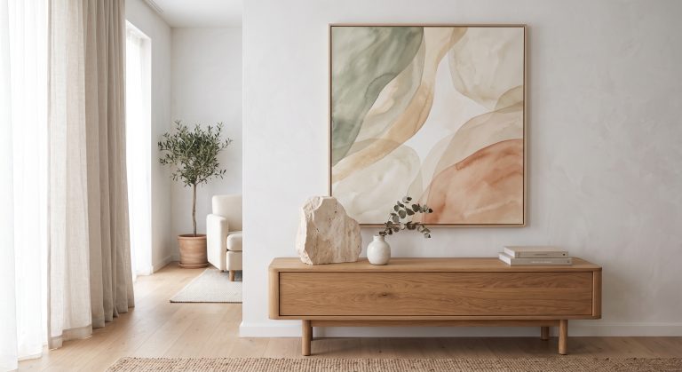
Abstract artwork adds complexity without breaking the calm. Texture adds depth. A sweeping line brings movement. A single dark mark creates contrast. Organic shapes soften hard architectural edges. And a restrained palette lets the work stay sophisticated while still giving the eye something to enjoy. That is a large part of why abstraction sits so naturally in contemporary interiors.
Abstract Art Is About More Than Decoration
A good abstract piece will certainly make a wall look better, but calling it decoration misses much of what makes abstraction interesting. Abstract artwork can explore:
- movement
- material
- emotion
- balance
- rhythm
- colour
- proportion
- space
- light
- physical process
It encourages you to stop and look. Often the most successful piece is the one you are still noticing months after it went up: not because it is loud, but because there is always something more to discover.
Final Thoughts
Abstract art doesn’t require you to know exactly what you are looking at. It simply asks you to look.
Notice the texture. Follow the line. Consider the balance and the colours, where the eye rests and where it moves, and how the piece changes as morning light gives way to lamplight. Above all, allow yourself a response without worrying whether it is the “correct” one.
There is enormous freedom within abstraction, from expressive gestural paintings to quiet minimalist compositions, from geological textures to a single line. That range is precisely what makes it so fascinating. For the full process of choosing, sizing and styling a piece once you’ve found one you respond to, see the complete guide to choosing artwork for your home.