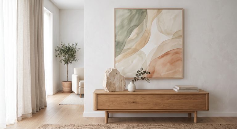
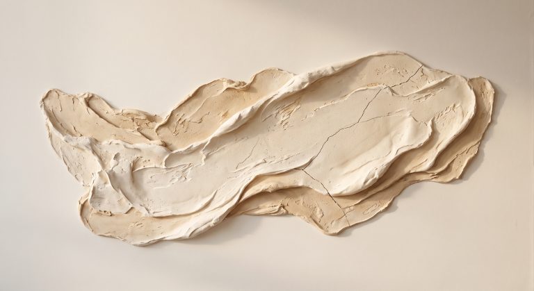
Textured Abstract Art: A Guide to Texture, Depth and Dimension
Some artworks reward a glance. Textured abstract art rewards two: one from across the room, and another from close up, when the surface starts to reveal what colour and shape alone cannot.
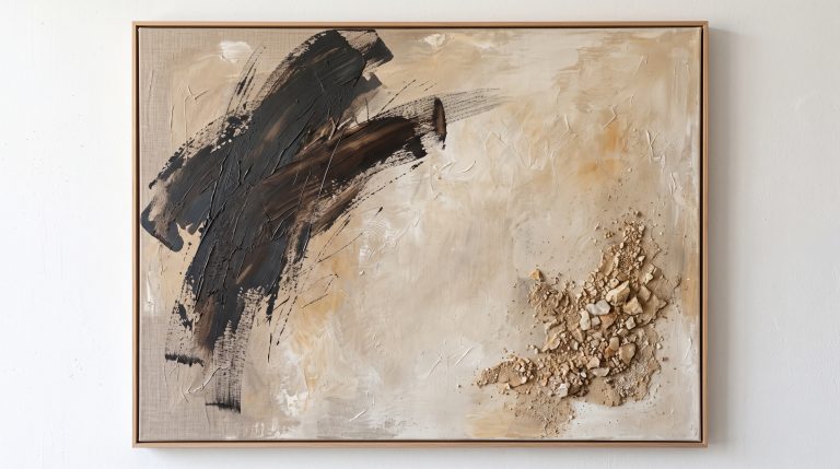
Raised ridges, fine cracks, layered plaster, a scatter of mineral-like powder. These are not decoration added to a picture. In the best textured work, the surface is the picture.
This guide explains what textured abstract art is, how its depth is created, what separates convincing texture from texture that has simply been added on top, and how to live with it in a calm interior. For the wider context, our pillar guide to what abstract art is is a good place to start.
What Is Textured Abstract Art?
Textured abstract art is abstract work in which the physical surface plays an active part in how the artwork looks and feels.
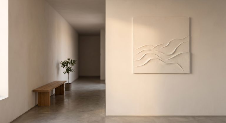
Instead of a flat plane of paint, the surface might be built up, scraped back, cracked, incised or layered. The artwork has real relief, so it changes as light moves across it.
It is one of the six broad approaches we outline in the different types of abstract art, and it overlaps easily with minimalist, organic and colour field work.
A Short Note on Material Abstraction
Working with the physical substance of a painting is not new. In the mid-twentieth century, artists such as Antoni Tàpies incorporated materials like sand and marble dust into their surfaces, and Alberto Burri worked with cracked, burned and stitched materials. Their work is often cited in discussions of material-led abstraction.
What has changed is the setting. Today, that material sensibility often appears in calm, neutral interiors, where a restrained palette is given depth through surface rather than colour.
How Texture Is Created
Different materials produce different effects. Common approaches include:
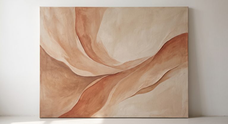
- Plaster or lime-based layers for a stone-like, matte relief
- Modelling paste or texture gels for controlled raised ridges
- Sand, grit or fine mineral powders for a granular, sedimentary feel
- Scraping, incising and sanding to reveal layers beneath
- Cracking, produced as thick layers dry or are deliberately stressed
The materials matter less than the result. What you are looking for is a surface that feels physically believable.
Texture That Feels Real vs Texture That Feels Added
This is the most useful thing to understand about textured art.
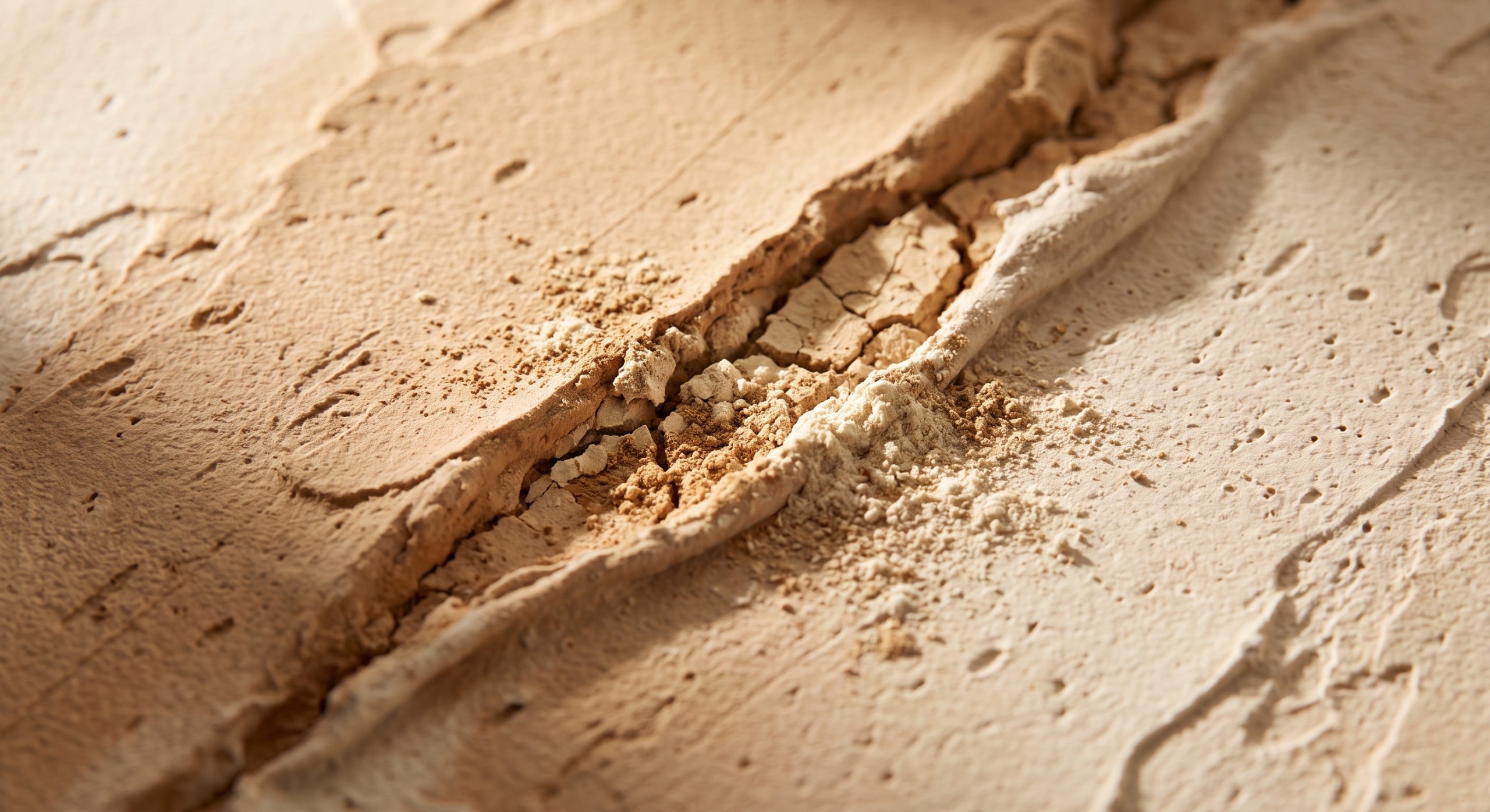
Convincing texture suggests a process. It looks as though something happened to the surface: pressure, fracture, erosion, sediment or abrasion. A crack looks like it opened because the material moved. A powdery edge looks like it crumbled.
Unconvincing texture looks applied. It sits on top of the composition as a pattern, evenly distributed and without any sense of cause.
Pressure and fracture
A crack that follows the direction of an underlying gesture feels integrated. A random crack drawn onto a smooth area does not. This is exactly the kind of layering seen in sandstone wall art ideas, where real geological strata provide the model.
Erosion and abrasion
Worn edges and softened ridges suggest time. They make a piece feel as though it has existed for a long while, which is part of the appeal of mineral-inspired work. It also echoes the appreciation of age in wabi-sabi art.
Sediment and layering
Horizontal or gently stepped layers can suggest strata. They give a quiet, geological rhythm without depicting rock directly.
The Power of One Disruption
The strongest textured pieces often rely on a single disruptive element: one fracture, one break, one area where the surface changes character.
That focal disruption gives the eye somewhere to go. Texture spread evenly across the whole surface tends to feel busy and gives the eye nowhere to land.
The disruption also feels stronger because of what surrounds it, which brings us to contrast.
Calm Areas Make Rough Areas Work
Broad, calm, relatively smooth areas make smaller areas of rough or particulate texture look intentional. The contrast is what creates drama.
This is the same principle explained in negative space in abstract art: what is left quiet gives the active areas their strength. A piece that is heavily textured from edge to edge often reads as tiring rather than sophisticated.
Why Texture Works So Well in Neutral Interiors
A neutral room can slip into flatness. The palette is calm, the furniture is simple, and nothing pulls the eye.
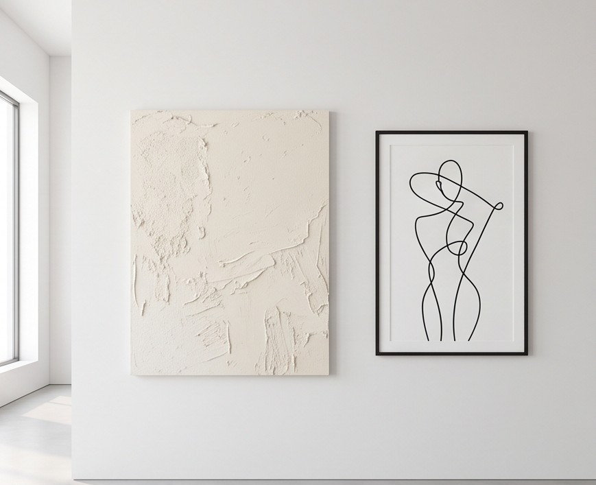
Texture solves that without adding colour. A cream textured artwork holds many tones at once: raised areas catch light and look pale, recessed areas fall into shadow and look darker. It brings variation and depth to a restrained scheme.
It also pairs naturally with other tactile materials such as linen, wood, ceramics and stone. If you’re working with warm neutrals in particular, see beige abstract art for calm contemporary interiors.
Light: The Second Artist in the Room
Textured art depends on light more than almost any other kind.
Light coming from the side, along the wall, creates the strongest shadows and makes relief most visible. Flat, direct light from directly in front reduces the effect. Light that changes through the day means the piece never looks quite the same twice.
If you have a choice, hang textured work on a wall that receives side light from a window, or add a directional light nearby.
Originals, Prints and Printed Texture
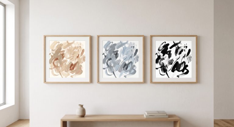
It’s worth being clear about one thing. A print of a textured artwork reproduces the appearance of texture, not the physical relief itself. It can still look convincing, particularly when printed on good paper, but the light will not create real shadows across it.
That is not a flaw, only a difference. Physical relief is a property of an original or a sculptural work. A print offers the visual language of texture at a very different scale of cost and practicality.
How to Choose Textured Abstract Art
- Decide how much surface you want to live with. Subtle relief suits quiet rooms; dramatic relief suits a focal wall.
- Look for one clear point of interest rather than uniform roughness.
- Check that the texture suggests a process, not a pattern.
- Consider your lighting and the wall it will hang on.
- Balance it with calm surroundings. A textured piece needs breathing space.
For the wider process of choosing, see how to choose abstract art for your home.
Final Thoughts
Textured abstract art asks something slightly different of you than a flat image does. It asks you to look again, to move, to notice how the light changes.
When it works, it does not feel like a surface decoration. It feels like the record of something that happened to a material, and it gives a calm room a quiet sense of time and depth.