Warm Neutral Wall Art: Colours, Textures and Styles
Some neutral rooms feel like a gallery. Others feel like a hug. The second kind almost always relies on warm neutrals.
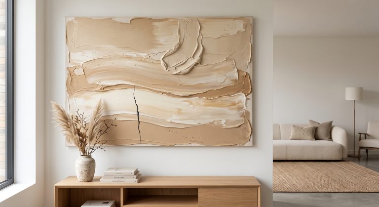
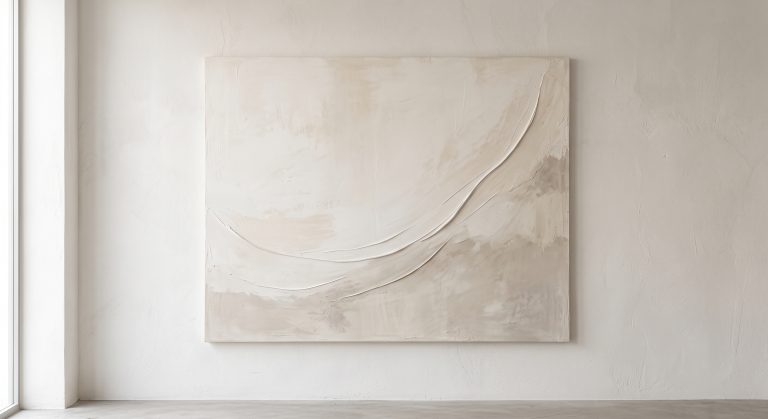
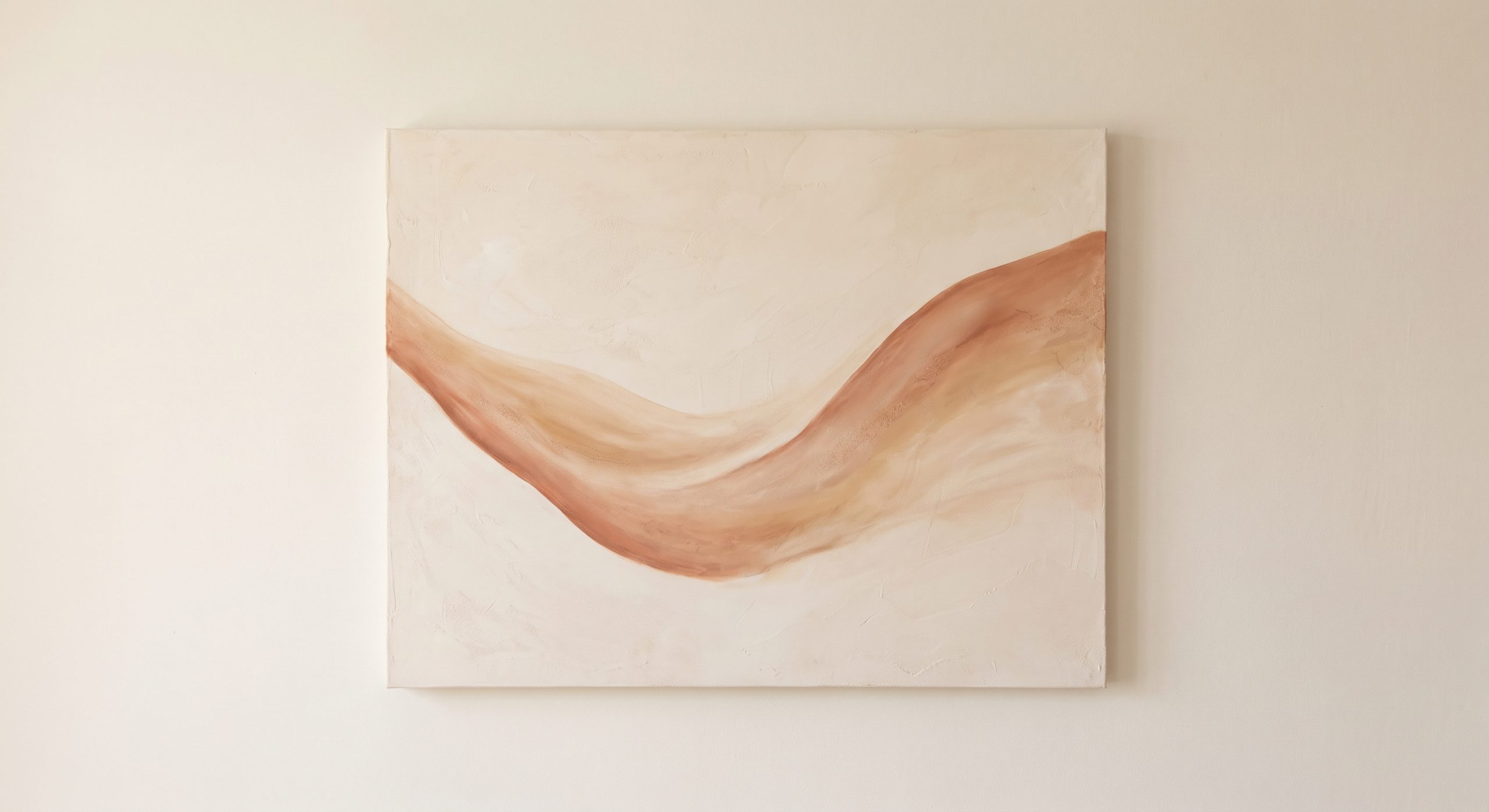
Warm neutral wall art draws on the colours of clay, sand, oiled oak, unbleached linen and candlelit plaster: ivory, oatmeal, camel, caramel and soft taupe, with undertones that lean golden, peach or brown rather than grey. It calms a room without cooling it, which is why it has become a signature of warm minimalist and Japandi-influenced interiors.
This guide explains what makes a neutral warm, the colours and textures to look for, the styles that suit it, and how to pair it with the rest of a room. For the wider picture, start with what neutral wall art is.
What Makes a Neutral “Warm”?
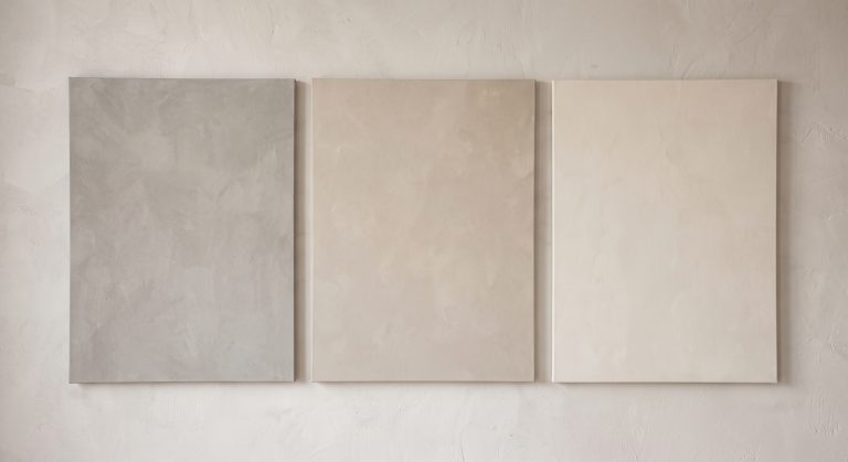
Every neutral has an undertone. Warm neutrals lean towards yellow, peach, red or brown. Cool neutrals lean towards blue, green or grey.
A simple way to tell: hold the colour against a sheet of pure white paper. A warm neutral looks slightly creamy, golden or pinkish beside it. A cool one looks slightly grey or blue-green.
The Warm Neutral Palette
- Ivory and cream: the softest, lightest warm tones
- Sand and oatmeal: gentle, earthy mid-tones
- Buff and camel: warmer, slightly golden
- Caramel and honey: richer, glowing tones
- Clay and terracotta-tinged neutrals: soft, muted earth
- Warm taupe and mushroom: deeper, brownish greys
- Soft chocolate and espresso: for grounding accents
For the impact of palette on mood, see how colour changes the feeling of abstract art.
Textures That Feel Warm
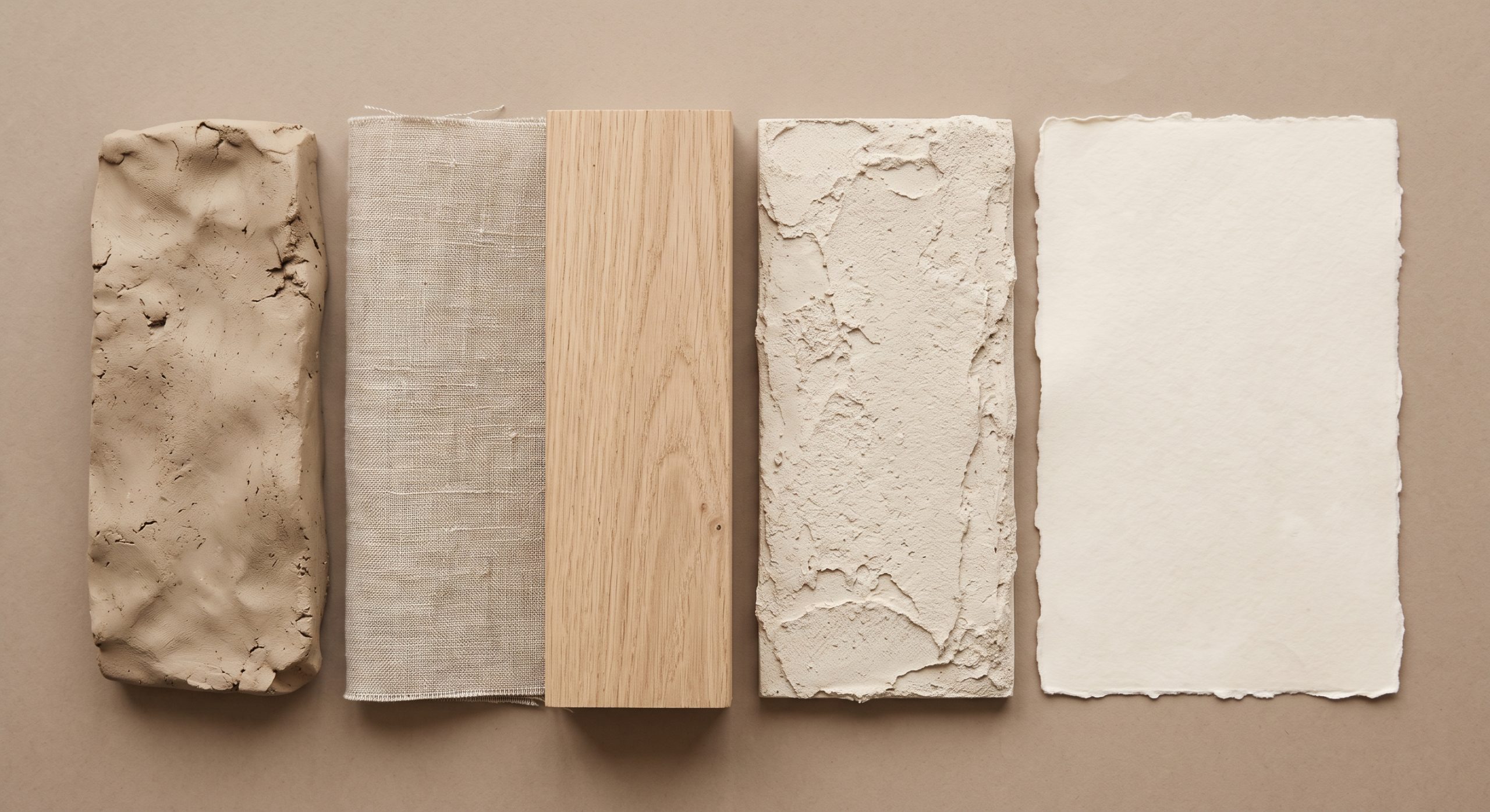
Warmth in art is not only about colour. Surface plays a large part, and the warmest pieces often look as though you could feel them.
- Plaster and lime-wash effects with soft, cloudy variation
- Handmade paper with visible fibres
- Linen and canvas weave
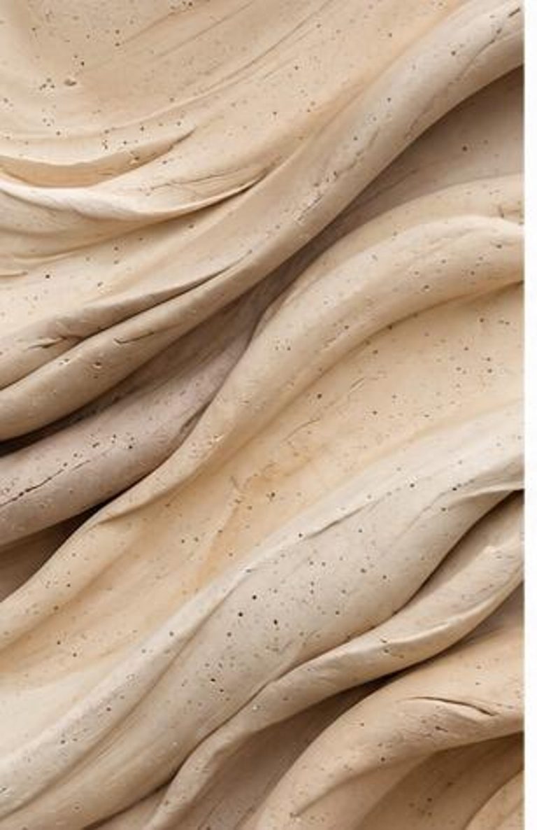
- Clay-like matte surfaces
- Soft brush and dry-brush marks
Finish changes how a piece reads, too. A glossy surface reflects more light, so it shows crisper highlights and sharper contrast but can also catch glare and reflect the colour of nearby light. A matte surface diffuses light, so tones look softer and more even from most angles, which is why many people find it suits warm neutrals. A note on prints: a printed piece can reproduce the look of these textures, but not physical relief. See textured abstract art for the distinction.
Styles That Suit Warm Neutrals
Organic abstract
Soft, curved forms in sand, clay and cream. See organic abstract art.
Mineral and sandstone-inspired
Layered, granular, earth-toned pieces that borrow the colours of weathered rock. See sandstone wall art ideas. Our own Sandstone Flow Texture sits squarely in this family: diagonal bands of ivory, beige and taupe with the look of cracked, powdery stone.
Japandi and wabi-sabi
Muted, handmade, softly imperfect work. See what Japandi art is and wabi-sabi art.
Fine line art
A warm brown or charcoal line on cream paper. See minimalist line art.
Dried botanicals and natural studies
Grasses, seed heads and leaves in dry, golden tones.
Pairing Warm Neutral Art With the Room
Woods
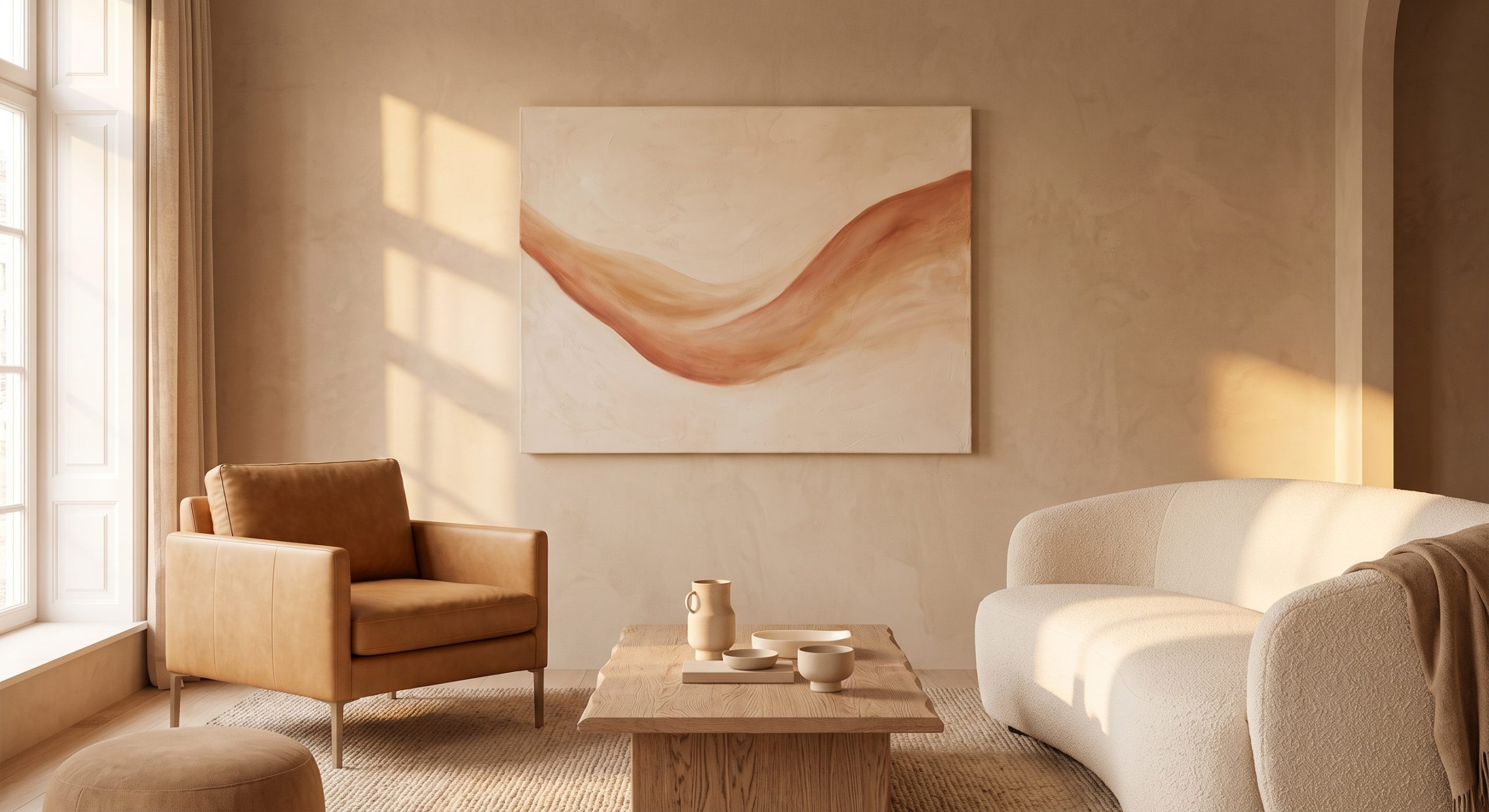
Oak, ash, walnut and teak all sit naturally beside warm neutrals. Lighter woods keep things airy; darker woods add depth.
Metals
Brushed brass, bronze and aged gold reinforce warmth. Chrome and cold silver can feel out of step.
Textiles
Linen, wool, bouclé and cotton in cream, sand and camel.
Walls
Warm white, cream and soft greige walls suit warm neutral art. A pure, cool white wall can make it look yellow, so check before committing.
Lighting
Warm neutrals depend on the light. Soft, warm-white bulbs (typically labelled around 2700K) bring out their glow, while cold white light drains them. If a piece looks dull, lighting is often the cause. In the evening, a warm-white picture light helps too; see the best wireless picture lights for artwork.
How to Stop Warm Neutrals Feeling Dull
- Include a range of tones from light to deep.
- Add one darker note, such as espresso or charcoal.
- Choose textured or hand-finished surfaces.
- Leave breathing space around each piece.
- Vary shapes: curves beside straight lines.
How to Choose Warm Neutral Wall Art
- Check the undertone against your walls and furniture.
- Look for tonal depth or texture.
- Consider a matte or low-sheen finish for a softer look with reduced glare.
- Match scale to the wall or furniture.
- Test the piece in both daylight and lamplight.
For more on grouping tones, see how to mix different shades of neutral artwork, and for a process across all room types, how to choose abstract art for your home.
Final Thoughts
Warm neutral wall art works because it agrees with the materials in a home: wood, clay, linen, plaster. It does not compete with them. It joins them.
Choose a consistent undertone, add texture and a little depth, and let good light do the rest. The result is a room that feels calm and warm at once. If you would like to see this palette in practice, our neutral abstract collection is built around warm, mineral tones.