Minimalist Artwork for Small Spaces
In a small space, every object is doing more work, and art is no exception. A piece that would be forgettable in a large living room can define a studio flat. A piece that is even slightly wrong can make a compact room feel cluttered within a day.
Minimalist art is a natural fit: it asks little of a room and gives a lot back. This guide explains how to choose and place minimalist artwork in small spaces, from studios and small bedrooms to hallways and entryways, and how to avoid the mistakes that make compact rooms feel smaller. For background, see what minimalist art is.
Why Minimalist Art Suits Small Spaces
Small rooms have limited visual room. Busy art competes with furniture, storage and everyday objects for the same few square metres of attention.
Minimalist work works with that limitation instead of against it:
- It uses few elements, so it adds little visual noise.
- It relies on empty space, which helps a room feel open. See negative space in abstract art.
- It usually has a quiet palette that does not fight with the rest of the room.
- It gives one clear point of focus rather than many.
One Larger Piece, or Several Small Ones?
This is the most common question, and designers often recommend fewer, larger pieces over a scatter of small ones. A cluster of small frames can read as clutter on a compact wall, while a single larger piece feels deliberate and calm.
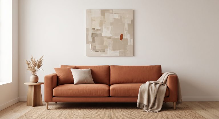
That does not mean huge. It means a piece that relates properly to the wall or furniture it sits above. As a rough guide, art above furniture tends to look right when it spans about two-thirds to three-quarters of the furniture’s width. For more on scale, see how to choose abstract art for your home.
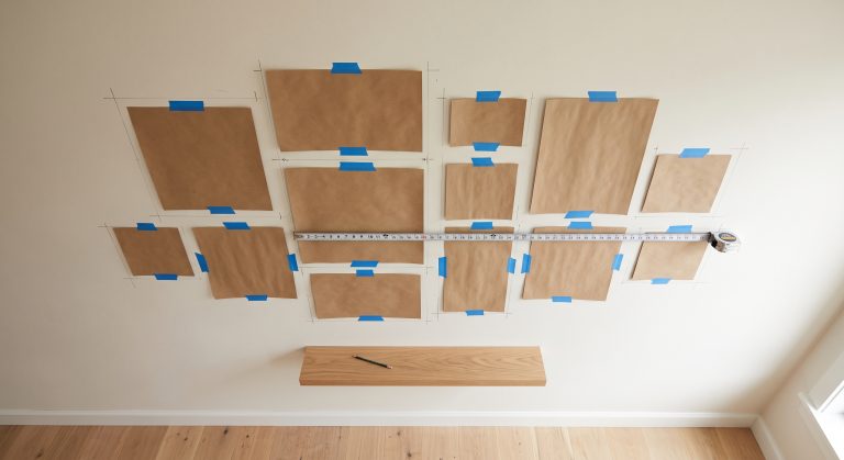
The exception is a small, tight gallery arrangement on a wall with nothing else on it, which can work if the pieces are closely related and evenly spaced.
Use Height
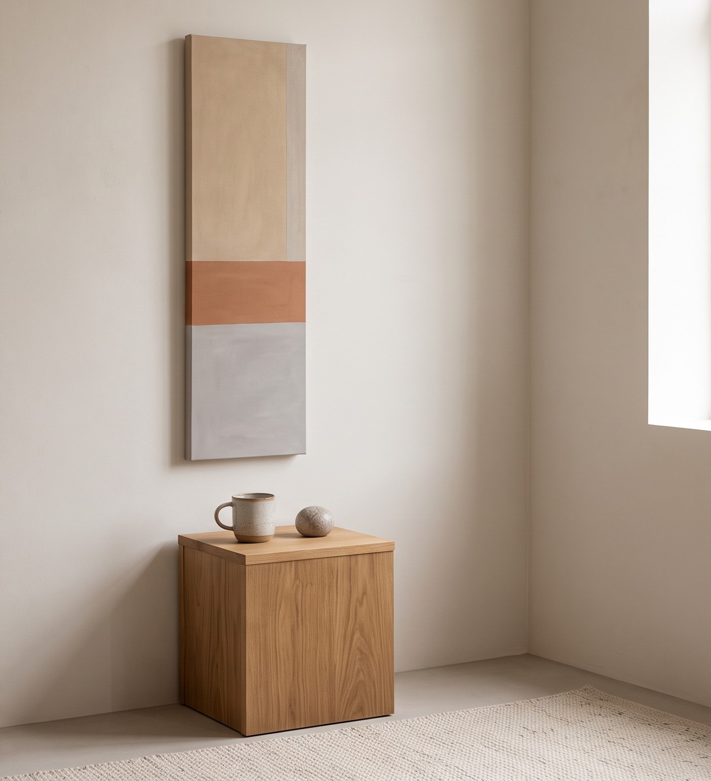
Small rooms often have limited floor and wall width but reasonable ceiling height. Vertical artwork draws the eye upward, which can make ceilings feel higher and narrow walls feel intentional.
- A tall, narrow piece suits a slim wall between a window and a corner.
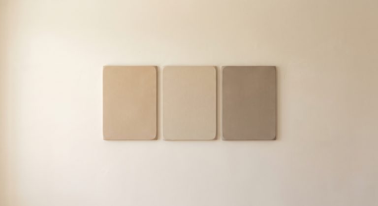
- A vertical pair can mark a doorway or a narrow alcove.
- A horizontal piece suits a low sofa, bed or console, mirroring the width of the furniture.
Choose Quiet Colour, With One Point of Contrast
Light, low-contrast palettes tend to feel spacious. Warm whites, oatmeal, sand and pale grey blend gently into pale walls and keep the room feeling open.
But an entirely pale piece can disappear against a pale wall. A single darker mark, such as a fine charcoal line or a small area of deeper clay, gives the eye somewhere to land. For palette help, see how colour changes the feeling of abstract art and beige abstract art for calm interiors.
Protect the Empty Wall
In a small room, empty wall is valuable. Leave breathing room around each piece so it does not crowd the corner, the ceiling line or the furniture.
- Keep art clear of switches, door frames and curtain tracks.
- Avoid hanging art so close to a bed, sofa or shelf that it looks squeezed.
- Resist filling every blank stretch of wall. One empty section is what makes the piece look chosen.
Minimalist Art Space by Space
Studio apartments
In a single room that must serve as living, sleeping and working space, art can quietly define zones. A single larger piece above the sofa or bed marks that area, while the rest of the wall stays calm. Keep to one palette across the room so the space reads as a whole.
Small bedrooms
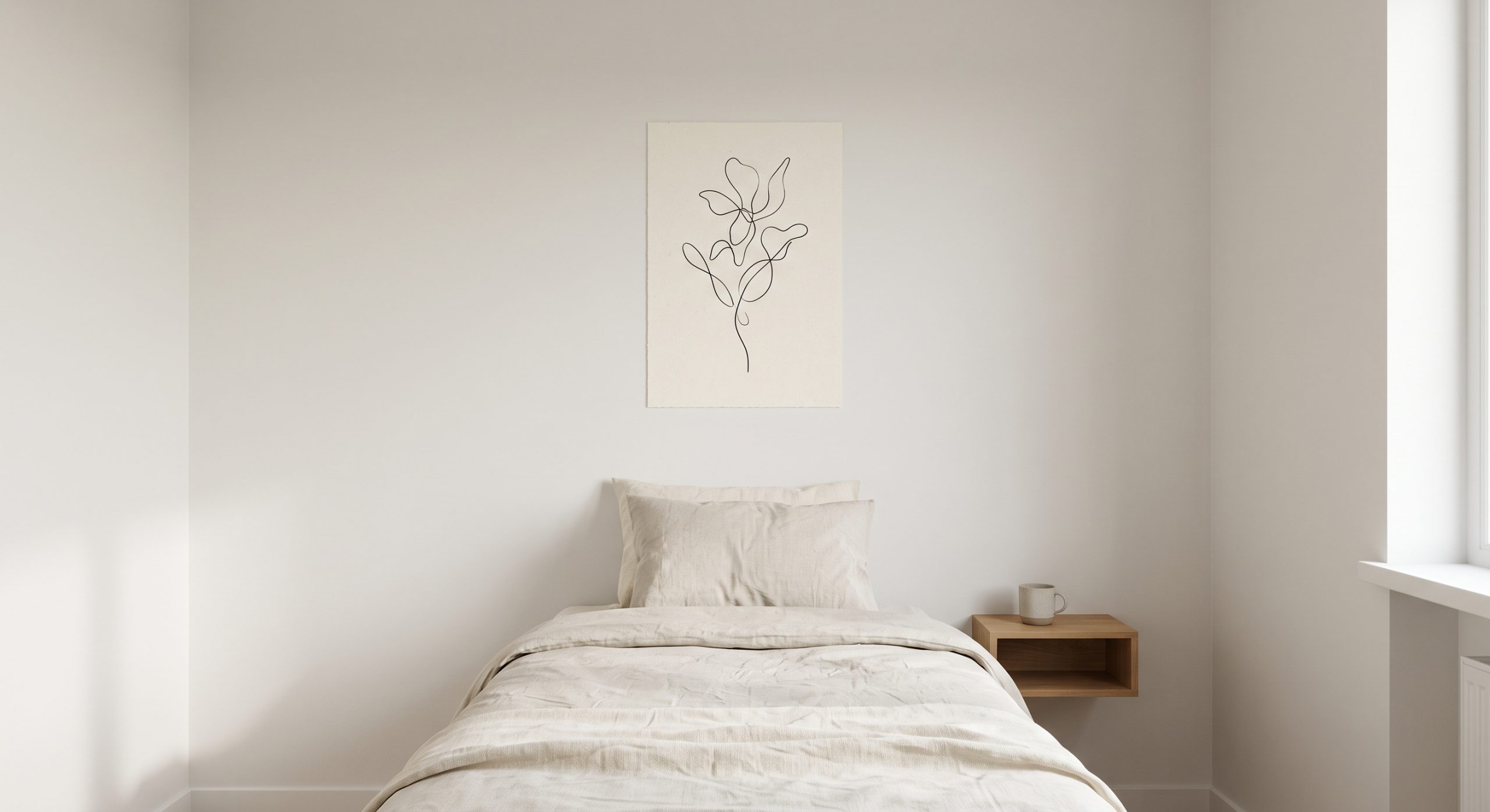
A single delicate piece above the bed, such as a line drawing or a soft abstract in low-contrast tones, supports a restful mood without taking over. See minimalist line art for what makes a line drawing work.
Hallways and entryways
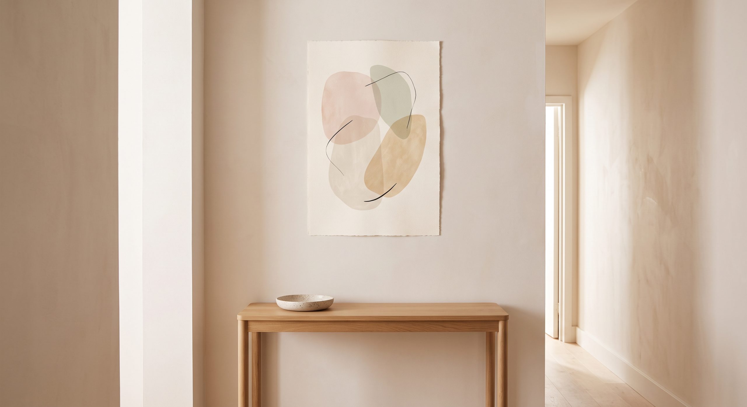
Narrow spaces suit slim vertical pieces or a row of two or three closely related works. Keep them shallow and avoid heavy frames that project into a walkway. A light, simple piece over a slim console makes a small entrance feel considered.
Home office nooks
Choose calm, low-contrast work that does not distract from the screen. A single piece to one side of the desk is usually better than a busy wall behind it.
Bathrooms
Moisture and steam are hard on paper. If you hang art here, choose a spot away from direct splashes, and consider sealed or glazed framing. Simple, quiet pieces suit small bathrooms best.
Frames and Presentation
- Choose slim frames. Chunky frames make small walls feel busy.
- Consider frames that match the wall or the artwork’s tones so they recede.
- A wider mat, the paper border inside the frame, gives a small piece more presence without enlarging the frame itself.
- Pale wood, white and thin black all work well in compact rooms.
If You Cannot Drill
In rented homes, leaning a larger piece on a shelf, mantel, dresser or picture ledge is a good option. It feels relaxed and lets you rearrange easily. Just make sure the piece is stable and does not block anything you use often.
Lighting
Small rooms often depend on a few light sources. A soft lamp or wall light near the art helps a minimalist piece show its tonal subtleties, particularly in the evening. Avoid strong glare directly on glazed pieces.
Common Mistakes
- Hanging several small pieces that read as clutter
- Choosing art that is too small for the wall
- Hanging art too high, which disconnects it from furniture
- Heavy dark frames or dense, dark artwork
- Overfilling every wall
- Ignoring the palette of the room
How to Choose: A Quick Checklist
- Measure the wall or furniture width first.
- Prefer one confident piece to a scattered group.
- Choose a palette close to the walls, with one point of contrast.
- Look for generous empty space inside the artwork itself.
- Choose slim frames and a generous mat.
- Leave breathing room around the piece.
If your taste leans towards the warm, natural end of minimalism, our guide to Japandi art is a good next read, and abstract line art ideas offers more ideas for compact rooms.
Final Thoughts
Small spaces reward restraint. The right minimalist artwork does not try to make a room look bigger than it is. It simply stops the room from feeling busier than it is.
Choose one piece with real presence, give it room, and let the empty wall do the rest.