Neutral Wall Art for Beige Living Rooms: How to Stop the Room Looking Flat
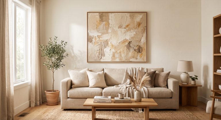
A beige living room looks flat when everything in it shares the same lightness and the same undertone. Neutral wall art for a beige living room fixes that not by adding colour, but by adding contrast in value (light and dark), a consistent undertone, and visible depth. Choose art that is noticeably lighter or darker than your walls, that leans the same warm or cool way as your beige, and that includes at least one deeper tone such as taupe, clay or walnut brown.
Get that balance right and a beige room stops feeling like one soft blur and starts to feel layered: oatmeal linen against a sand-toned wall, a band of deep taupe in the art, a walnut frame catching the lamplight. “Add texture” is the usual advice, and it helps, but on its own it rarely solves the problem. This guide goes further: how to read your beige, how much contrast you need, where greige and taupe fit, and how frames, wood and lighting finish the job.
Why Beige Rooms Go Flat
Beige is a mid-to-light neutral that sits comfortably beside almost anything, which is exactly why rooms full of it can lose definition. When the walls, sofa, rug, curtains and art all fall in a narrow band of lightness, the eye has nothing to rest on. Nothing reads as foreground or background.
Art is one of the easiest ways to break that blur, because it sits at eye level on the largest surface in the room.
Step 1: Read Your Beige
Not all beige is the same. Before choosing art, work out which way your walls lean.
Warm beige
yellow or golden
Pink beige
rosy, blush
Greige
grey plus beige
Green beige
stone, putty
Taupe
deeper grey-brown
Common beige undertones. Screens vary, so compare your own wall to a sheet of plain white paper in daylight.
The white paper test: hold a sheet of plain white printer paper against the wall in daylight. Beside pure white, the hidden undertone shows itself: yellow, pink, grey or green.
- Warm beige (yellow or golden) suits art with sand, honey, clay and ivory tones.
- Pink beige suits terracotta, blush and warm taupe.
- Greige suits stone, mushroom and cooler taupe, and can take a little charcoal.
- Green-leaning beige suits olive, sage and putty tones, or warm off-whites.
The undertone rule: art that shares your wall’s undertone looks harmonious; art with a clashing undertone makes either the wall or the art look muddy. For more on this, see how to match artwork to your interior colour scheme.
Step 2: Build in Contrast
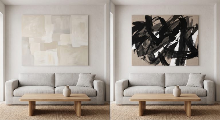
The single most effective fix for a flat beige room is value contrast: the difference between light and dark. Colour hardly matters here; a sand-coloured artwork can stand out beautifully against a beige wall if it is clearly lighter or darker.
- On mid-beige walls, choose art with a wide range from ivory to deep taupe or brown, so both ends of the scale are represented.
- On pale beige walls, lean towards art with some depth: shadowed forms, darker bands, a clay or walnut accent.
- On deeper beige or taupe walls, lighter art in ivory and cream will glow against the wall.
A quick check: take a photo of the wall with the art held against it, and switch the photo to black and white. If the art almost disappears, it needs more contrast.
Step 3: Use Greige and Taupe as Bridges
Greige (grey plus beige) and taupe (a deeper grey-brown) are the most useful supporting tones in a beige living room.
- Greige cools down a very yellow beige room, stopping it from feeling dated or overly golden.
- Taupe adds weight and depth without the heaviness of black or dark brown.
- Art that moves from ivory through greige to taupe creates natural depth, because it contains several steps of lightness in one piece.
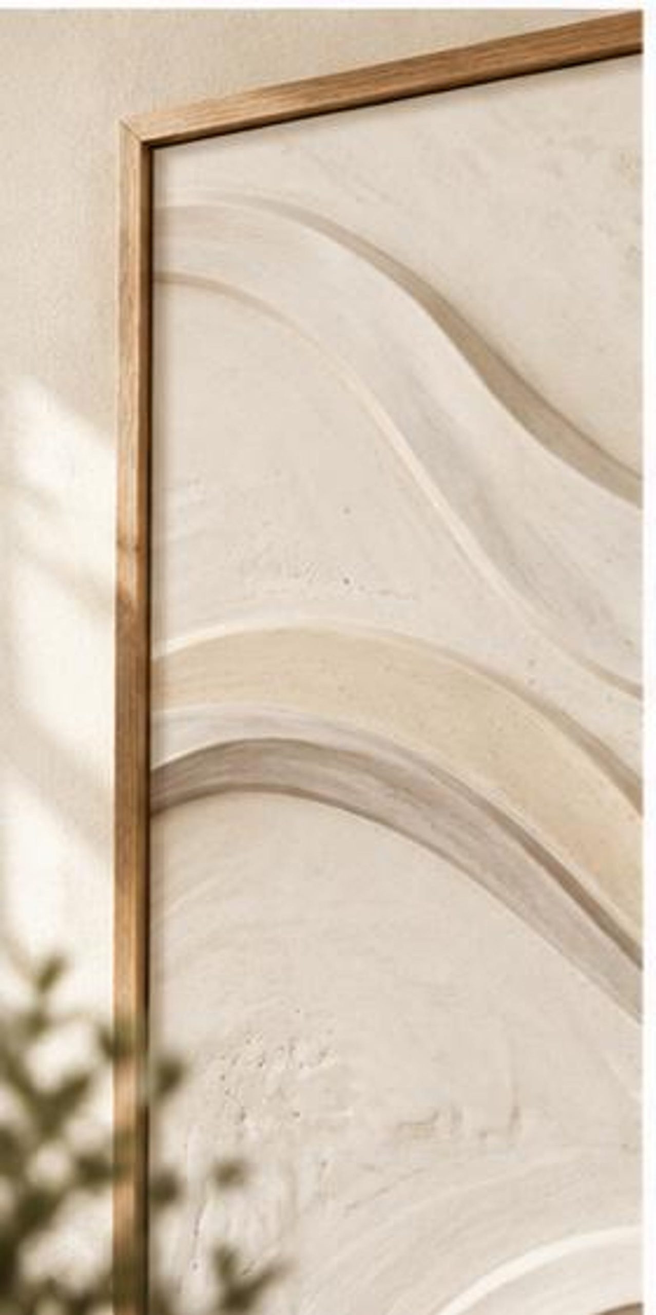
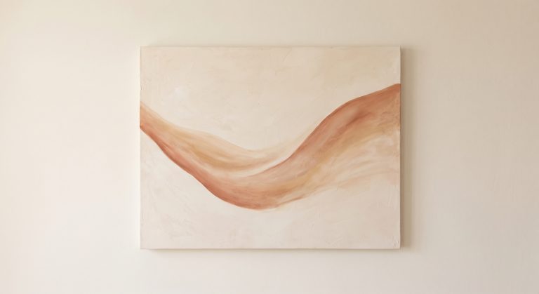
Our Gilded Strata print is a good example: smooth, wavy bands flow diagonally across a pale cream ground, and the soft shading that suggests their raised edges gives it depth on a beige wall without introducing a new colour. The relief is in the image; the print itself is flat. For more on combining shades, see how to mix different shades of neutral artwork.
Step 4: Add One Dark Accent
Almost every successful neutral room has a small amount of something dark. It gives the eye an anchor and makes the lighter tones look intentional.
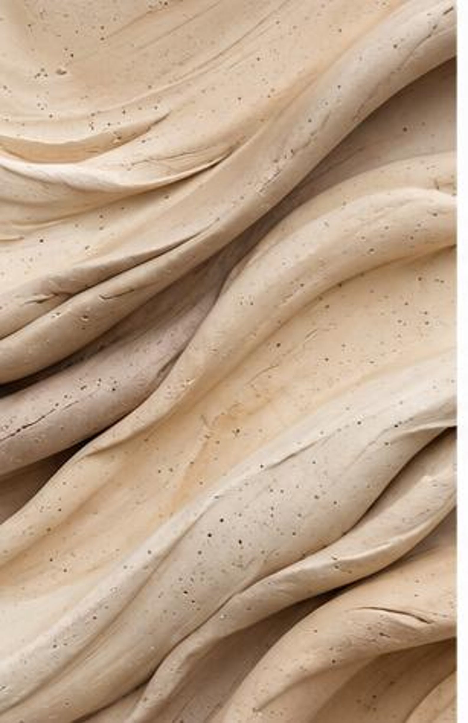
- In the art itself: choose a piece with deeper shadows or darker detail, such as our Deep Earth Relief, whose tightly flowing diagonal ridges in warm sand and beige are scattered with small dark speckles.
- In the frame: a slim walnut, bronze or black frame outlines a soft piece.
- Nearby: a dark wood side table, a black ceramic vase or a charcoal cushion repeats the accent and ties it to the art.
Keep it to roughly one-tenth of what you see. A little dark makes beige look rich; a lot turns the room into a different scheme.
Step 5: Texture, Real and Printed
Texture matters, but it is worth being precise about which kind.
- Physical texture comes from raised surfaces: plaster or bas relief art, impasto paint, textile hangings. It catches light and casts tiny shadows. See what textured wall art is.
- The appearance of texture comes from light and shadow drawn or photographed into a flat print. It adds visual depth but no raised surface. Most printable art, including our own, works this way.
Both help a beige room. A flat print with the look of stone or plaster adds visual interest; pairing it with genuinely textured materials nearby, such as linen curtains, a bouclé chair or a travertine side table, adds the physical surface. For more, see textured abstract art.
Step 6: Get the Scale Right
In a flat room, small art makes things worse: a modest print on a large beige wall reads as an afterthought. Go bigger.
- Above a sofa, aim for art roughly two-thirds to three-quarters of the sofa’s width.
- Use one large piece or a pair rather than scattering small prints.
- On a feature wall, a single oversized piece creates the focal point a beige room often lacks.
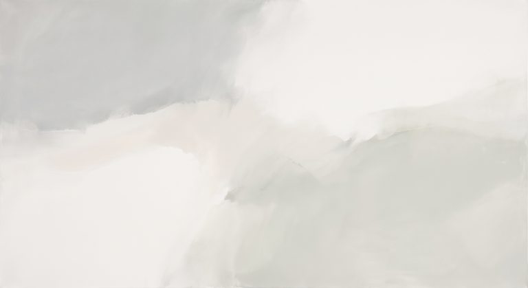
A soft, calm portrait piece such as Quiet Dunes suits a narrower wall or the space above a console; above a wide sofa, hang it as one half of a portrait pair to reach the right width. For proportions, see how big wall art should be, and for the bigger picture, how to choose wall art for your living room.
Step 7: Choose Frames With Intent
- Natural oak keeps a warm beige room soft and Scandinavian.
- Walnut or dark stained wood adds depth and suits the dark-accent approach.
- Slim black metal gives crisp definition, especially to soft abstract work.
- White frames on a beige wall can look stark; warm white or ivory is gentler.
- A wide, warm-white mount separates the art from the wall and makes it read as a deliberate piece.
Our guide to how to frame printable wall art covers mounts and glazing.
Step 8: Echo Your Wood Tones
Wood is the hidden colour in most beige rooms. Floors, coffee tables, shelving and frames all bring their own undertone.
- Pale oak and ash sit best with warm, light art in sand and ivory.
- Mid-tone oak and teak pair with honey, caramel and clay accents.
- Walnut pairs with deeper taupe and chocolate tones in the art, and makes a beautiful frame for pale work.
Repeating a wood tone from the room in the art or frame is one of the easiest ways to make everything feel connected.
Step 9: Light the Art
Lighting changes beige more than almost any other colour.
- North-facing rooms (in the northern hemisphere) get cooler light that can make beige look grey and flat. Choose warmer art and warm white bulbs.
- South-facing rooms get warm light that can push yellow beige towards orange. Greige and cooler taupe art help balance it.
- Bulb colour: warm white (around 2700K) flatters beige and earthy tones; very cool bulbs drain them.
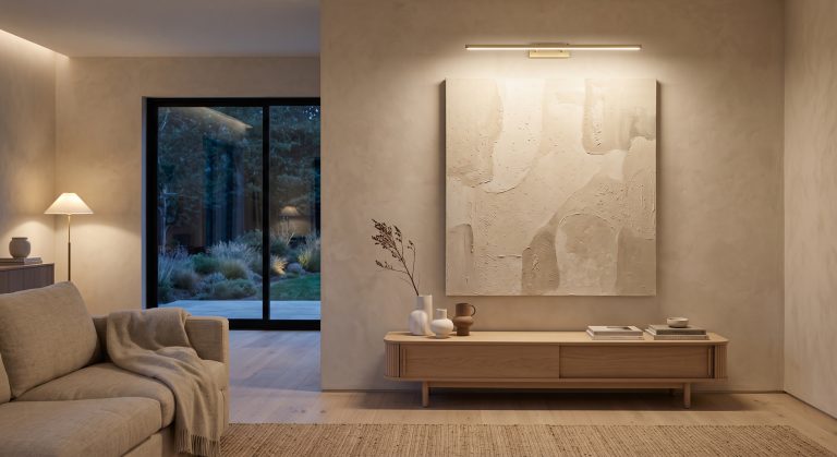
- Light the art directly with a picture light or angled lamp. Even a small pool of light lifts a neutral piece away from the wall. See how to light artwork without wiring.
- Use matte paper and low-glare glazing, since reflections wash out subtle neutral tones.
Quick Checklist
- Identify your beige’s undertone with the white paper test.
- Choose art that shares that undertone.
- Check value contrast with a black-and-white photo.
- Include greige or taupe for depth.
- Add one dark accent in the art, frame or nearby decor.
- Pair printed texture with real textured materials.
- Scale the art to the furniture, and go larger than feels safe.
- Match frames and wood tones.
- Light the art with warm white light.
Common Mistakes
- Matching the art exactly to the wall, so it disappears.
- Mixing undertones, such as cool grey art on a yellow beige wall.
- Small art on a large wall, which emphasises the emptiness.
- Bright white mounts and frames that look harsh beside warm beige.
- Relying on texture alone without adding any contrast.
- Cool lighting that turns beige grey.
Final Thoughts
A beige living room does not need colour to come alive. It needs contrast, a consistent undertone, a touch of depth and art at a confident scale. Choose neutral wall art that steps from light to dark, echo its tones in your wood and textiles, and give it warm light. The room will feel calm and layered rather than flat.
Every piece in our Neutral Abstract Printable Wall Art Collection is designed around this kind of tonal range. For more ideas, see beige wall art ideas and beige abstract art for calm interiors.