
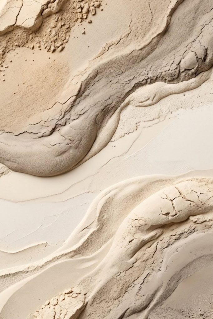
This is the first Aesthetic Haven Co collection: six neutral abstract artworks drawn from the slow processes that shape stone and sand. Layered strata, eroded folds, wind-moved dunes and a carved canyon passage, all rendered in the warm, quiet range between ivory and taupe.
Each piece is available as a printable digital download through our Etsy shop, and most are now also available as fine art prints or ready-to-hang canvases. Below you will find every artwork in the collection, how the pieces differ, which rooms and interior styles they suit, and how to print them well. If printable art is new to you, our guide to what printable wall art is and how it works covers the basics first.
About the Collection
The collection began with a simple question: what does calm look like when it is taken from the landscape rather than invented? The answer kept returning to stone. Sedimentary rock records time in layers. Wind softens a dune ridge into a single long curve. Water and grit wear a canyon wall into ribbons. None of these forms is loud, yet all of them carry a sense of depth and movement.
Every artwork here works with a restrained palette, so the interest comes from form and tone rather than colour. That is what makes the pieces easy to live with. They add structure and warmth to a wall without asking the rest of the room to compete.
The six pieces fall into two loose families:
- Sculptural abstracts: Gilded Strata, Deep Earth Relief, Soft Sand Contours and Sandstone Flow Texture. These read as surfaces: carved, layered or poured.
- Abstracted landscapes: Quiet Dunes and Canyon Passage. These keep a sense of place, a horizon or a passage of light, while staying minimal enough to sit alongside the abstracts.
A note on texture: these are flat images, whether you download them or choose a fine art print or canvas. The depth you see is the appearance of relief, created through light and shadow in the image. Printed, they will not have a raised surface. If you are curious about the difference, our guide to textured wall art explains how physical texture and printed texture compare.
The Artworks
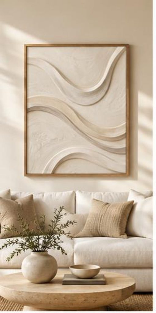
Gilded Strata
Soft, flowing bands sweep through the composition like sediment laid down over centuries, then gently lifted and curved. The palette moves from ivory through beige and greige into taupe, giving the piece a quiet architectural rhythm.
Suits: Japandi, organic modern and minimalist living rooms; tall walls, alcoves and spaces beside a console or bed.
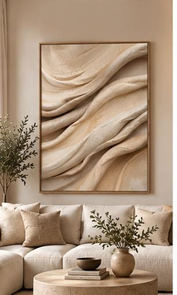
Deep Earth Relief
The most tactile-looking piece in the collection. Folds and hollows suggest carved sandstone and weathered earth, with deeper shadow giving it more visual weight than its neighbours. It brings grounding to a room that feels too light or too smooth.
Suits: wabi-sabi and Japandi interiors, rooms with natural wood and stone, studies and dining rooms that need a calm anchor.
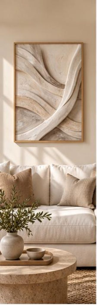
Soft Sand Contours
Where Deep Earth Relief is weathered, Soft Sand Contours is polished. Smooth, rounded forms recall sculpted sand and honed stone, with almost no hard edges anywhere in the composition. It is the gentlest piece in the collection and the one most at home in a bedroom.
Suits: quiet-luxury and minimalist bedrooms, narrow walls, hallways and pale, light-filled rooms.
Sandstone Flow Texture
A portrait composition of mineral bands that seem to flow through the surface the way water once moved through the stone. Its upright format suits narrow walls, alcoves and the space beside a console, or it can be paired with another portrait piece above a sofa or bed.
Suits: organic modern and earthy neutral schemes; hallway walls, spaces between windows and narrower furniture.
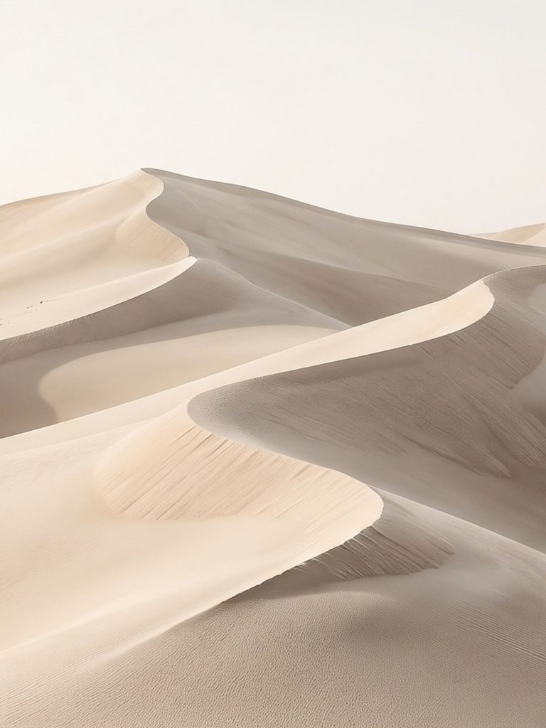
Quiet Dunes
Wind-shaped dunes reduced to their essentials: a few long ridges, a soft fall of shadow and plenty of open space. It is the most minimal piece in the collection and the easiest to place, because it rests the eye rather than drawing it.
Suits: minimalist and Japandi bedrooms, home offices, calm reading corners and Scandinavian-leaning rooms.
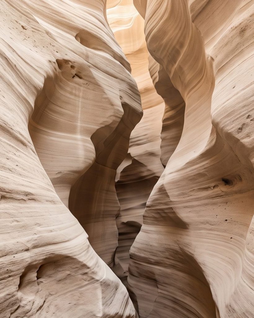
Canyon Passage
A photorealistic piece looking into a narrow sandstone canyon, where erosion has carved the walls into curves and light falls in from above. It has the most depth of any work in the collection, pulling the eye into the wall rather than across it.
Suits: organic modern and desert-inspired interiors, hallways and long sightlines, rooms with warm wood and terracotta.
Every artwork is available as a digital download. Gilded Strata, Canyon Passage and Quiet Dunes are also available as fine art prints and stretched canvases, and Deep Earth Relief and Sandstone Flow Texture as fine art prints. All purchases take place securely on Etsy.
Why Neutral Artwork Works in Contemporary Interiors
Contemporary interiors have moved towards warmer, softer neutrals: limewash walls, oatmeal linen, pale oak, travertine. Artwork in the same family reinforces that calm instead of interrupting it. The trick is that neutral does not mean empty. A good neutral piece still needs contrast, structure and a reason to look at it twice.
In this collection that reason is form. The eye follows a curve, a fold, a band of shadow. Because the colour stays restrained, those shapes do the work. For a deeper look at how this works, see what neutral wall art is and why beige abstract art rarely feels flat when tone and texture are layered carefully.
How to Style Beige and Neutral Artwork
The most common mistake with neutral art is matching it too closely to the wall. A beige print on a beige wall can disappear. Give it a little separation:
- Shift the value. Pair lighter artwork with a slightly deeper wall, or a darker piece like Deep Earth Relief with a pale wall.
- Use the mount. A wide off-white mount creates a quiet frame of space around the image and makes even small prints read as considered.
- Repeat a tone elsewhere. Echo the taupe in a cushion, a vase or a wooden stool so the art feels connected to the room.
- Mind undertones. These pieces lean warm. They sit best alongside warm whites, sand and greige rather than cold blue-greys.
Our guide to mixing different shades of neutral artwork goes further into undertone and value.
Interior Styles These Pieces Suit
Japandi
Japandi blends Japanese restraint with Scandinavian warmth and practicality. It favours natural materials, low furniture and a sense of breathing room. Gilded Strata, Quiet Dunes and Soft Sand Contours suit it particularly well, because they leave space around their forms. More on the style in what Japandi art is.
Organic Modern
Organic modern rooms combine clean modern lines with curved furniture, raw materials and earthy colour. Sandstone Flow Texture and Canyon Passage bring the landscape references this style loves. See organic modern art explained for how the look comes together.
Minimalist Interiors
In a minimalist space, every object is visible, so the art has to earn its place. A single large piece with plenty of wall around it usually works better than several small ones. Quiet Dunes is the most minimal option here.
The Wabi-Sabi Influence
Wabi-sabi is a Japanese aesthetic idea that finds beauty in imperfection, age and impermanence. Weathered stone and eroded earth are natural expressions of it, which is why Deep Earth Relief and Sandstone Flow Texture carry a wabi-sabi feeling. Read more in wabi-sabi art: finding beauty in imperfection.
Rooms These Artworks Suit
- Living room: above a sofa, choose one large print such as Quiet Dunes, or a pair of portrait pieces such as Sandstone Flow Texture and Canyon Passage. See how to choose wall art for your living room.
- Bedroom: Soft Sand Contours and Quiet Dunes are the calmest choices. A pair of portrait pieces either side of a bed also works well. See how to choose wall art for your bedroom.
- Hallway: the portrait pieces suit narrow walls; Canyon Passage adds depth at the end of a long corridor.
- Home office and dining room: Deep Earth Relief and Gilded Strata give a steady, grounded focal point.
Portrait or Landscape: Choosing the Right Orientation
Orientation should follow the wall and the furniture beneath it, not the other way round.
- Landscape works across wide furniture: sofas, beds, sideboards and benches. As a rough guide, art above furniture tends to look balanced at around two-thirds of the furniture’s width.
- Portrait suits narrow walls, alcoves, the space beside a door or window, and stairwells. It also adds height to rooms with lower ceilings.
- Pairs of portrait pieces can stand in for one landscape piece above a bed or sofa, with a consistent gap between them.
For proportions in more detail, see how big wall art should be and how high to hang wall art.
Pairing Neutral Art With Natural Materials
Neutral artwork comes alive when the room around it has real texture. Because these prints suggest stone and sand without being physically textured, the materials nearby supply the touch.
- Wood: pale oak and ash keep things light and Scandinavian; walnut adds depth beneath the warmer pieces.
- Linen: slubby curtains or bedding echo the soft irregularity in the artwork.
- Bouclé: a looped-wool chair or cushion adds a nubbly surface that makes printed texture feel richer by contrast.
- Stone: travertine, marble or limestone side tables and trays repeat the mineral theme directly.
- Ceramics: matt, hand-thrown vessels in clay and oatmeal tones bring a quiet wabi-sabi note.
If you are grouping several pieces, our neutral gallery wall ideas show how to vary tone and format so the arrangement feels curated.
How to Print Your Digital Art
Each artwork comes as five high-resolution JPG files prepared at 300 DPI, covering the 2:3, 3:4, 4:5 and 11:14 ratios plus International A-series sizes. Each ratio needs a slightly different crop, so the composition may shift subtly between files.
- Pick the ratio that matches your frame. Our printable wall art size guide shows which frame sizes belong to which ratio.
- Choose your printer. A good home photo printer handles small sizes well; for larger prints, a professional or online print service gives more consistent colour. Our guide to where to print digital art from Etsy compares UK and US options.
- Choose the paper. Heavyweight matte or fine art paper suits these soft, earthy tones best. See matte vs glossy paper for art prints.
- Frame it. A simple frame and a generous mount give a gallery finish. See how to frame printable wall art.
Colours can vary slightly between screens, printers and papers, so a small test print before a large one is always worthwhile. For the wider picture on buying and printing digital art, return to our printable wall art guide or browse printable art.
Find the Collection on Etsy
Shop instant digital downloads, fine art prints and ready-to-hang canvases from the Aesthetic Haven Co shop. Checkout happens securely on Etsy.