Matte vs Glossy Paper for Art Prints
The same artwork printed on matte paper and on glossy paper can look like two different pieces. Neither is objectively better; they simply do different jobs, and picking the wrong one is a common reason a print looks less refined than the file it came from.
This guide explains what actually changes between matte and glossy paper, when each works best, and how to choose for your own space. For printing wall art generally, see what is printable wall art.
What Actually Differs
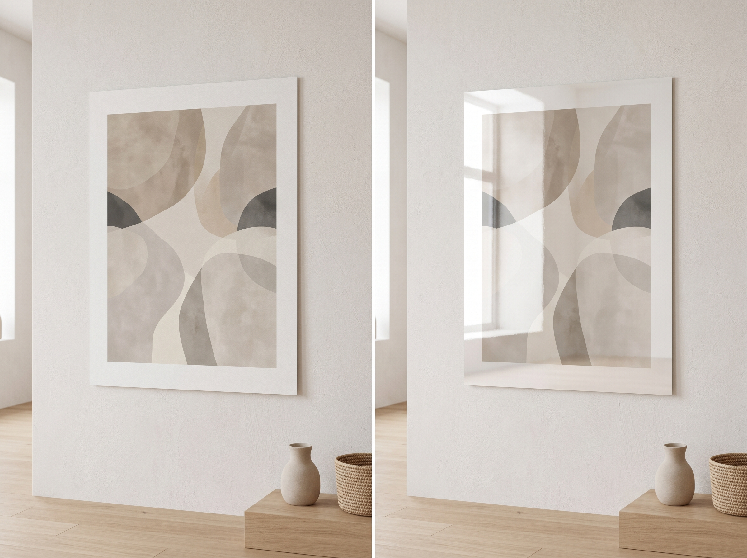
The core difference is how each surface handles light.
Matte paper
Matte paper has a non-reflective surface. Light hitting it scatters evenly rather than bouncing back in a concentrated way, which is why matte prints show almost no glare, even under direct light.
Glossy paper
Glossy paper has a smooth, reflective coating. Light bounces back more directly, which can make colours look more saturated and blacks look deeper, but it also means visible glare and reflections under strong light.

How Each Affects the Look of Art
Colour and contrast
Glossy paper generally makes colours appear more vivid and increases apparent contrast. Matte paper renders colour more softly, closer to how it might look on canvas or in a gallery print.
Texture and surface feel
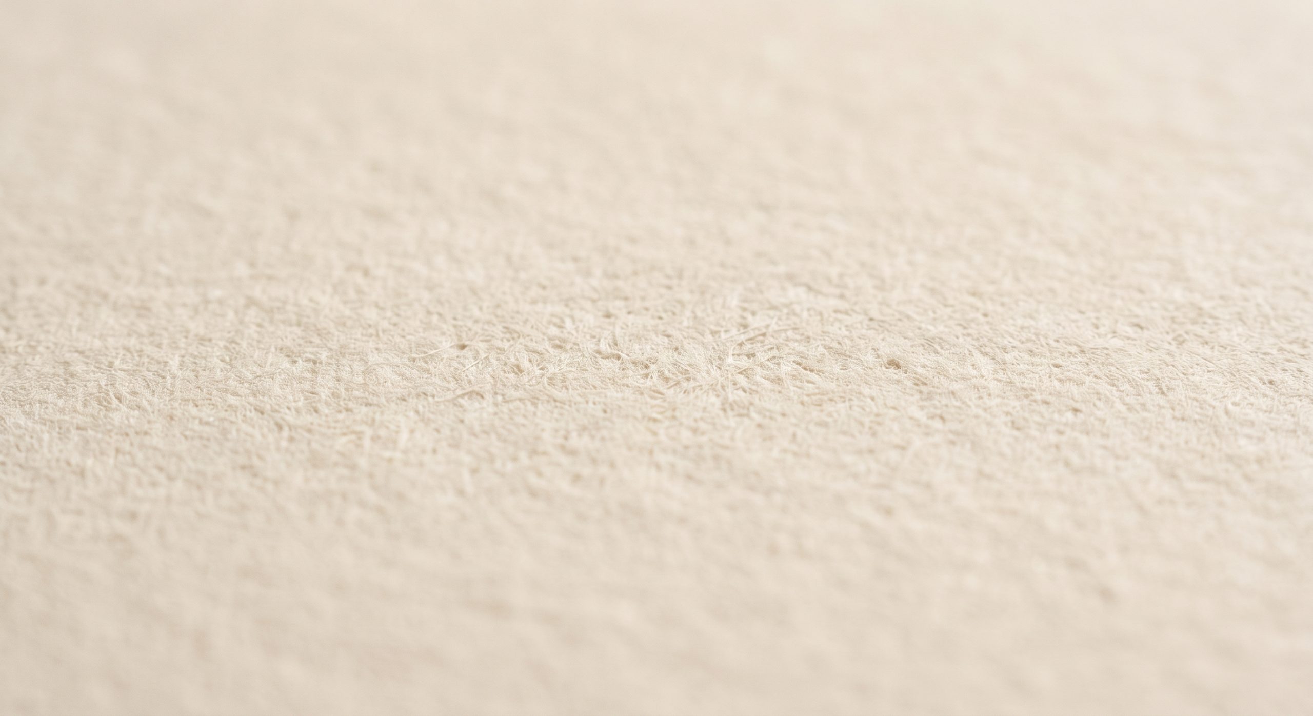
Matte paper often has a slight texture, or at least a non-reflective softness, that reads as more considered and “arty”. Glossy paper feels closer to a glossy photograph.
Glare and viewing angle
This is the most practical difference. Glossy prints can be hard to view from certain angles or under bright, direct light, especially near windows. Matte prints remain legible from almost any angle.
Which Suits Which Kind of Art
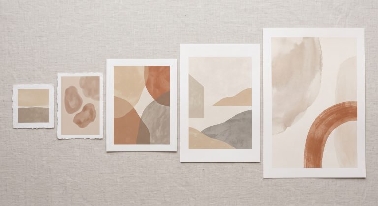
- Abstract, textured or painterly work: matte paper, since it echoes the quiet, non-reflective surface of an original painting.
- Photography with strong colour or deep shadows: glossy or semi-gloss can bring out contrast and detail, though matte still works well for a softer, more muted look.
- Line art and minimalist work: matte, almost always, since glare would distract from the delicacy of a fine line.
- Anything hung opposite a window or under a spotlight: matte, to avoid glare at typical viewing angles.
A Middle Ground: Semi-Gloss and Lustre
Many print shops also offer a semi-gloss or lustre finish, which sits between the two: less glare than full gloss, more colour vibrancy than full matte. It’s a reasonable compromise if you’re unsure, particularly for photography.
Paper Weight and Quality Matter Too
Finish is only part of the picture. A heavier paper (measured in gsm, grams per square metre) generally feels more substantial and resists curling or showing through when framed. For fine art reproductions in particular, a heavier matte paper, sometimes called a fine art or archival paper, often gives the most refined result. For a full comparison of paper types and weights, see our guide to the best paper for printable wall art.
Testing Before You Commit
If you’re printing something important, or a large size, order a small test print in both finishes first. Screens do not fully predict how a paper’s finish will look in your actual room’s lighting, and a small physical sample removes the guesswork.
Where Each Finish Will Hang
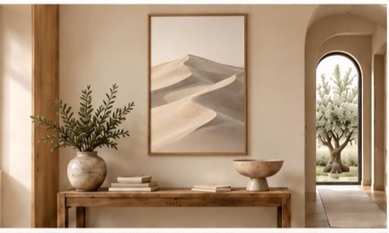
Consider the room’s light before choosing. A wall that gets strong, direct sunlight at certain times of day will show glare on a glossy print far more than a similar wall in softer, indirect light. If in doubt, matte is the safer default for most living spaces.
Common Mistakes
- Choosing glossy paper for a wall that gets direct light
- Assuming glossy always looks “better” rather than simply different
- Ignoring paper weight in favour of finish alone
- Not testing a sample before committing to a large, expensive print
Final Thoughts
Matte and glossy are not a quality ranking; they are two different relationships between paper and light. Matte tends to suit abstract, textured and line-based art, and rooms with strong natural light. Glossy suits photography that benefits from extra vibrancy, in rooms where glare is less of a concern.
Choose based on the art and the room, not habit, and the print will look considered rather than accidental.