Best Paper for Printable Wall Art: Matte, Satin or Fine Art?
For most printable wall art, the best paper is a heavyweight matte fine art paper, ideally around 200 to 310gsm. It shows no glare, renders soft and neutral tones beautifully, and looks closer to an original painting or drawing than any photo paper. Satin (also called lustre) is the better choice for photography and richly coloured images, and glossy paper is best kept for photographs that will hang without glass in soft light.
That is the short answer. The longer one depends on what kind of art you are printing, where it will hang, and whether it will sit behind glass. This guide explains every paper type you are likely to be offered, what the numbers on the packet mean, and which paper suits which kind of artwork. For the specific glare-and-colour comparison between the two most common finishes, see our guide to matte vs glossy paper for art prints.
The Five Paper Types You Will Be Offered
Print services and paper brands use different names, but nearly every option falls into one of five groups.
1. Matte photo paper
A coated paper with a flat, non-reflective surface, sold by most photo services and stocked for home printers. It is affordable and glare-free, and a good everyday choice for small prints. The coating is usually on a wood-pulp base, so it is not always archival, and the whitest versions can look slightly cool next to warm, creamy artwork.
2. Satin, lustre and pearl
These are all names for a semi-gloss finish with a gentle sheen and a faint texture, a little like the surface of an orange peel. They give colours more depth than matte while keeping glare under control, which is why they are the default at many photo labs. Satin suits photography, botanical prints and colourful illustration well.
3. Glossy
A smooth, highly reflective surface that maximises colour saturation and the depth of dark tones. It is the most “photographic” finish, and the least forgiving: fingerprints, reflections and glare all show. Glossy paper rarely suits soft or minimalist wall art.
4. Smooth fine art paper
Fine art papers are heavier, uncoated-looking papers made for giclée printing, often from cotton rag or high-quality alpha-cellulose (a purified wood pulp). Smooth versions are sometimes labelled hot press, a term borrowed from watercolour paper. They have a soft, velvety matte surface and render fine detail crisply. Well-known examples include Hahnemühle Photo Rag and Canson Rag Photographique.
5. Textured fine art paper
The same family of papers with a visible tooth, like watercolour paper, often labelled cold press or given names that describe the texture, such as “German Etching” or “William Turner” from Hahnemühle. The texture catches the light and gives a print a handmade, painterly quality. It is wonderful for abstract and organic artwork, and less suited to very fine line work, where the grain can break up a delicate line.
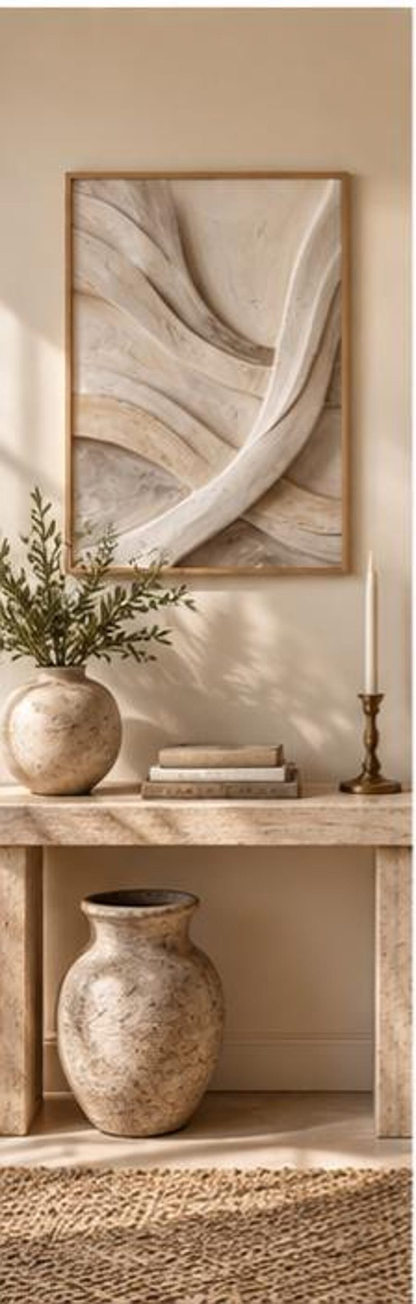
A note on texture: textured paper adds a real, physical surface to the print, but only the texture of the paper itself. If the artwork shows the appearance of carved plaster or stone, printing it on textured paper will not make those forms raised. Our guide to textured wall art explains the difference between printed and physical texture.
Same Artwork, Five Papers: A Visual Comparison
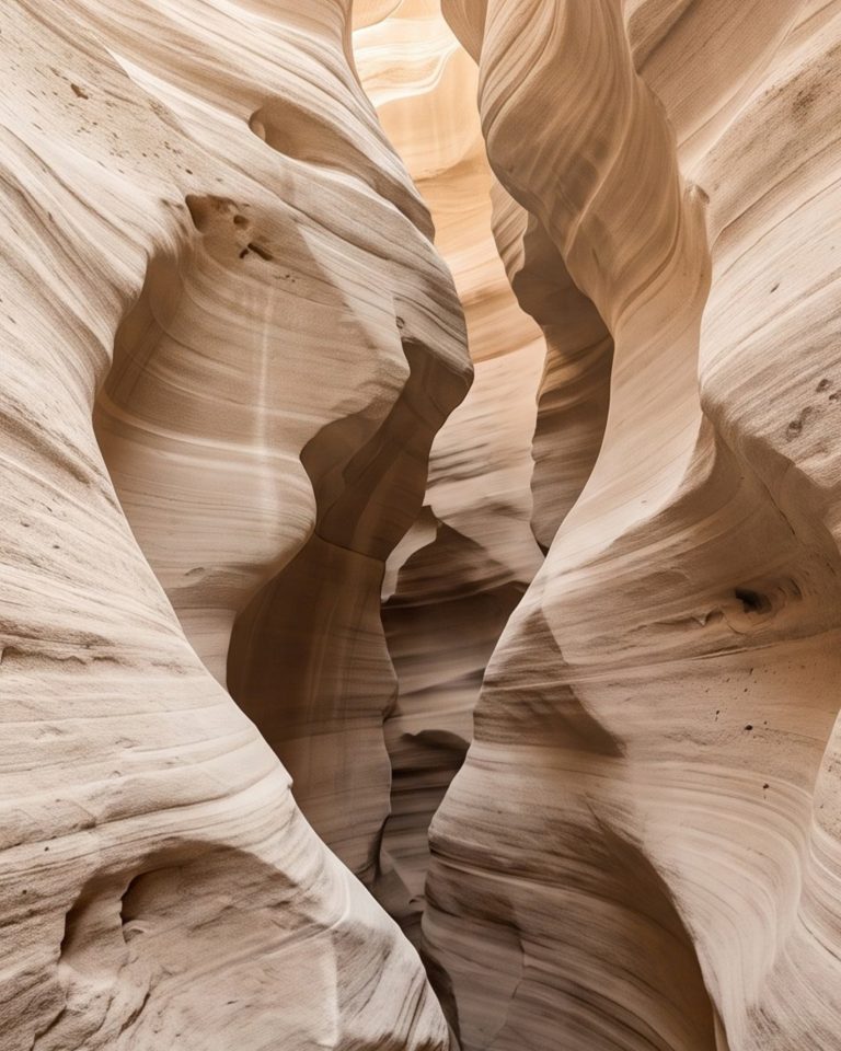
To see how much paper matters, picture one of our own pieces, Soft Sand Contours, printed five times. It is a useful test because its ivory, greige and stone tones sit very close together, and subtle tones are exactly where paper differences show.
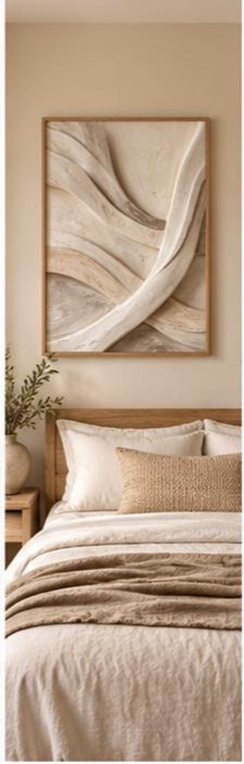
| Paper | How Soft Sand Contours would look |
|---|---|
| Matte photo | Clean and glare-free. Whites can lean slightly cool, flattening the warmth of the ivory a touch. |
| Satin / lustre | A little more depth in the shadowed curves, with a faint sheen visible at an angle. |
| Glossy | Strongest contrast, but reflections compete with the soft forms and the piece starts to look like a photograph. |
| Smooth fine art | The most faithful result: velvety, warm and calm, with the curves reading clearly. |
| Textured fine art | Softer edges and a gentle surface grain that adds a handmade feel, at the cost of a little sharpness. |
If you are printing an important piece, the most reliable way to choose is to make this comparison yourself: print the same small crop on two or three papers and look at them side by side in daylight.
What Paper Weight (GSM) Should You Choose?
Paper weight is measured in gsm, grams per square metre. Heavier paper feels more substantial, lies flatter in a frame and is less likely to ripple or curl over time.
| Weight | What it is like | Best for |
|---|---|---|
| Under 150gsm | Thin, close to standard printer paper | Drafts and layout tests only |
| 170–250gsm | Typical photo and poster paper | Everyday prints, small and medium sizes |
| 250–320gsm | Most fine art papers | Framed wall art you want to keep |
| Over 320gsm | Very heavy, card-like | Premium prints; check your printer can feed it |
If you are printing at home, check your printer’s maximum paper weight before buying heavy fine art paper. Many home printers need heavyweight sheets fed through a rear or manual tray.
Paper White: The Detail Most People Miss
Papers are not all the same white. Many brighter papers contain optical brightening agents (OBAs), additives that make the paper look extra-white, sometimes slightly blue, under daylight. Natural white or OBA-free papers have a softer, warmer white.
This matters most for neutral artwork. A beige or sand-toned print on a bright white paper can look slightly cooler than intended, while the same file on a natural white paper keeps its warmth. OBAs can also fade over time, gradually shifting the paper’s tone, which is one reason archival papers tend to avoid or minimise them.
Which Paper Suits Which Kind of Art?
Neutral, beige and abstract art
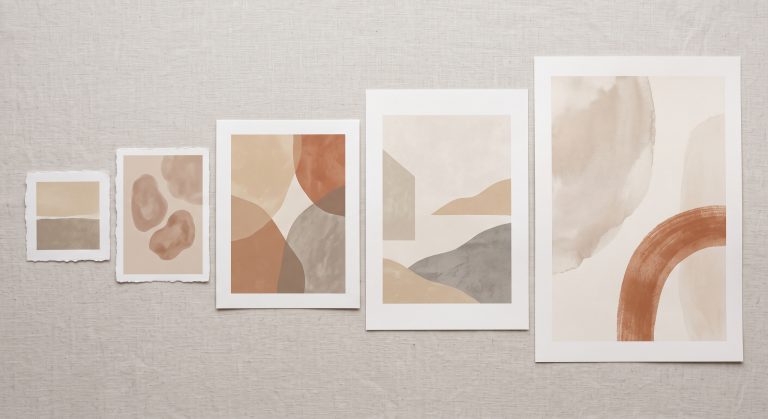
Choose a smooth or lightly textured matte fine art paper in a natural white. Subtle tones need a surface that does not reflect light back at the viewer, and warm whites suit warm palettes. This is what we recommend for every piece in our Neutral Abstract Printable Wall Art Collection.
Photography
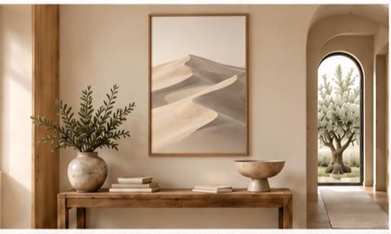
Satin or lustre is the safe all-rounder. Glossy works for high-contrast or colourful photographs viewed without glass. For soft, atmospheric photography, such as dunes, mist or landscapes in muted light, a smooth matte fine art paper can look beautiful and more painterly.
Line art and minimal drawings
A smooth matte paper, either photo or fine art. Matte keeps a fine line clean and glare-free, and a smooth surface keeps it sharp. Heavily textured paper can make a delicate line look broken. For more on the style itself, see minimalist line art.
Painterly and textured-look abstracts
A textured fine art paper adds real surface interest that complements expressive or organic work, as long as you are not relying on very fine detail.
Kids’ rooms, offices and high-traffic spaces
Satin is the most practical: durable, easy to handle, and less prone to showing scuffs than matte.
Framing Behind Glass
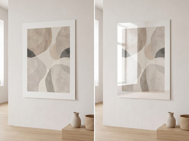
Glass changes the paper decision. The glazing adds its own reflection, so a glossy print behind glass gives you two layers of shine. Matte or fine art paper behind glass is almost always the calmer combination.
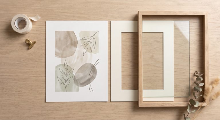
There is also a practical issue. If a glossy or satin print touches the glass directly, its surface can stick to the glass over time, especially in humid rooms, and the print can be damaged when you remove it. A mount (or mat) holds the paper away from the glass and avoids this. Our guide to how to frame printable wall art covers mounts and glazing in more detail.
If you would rather frame without glass, use a matte fine art paper and hang it away from kitchens, bathrooms and direct sunlight.
Home Printing vs Ordering From a Lab
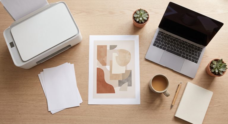
Your paper choice also depends on where you print. At home you can use any paper your printer can feed, including fine art sheets, but results depend heavily on your printer’s inks. Pigment-ink printers handle fine art papers best; many everyday dye-ink printers are designed for photo paper.
Online labs and fine art printers offer their own paper ranges and handle the colour settings for each paper. High-street counters usually offer only gloss and satin. For a comparison of these options, including UK and US services, see where to print digital art from Etsy.
Common Mistakes
- Using standard copy paper, which makes even a beautiful file look flat and cheap.
- Choosing glossy paper for soft, minimal artwork because it looks impressive on the paper sample, then fighting reflections on the wall.
- Ignoring paper white, so a warm beige print comes out slightly cool.
- Buying heavy fine art paper your home printer cannot feed.
- Letting a glossy print touch the glass in a frame without a mount.
- Expecting textured paper to make printed texture three-dimensional. The paper adds grain, not relief.
Final Thoughts
There is no single best paper for every print, but there is a reliable default. For calm, neutral, abstract and minimal wall art, choose a heavyweight matte fine art paper in a natural white. Move to satin for photography and colourful work, use textured fine art paper when you want a painterly surface, and keep glossy paper for images that genuinely benefit from extra punch.
Once you have chosen your paper, the next step is choosing the right size and file. Our printable wall art size guide shows which file matches which frame, and what printable wall art is explains the whole process from download to wall.