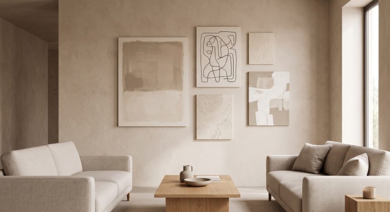
Neutral Gallery Wall Ideas
A neutral gallery wall solves a problem that a coloured one creates for itself: how do you combine several different artworks without the wall turning into a fight for attention?
Keep the palette neutral, and the fight mostly disappears. Tone becomes the unifying force, which frees you to mix formats, sizes and subjects far more freely than a bold, varied palette would allow.
This guide covers how to choose neutral pieces that cohere, how to add enough variation that the wall does not feel flat, and how to arrange them. For the underlying palette principles, see what neutral wall art is.
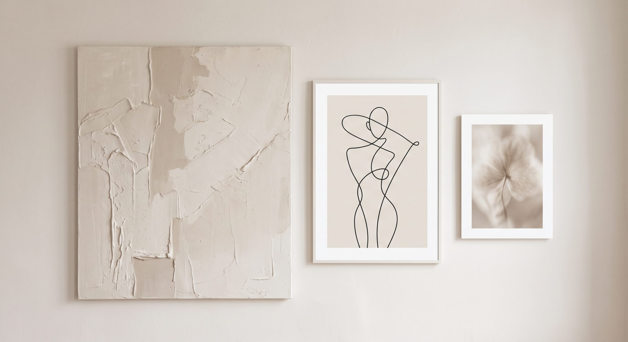
Why Neutral Suits Gallery Walls So Well
- It unifies automatically. Pieces bought at different times, in different styles, still look related.
- It survives mixing formats. Abstract, photography, line art and botanical studies can share a wall without clashing.
- It ages well. A neutral group rarely feels dated the way a trend-coloured one can.
- It highlights composition. Without colour competing for attention, layout and spacing do more of the visual work.
The Risk: Flatness
The trade-off is that an all-neutral wall can slip into looking uniform rather than curated. Avoiding that comes down to variation within the palette, not outside it.
Vary the tone
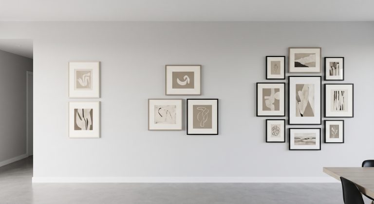
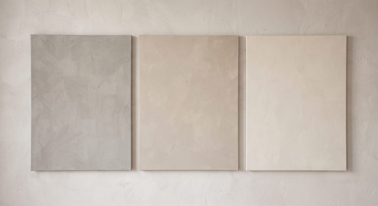
Combine warm and cool neutrals deliberately, or stay within one family but include both light and dark pieces. A group that is all one value tends to blur together. See how to mix different shades of neutral artwork for the mechanics of this.
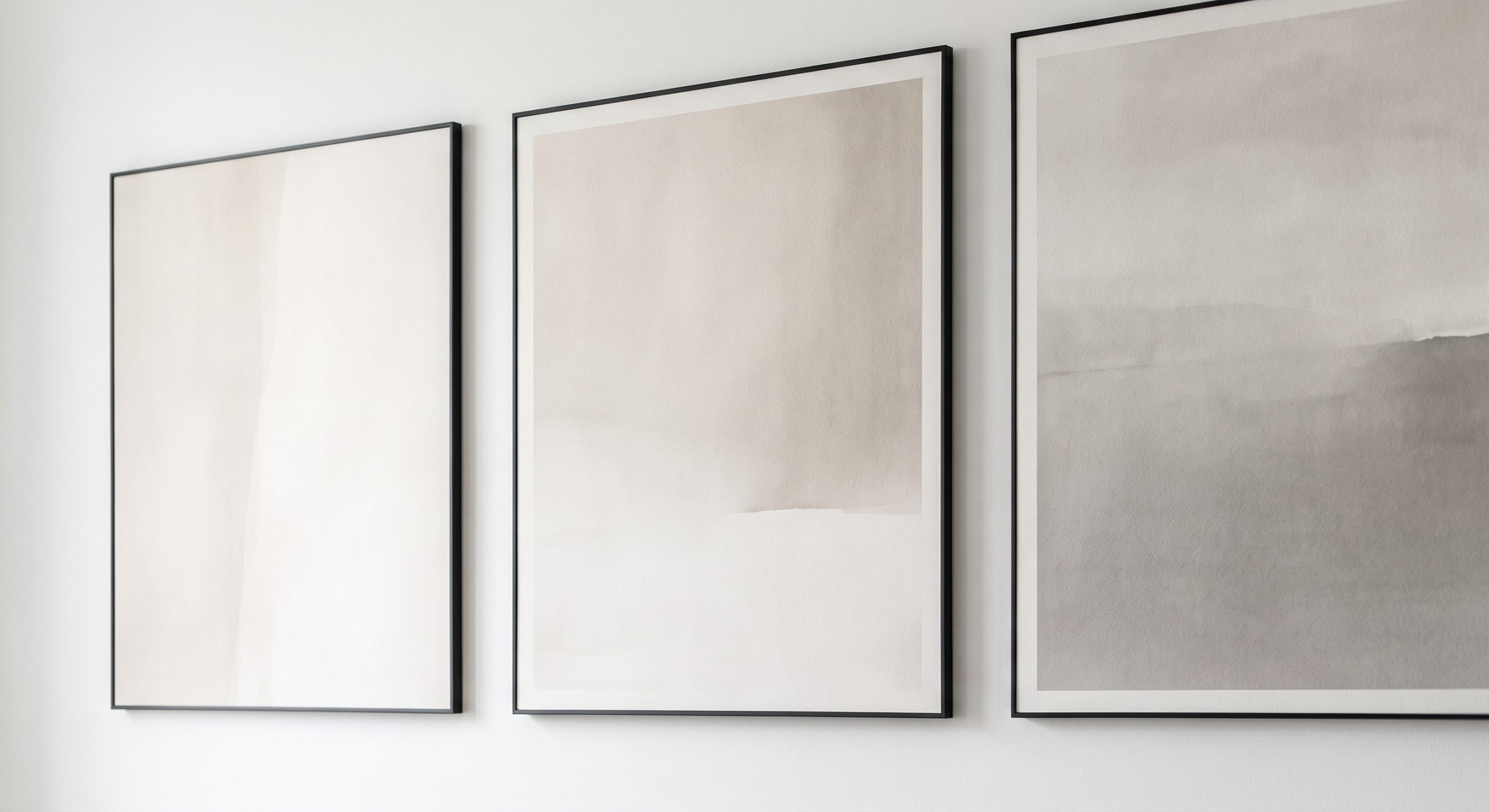
Vary the texture
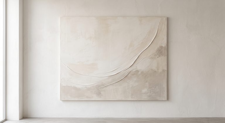
A smooth photograph, a textured plaster-style piece and a fine line drawing on paper each catch the light differently, which adds richness that colour alone would otherwise provide. See textured abstract art.
Vary the format
Mix abstract with line art, photography or botanical studies rather than repeating one type five times. See minimalist line art and abstract line art ideas for line-based options.
Add one point of contrast
A single darker piece, or one with a fine charcoal mark, gives the eye somewhere to land among the softness. Without it, a neutral wall can feel like it is waiting for something to happen.
Choosing Neutral Pieces That Work Together
- Pick a dominant undertone, warm or cool, and choose most pieces from it.
- Include a range of value, from pale to a deeper anchor tone.
- Choose at least two formats, such as an abstract and a line drawing.
- Repeat one shade across two or more pieces, or in a nearby object, to tie the group together.
Frames for a Neutral Gallery Wall
Keep frames to one or two finishes. Pale oak or ash frames feel warm and organic. Thin black frames add graphic structure. Mixing many different woods and metals undoes the calm that a neutral palette is meant to provide.
Layout for Neutral Walls
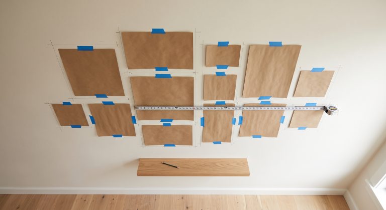
Because the palette is already calm, neutral gallery walls can carry either a precise grid or a looser curated cluster equally well. What matters most is consistent spacing and a clear anchor piece. For the full planning process, see how to plan a gallery wall layout, and for choosing a piece count, how many pieces should be in a gallery wall.
Neutral Gallery Wall in a Room
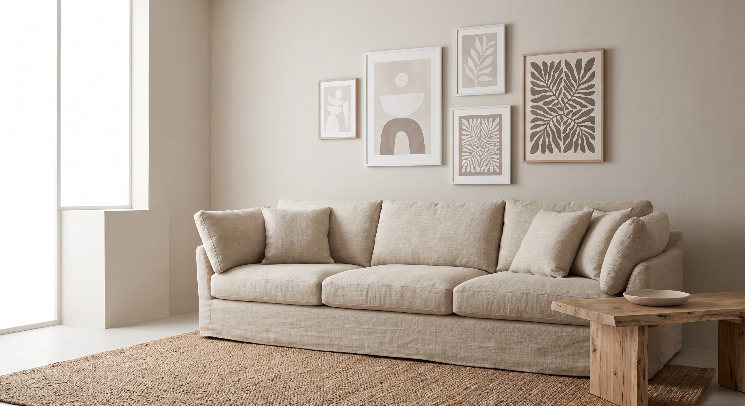
A neutral group works particularly well above a sofa, bed or console, where it can act as a single visual statement rather than several unrelated pictures. Keep the group’s total width in proportion with the furniture beneath it, following the same scale guidance in how to choose abstract art for your home.
Common Mistakes
- Choosing pieces that are all the same value, so the wall reads as flat
- Mixing warm and cool undertones without a bridging shade
- Too many frame styles at once
- No point of contrast anywhere in the group
- Under-scaling the whole arrangement for the wall
Final Thoughts
A neutral gallery wall trades the drama of colour for the quieter reward of cohesion. Get variation right within the palette, tone, texture, format and value, and a group of neutral pieces can feel far richer than their shared colour range suggests.