How to Choose Wall Art for Your Bedroom
The bedroom is the one room where art has a genuinely practical job. Art above the bed is the last thing you see as the lamp clicks off and the first thing your eyes find in the soft grey of morning, so it needs to support rest rather than compete for attention.
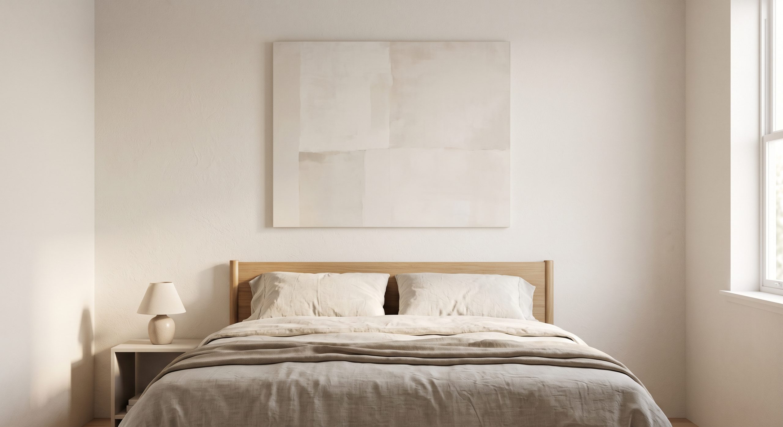
That single requirement shapes almost every decision when choosing wall art for a bedroom. Look for muted, low-contrast tones, soft organic forms and generous empty space; size the main piece to about two-thirds of the headboard’s width; and hang it close enough to the bed to feel part of it. This guide covers each of those choices, plus alternatives to one large piece and what to avoid. For general choosing principles, see how to choose abstract art for your home.
Above the Bed: The Main Decision
Scale
As a starting point, art above a bed looks best spanning roughly two-thirds of the headboard’s width, centred above it. A piece that is too narrow looks stranded on a wide wall, like a single cushion on a large sofa.
Palette
Low-contrast, muted tones tend to suit bedrooms best: soft neutrals, gentle blues, faded sage, the colours of washed linen and early light. See calm artwork ideas for a peaceful home for what makes art feel restful in particular.
Composition
Soft, organic forms and generous negative space suit the bedroom far better than dense, busy compositions. Curves slow the eye down; open space gives it somewhere to rest. See organic abstract art and negative space in abstract art.
Our own Soft Sand Contours has exactly this quality: smooth, rounded forms in ivory and stone with almost no hard edges. It is the gentlest piece in our neutral abstract collection.
Alternatives to One Large Piece
Fine line art
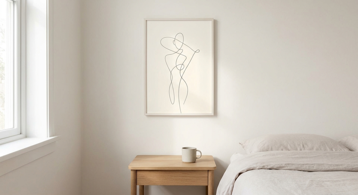
A delicate line drawing brings quiet structure without visual weight. It suits a bedroom particularly well because it rarely feels stimulating: a few unhurried strokes on cream paper, and a great deal of calm around them. See minimalist line art.
A symmetrical pair
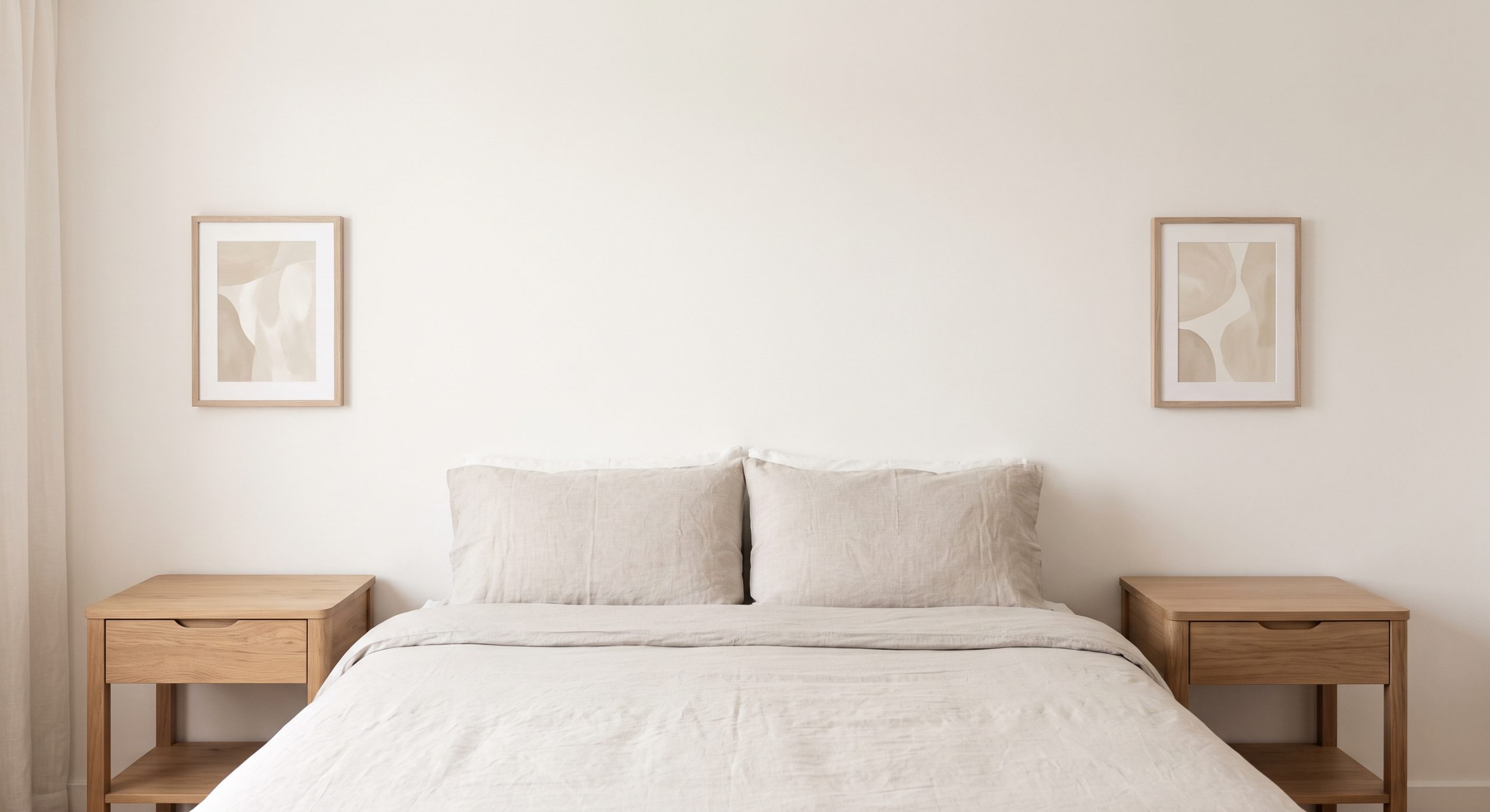
Two small matching pieces above the nightstands create a settled, balanced feel, and they work especially well either side of a centred bed. Two portrait pieces in the same palette can also stand in for one wide landscape piece above the headboard.
What to Avoid in a Bedroom
- High contrast. Strong blacks and whites can feel stimulating rather than restful here.
- Dense, busy compositions. They give the eye too much to process before sleep.
- Sharp angular gestures. Curved, organic forms are generally more soothing.
- Anything directly opposite the bed at an uncomfortable viewing height, since it will be the first and last thing seen each day.
Choosing for Different Bedroom Styles
- Neutral bedrooms: layered warm or cool tones, so the piece has depth rather than one flat shade. See what neutral wall art is.
- Minimalist bedrooms: one restrained piece with generous space around it. See what minimalist art is.
- Japandi bedrooms: soft, natural, handmade-feeling pieces that sit easily beside pale oak and paper lantern light. See what Japandi art is.
Other Bedroom Walls
Opposite the bed
This wall is seen most often while sitting up in bed or moving around the room, so it can carry a slightly bolder piece than the wall directly above the headboard. A calm portrait piece with a quiet landscape subject, such as the wind-shaped ridges of our Quiet Dunes, gives the eye somewhere to settle without asking too much of it.
Reading corners
A small, quiet piece near a chair or a reading lamp adds warmth to a corner without demanding attention.
Hanging Height
Because beds sit lower than sofas, art above a headboard is often hung slightly lower than the general eye-level guideline used elsewhere. See how high should you hang wall art for specifics. And since the piece hangs directly over where you sleep, it is worth fixing it securely: fixings suited to your wall, two hanging points and, for larger pieces, lighter acrylic glazing.
Common Mistakes
- Choosing high-contrast or busy art for the wall above the bed
- Hanging art too high above a low headboard
- Ignoring how a piece will look under evening lamp light, not just daylight
- Ignoring what the piece looks like from a lying-down position, not just standing
Final Thoughts
Bedroom art has one job above all others: to help the room feel calm. Choose muted tones, soft forms and generous space, and judge the piece not just from the doorway but from the pillow, because that is where you will actually live with it.
Choosing for the living room too? Our guide to how to choose wall art for your living room covers the room where art can afford a little more presence.