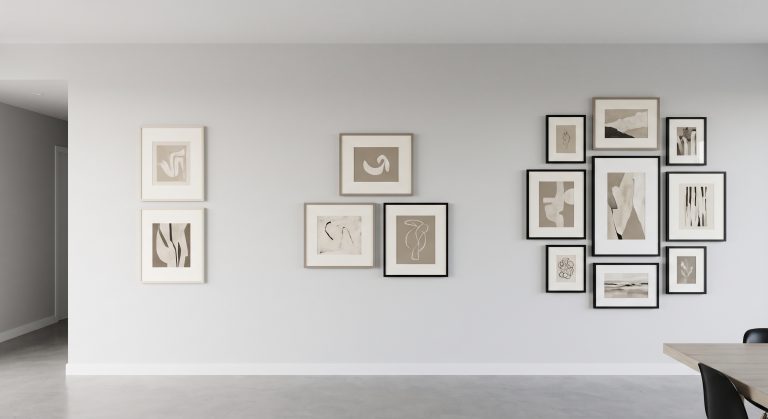
Gallery Wall Colour Schemes That Work
A gallery wall is really a colour decision wearing several frames. Get the palette right and almost any combination of formats and sizes will hold together. Get it wrong, and even a perfectly measured, perfectly spaced layout will look like a collection of unrelated purchases.
This guide covers the colour schemes that reliably work for gallery walls, why they work, and how to apply them to art you already own or are choosing. For the fundamentals of colour in art generally, see how colour changes the feeling of abstract art.
Why Colour Matters More on a Gallery Wall Than on a Single Piece
A single artwork only has to work with its room. A gallery wall has to work with its room and with every other piece in the group. Colour is the fastest, most reliable way to make several pieces agree, which is why almost every successful gallery wall scheme starts with a colour decision rather than a piece-by-piece one.
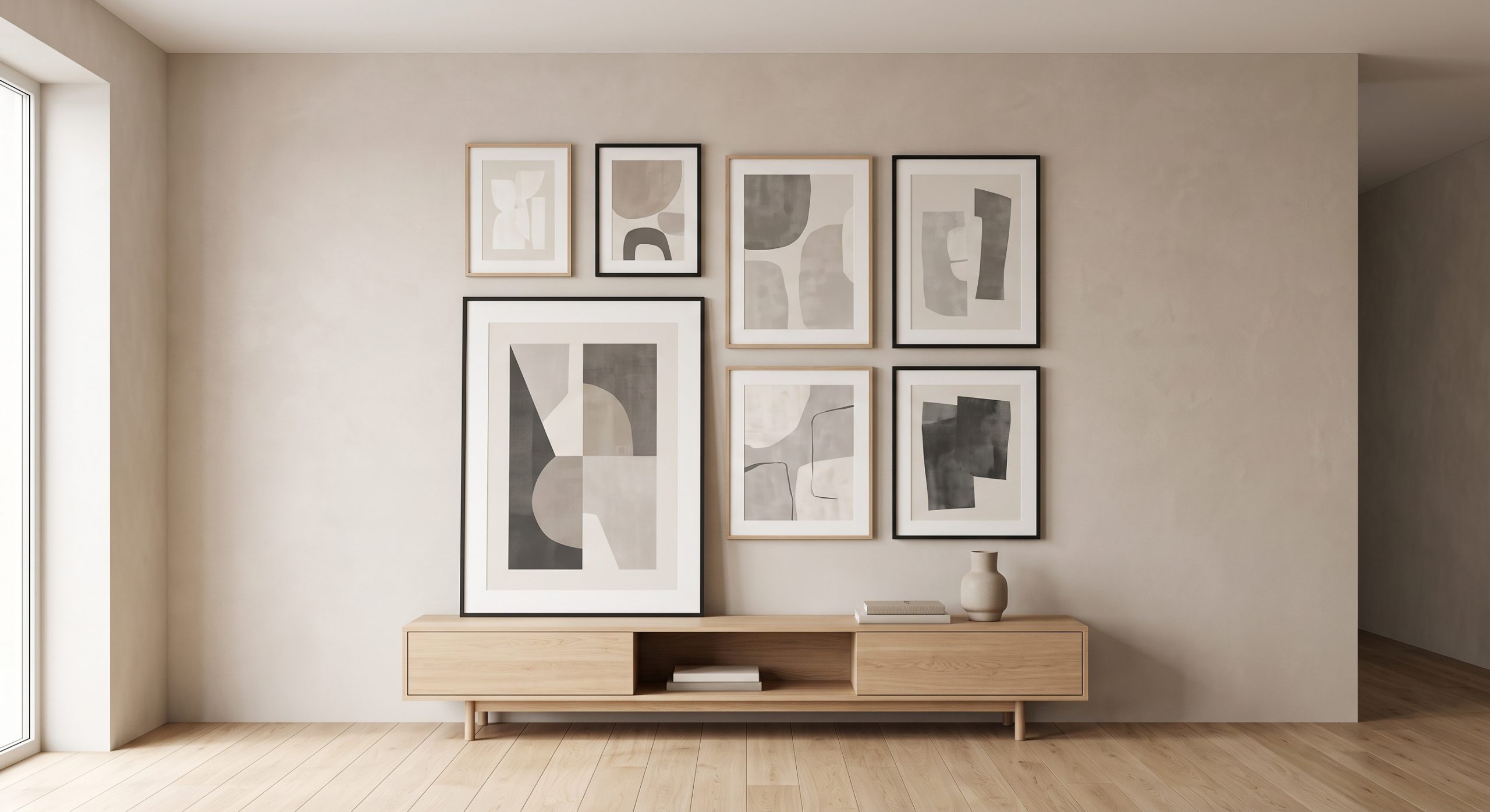
Scheme 1: The Neutral Palette
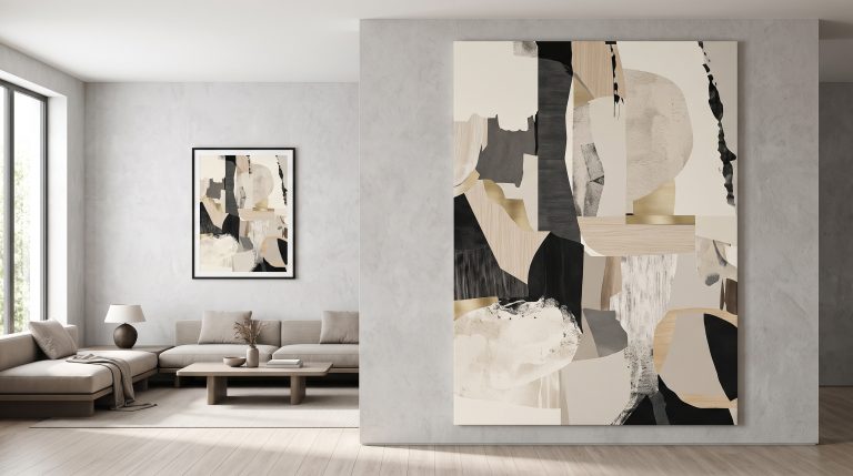
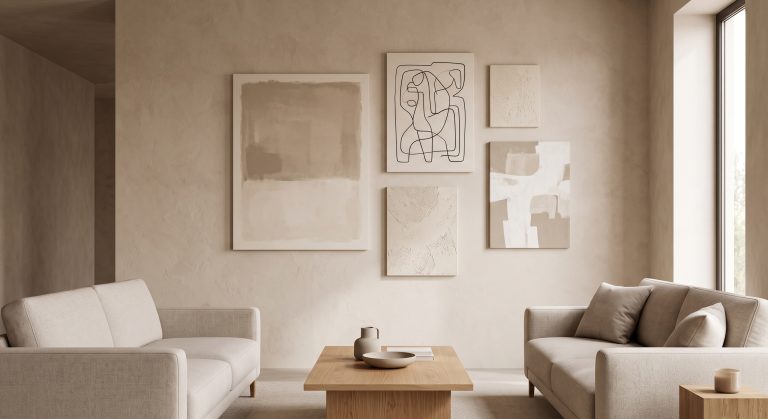
Ivory, sand, oatmeal, taupe and soft charcoal. This is the most forgiving scheme, because it tolerates a wide mix of formats, abstract, photography, line art, without any of them clashing. See neutral gallery wall ideas for a full treatment of this approach, and how to mix different shades of neutral artwork for the mechanics of combining tones well.
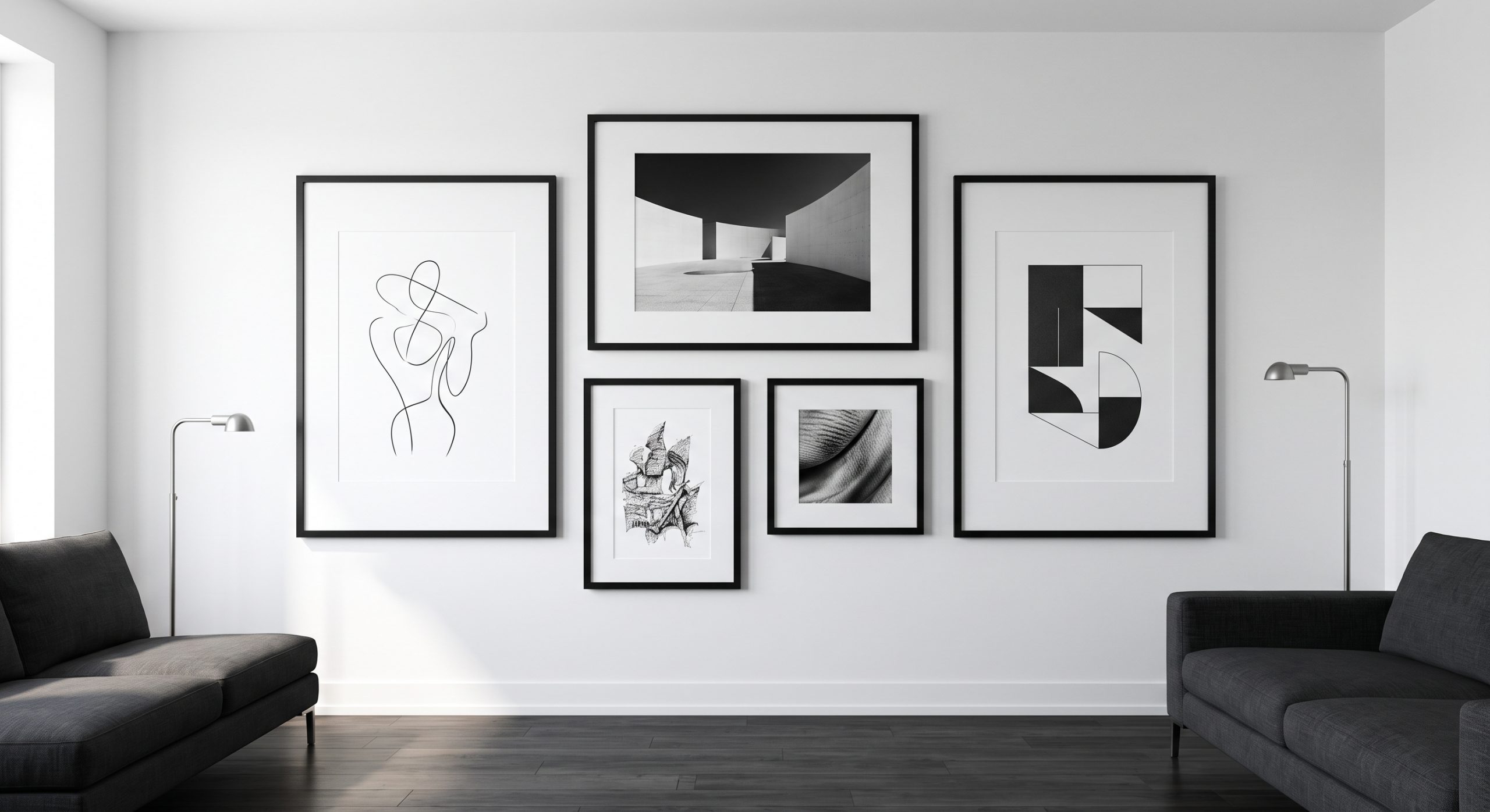
Scheme 2: Monochrome
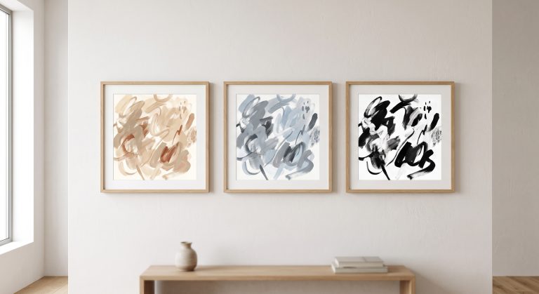
Black, white and grey throughout, whatever the subject matter. This scheme relies on value contrast rather than colour, and it suits crisp, modern rooms particularly well. Line art, black-and-white photography and graphic abstracts combine easily here, since the shared absence of colour does the unifying work.
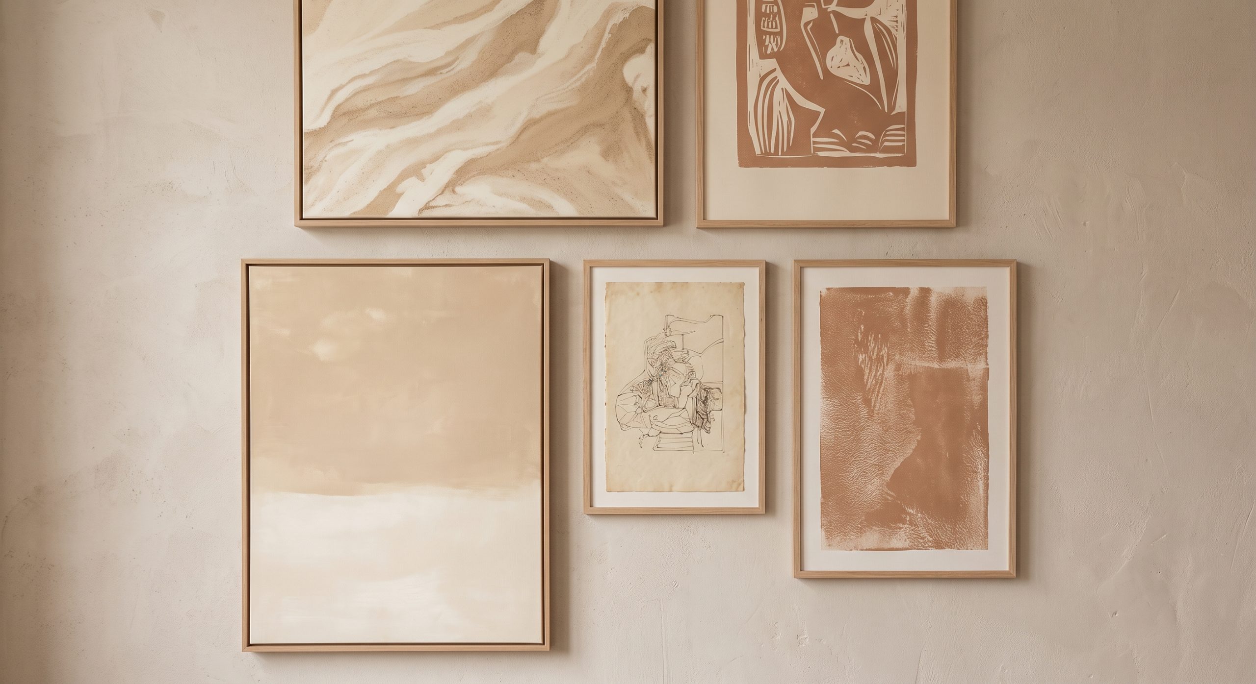
Scheme 3: Warm Earth Tones
Terracotta, clay, rust, ochre and warm brown. This scheme brings real warmth and works especially well with natural materials such as wood, linen and stone. See warm neutral wall art and sandstone wall art ideas for pieces that suit this palette.
Scheme 4: Cool Tones
Soft blues, pale greys, sage and cool whites. This scheme feels calm and slightly more formal than warm earth tones, and it suits rooms with cooler light or a more contemporary, architectural feel.
Scheme 5: One Dominant Colour With Neutral Support
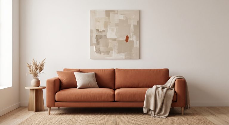
Choose a single accent colour, such as sage, rust or navy, and let it appear in only one or two pieces, with the rest of the group in supporting neutrals. This gives a gallery wall a clear focal point without turning it into a rainbow.
How to Apply a Scheme to Art You Already Own
- Lay everything out and look at the colours as a group, not individually.
- Identify the dominant colour family already present, rather than forcing a new one.
- Set aside pieces that clash rather than trying to force them in with a mismatched frame.
- Choose one or two new pieces to fill genuine gaps in the palette, rather than replacing what you already like.
Undertones Matter as Much as Colour Names
Two “neutral” pieces can clash badly if one leans warm and the other leans cool. The same is true within any scheme: two blues, two greens or two beiges can disagree if their undertones differ. Check pieces together in the same light before committing, following the same undertone principles in how to mix different shades of neutral artwork.
Frames Are Part of the Colour Scheme
Frame colour counts as much as the art inside it. A scheme can be undone by five different frame finishes competing with each other. Choose one or two frame colours (pale wood and slim black is a reliable pairing) and keep them consistent across the group.
Matching the Scheme to the Room
- Neutral schemes suit almost any room and are the safest default.
- Monochrome suits modern, minimal or graphic interiors.
- Warm earth tones suit Japandi, organic modern and rustic rooms. See what Japandi art is.
- Cool tones suit Scandinavian-influenced or more formal, architectural rooms.
- One dominant accent works well when the room itself is already fairly neutral and could use a single, controlled point of colour.
Common Mistakes
- Choosing pieces on individual appeal without checking them as a group
- Two or more competing accent colours instead of one
- Ignoring undertone within a single “neutral” or “blue” scheme
- Too many frame colours diluting an otherwise cohesive scheme
- Forcing in a piece that does not belong, for sentimental reasons, without adjusting its frame or placement to compensate
Final Thoughts
A gallery wall colour scheme does not need to be complicated. Choose one direction, neutral, monochrome, warm, cool or a single controlled accent, and let every other decision support it.
Once the palette agrees, the rest of the gallery wall, format, size and layout, has far more room to vary without ever looking chaotic. For the underlying colour principles, see how colour theory applies to interior artwork.