How Colour Theory Applies to Interior Artwork
Colour theory sounds like something for painters, not people choosing art for a living room. In practice, the small handful of ideas that matter for interiors are simple, practical, and make the difference between an artwork that fits a room and one that merely hangs in it.
This guide covers the parts of colour theory genuinely useful when choosing and placing artwork at home, without the art-school detour. For how colour affects abstract art specifically, see how colour changes the feeling of abstract art.
The Colour Wheel, Briefly
The colour wheel arranges hues in the order they appear in visible light, from red through orange, yellow, green, blue and violet, back to red. Most practical colour theory is really just describing different relationships between points on that wheel.
Analogous Colours: Calm Harmony
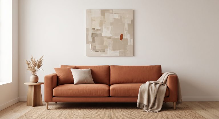
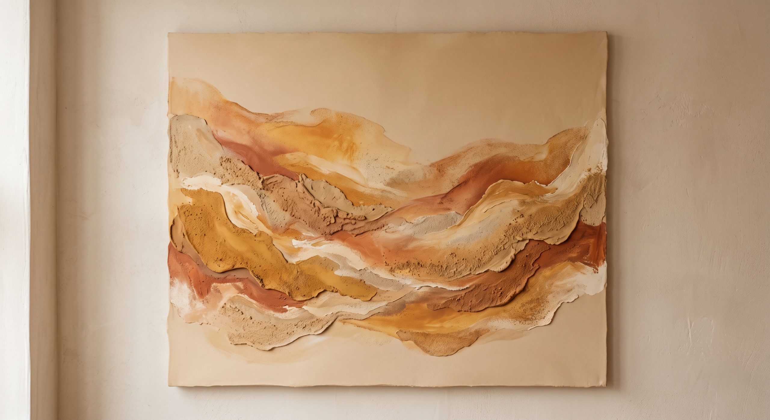
Analogous colours sit next to each other on the wheel, such as red, orange and yellow, or blue, teal and green. Because they’re closely related, analogous palettes tend to feel harmonious and easy to live with, which is why so many calm interior palettes, sand through clay to soft ochre, for example, are built from analogous warm tones.
An artwork built from analogous colours will generally sit comfortably in a room without demanding much negotiation with what’s already there.
Complementary Colours: Deliberate Contrast
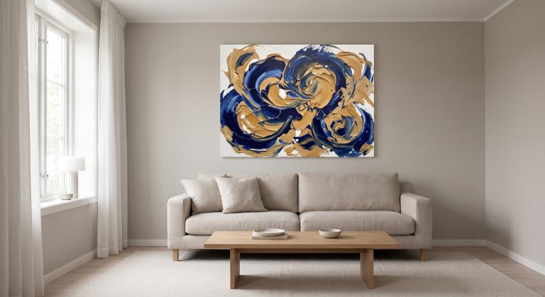
Complementary colours sit opposite each other on the wheel, such as blue and orange, or red and green. Placed together, they create the strongest possible contrast, which is why a small amount of a complementary accent can make a muted piece feel alive.
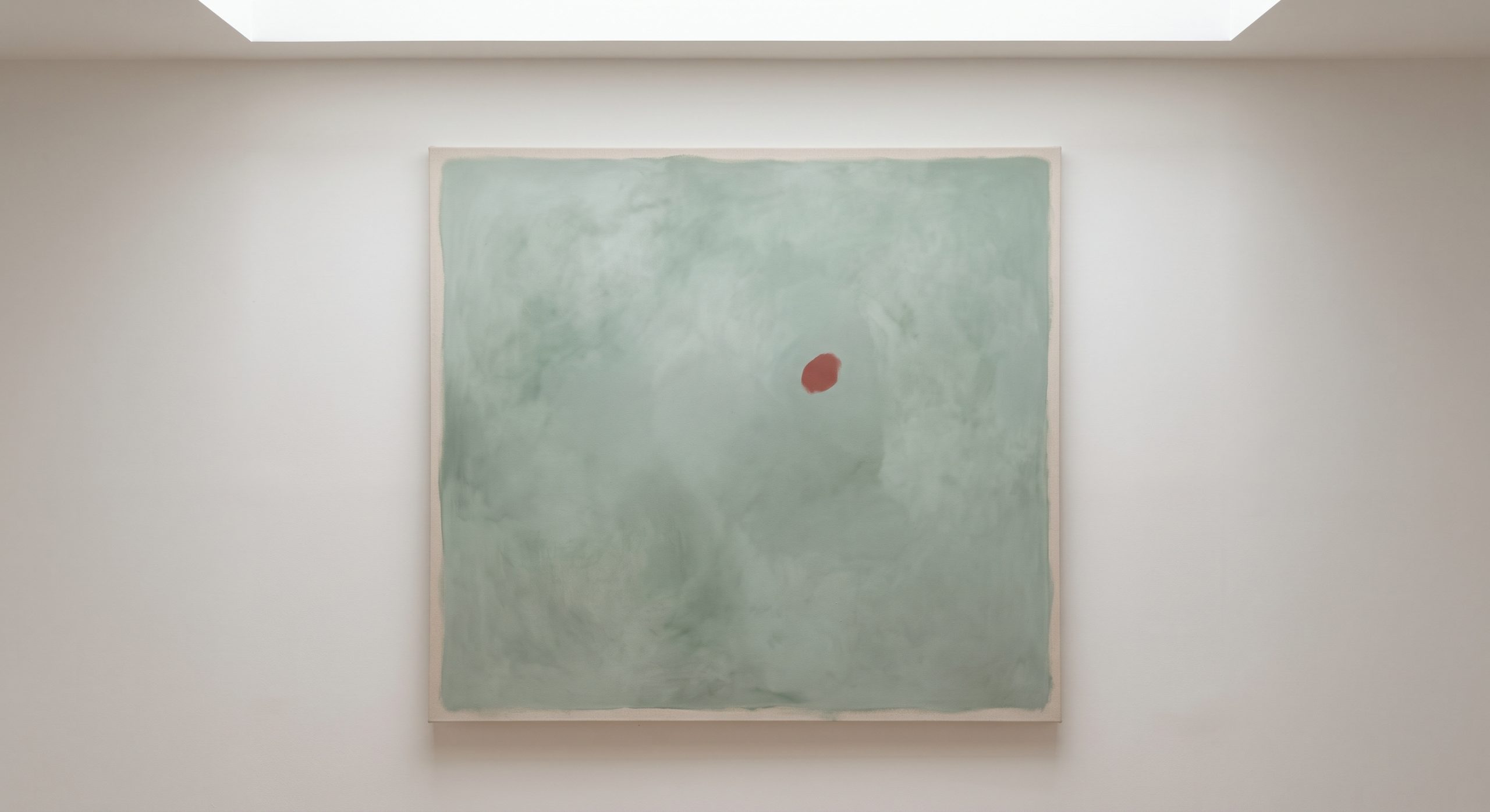
The key word is small. A little complementary contrast reads as a deliberate accent; a lot can feel visually loud. Muting both colours, terracotta rather than pure orange, sage rather than pure green, keeps the contrast sophisticated rather than jarring.
Warm and Cool: Setting the Temperature
Colours divide broadly into warm (reds, oranges, yellows) and cool (blues, greens, violets), and this divide affects mood more directly than almost any other colour property. Warm tones tend to feel grounded and inviting; cool tones tend to feel calm and composed. See warm neutral wall art for the warm end of that range in depth.
Value: Light, Dark, and Everything Between
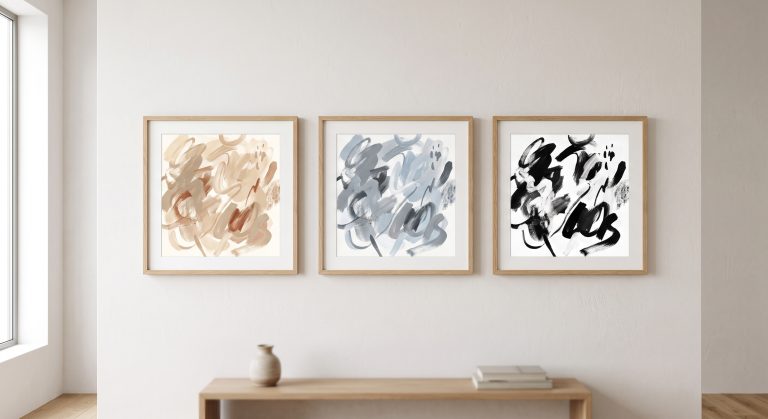
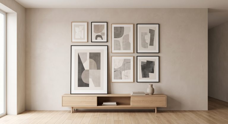
Value refers to how light or dark a colour is, independent of the hue itself. A composition with a full range of values, from pale to deep, tends to feel more dimensional than one where everything sits at a similar value, even if the actual hues are quite different. This is closely tied to how mixing shades of neutral artwork works, since neutral palettes rely on value contrast in the absence of strong hue contrast.
Saturation: Volume Control for Colour
Saturation describes how intense or muted a colour is. A fully saturated red is vivid and demands attention; a desaturated, muted version of the same red reads as sophisticated and easy to live with. Most calm, considered interiors lean toward lower saturation across the board, reserving higher saturation for small, deliberate accents.
Applying This to a Room
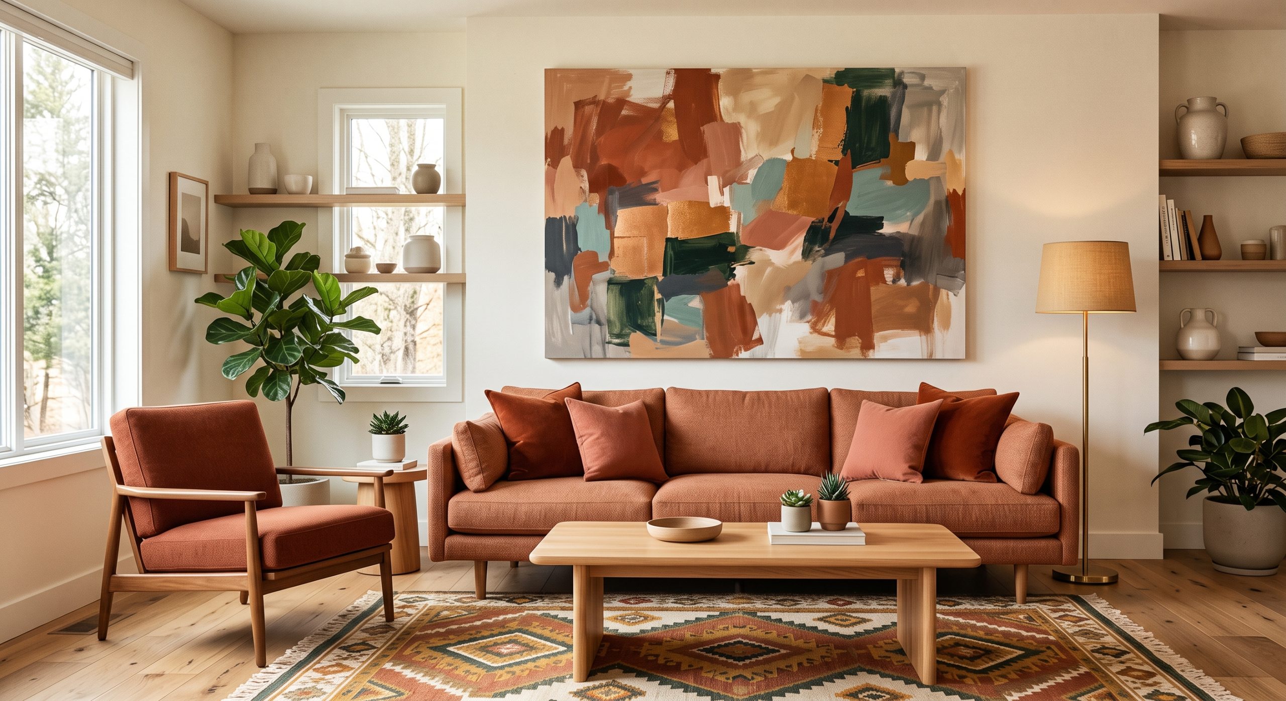
- Identify what’s already there. Note the dominant hue, warm or cool temperature, and general value range of your existing furniture and walls.
- Decide: echo or contrast. An analogous approach will blend in; a complementary accent will stand out. Both are valid, depending on what the room needs.
- Check saturation. A muted piece will usually integrate more easily than a highly saturated one, unless a bold accent is specifically what you want.
- Consider value range. A piece with some contrast in lightness and darkness will generally read as more dimensional than one that’s uniformly mid-toned.
For matching artwork to a specific existing scheme, see how to match artwork to your interior colour scheme.
Common Mistakes
- Choosing art on screen without checking it against real fabric or paint samples
- Using full-saturation complementary colours rather than muted versions
- Ignoring value, so a piece disappears into a similarly toned wall
- Assuming colours must match exactly rather than relate
Final Thoughts
You don’t need a design degree to use colour theory well. Analogous for harmony, complementary for accent, value for depth, and saturation kept low except where you want deliberate emphasis. Those four ideas cover most of what actually matters when choosing artwork for a room, alongside the rest of the process covered in the complete guide to choosing artwork for your home.