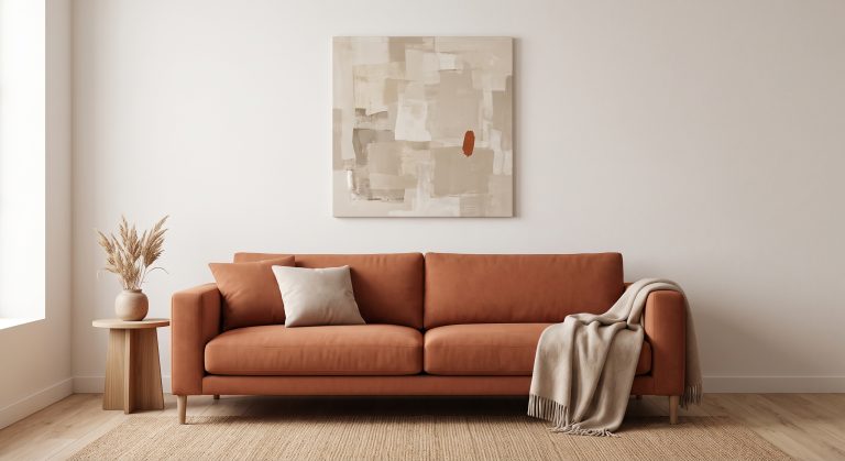
How to Choose Abstract Art for Your Home
Choosing abstract art can feel harder than choosing a landscape or a portrait. There is no obvious subject to judge it by, so it is easy to fall back on “I like it” without knowing whether it will work on your wall.
The best way to choose abstract art for your home is to decide in a fixed order. Start with the feeling you want the room to have, then read the room’s existing lines and materials, choose a palette that supports that mood, get the scale right (above furniture, roughly two-thirds to three-quarters of its width), decide between flat and textured, and finally check that the composition feels resolved. Take those questions in sequence and thousands of options narrow to a handful in minutes.
Below, each step is explained in turn, with a quick checklist at the end. If you are new to the subject, our pillar guide to what abstract art is is a helpful starting point.
Step 1: Start With the Feeling, Not the Artwork
Before looking at a single piece, decide what you want the wall to do.
Do you want the room to feel calmer? More energised? More grounded? More dramatic?
Abstract art works primarily on mood, so this one decision filters everything else. Calm rooms tend to suit warm neutrals, organic forms, soft texture and generous empty space. More dramatic rooms can carry stronger contrast, darker marks and sweeping gestures.
Step 2: Read the Room’s Existing Visual Language
Every room already has a character, made up of its lines, materials and colours. Stand in the doorway and notice what dominates: the curve of a sofa arm, the grain of an oak floor, the cool gleam of a steel lamp.
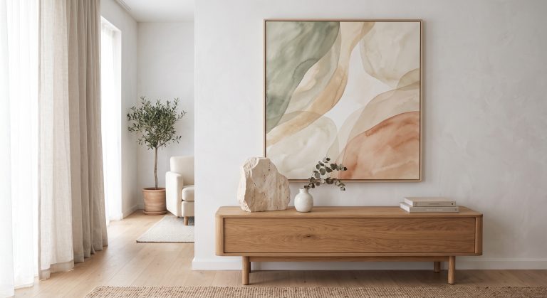
- Curves, wood, linen and stone suggest organic abstraction. See organic abstract art and why it feels so calm.
- Straight lines, glass and metal suggest geometric or minimalist work.
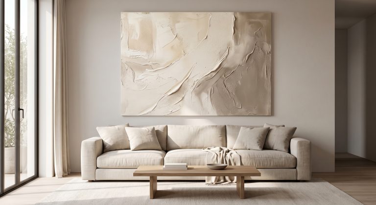
- A very plain, pale room often benefits from a textured piece that adds depth.
- A busy, patterned room usually wants something calmer, with strong negative space.
Working against the room on purpose can look brilliant, but it is an advanced move. If you are unsure, start by working with it.
If you want to know what each style looks like, our guide to the different types of abstract art will help you recognise them. For calm, natural interiors, see what Japandi art is, and for compact rooms, minimalist artwork for small spaces.
Step 3: Decide the Palette
Colour is the fastest way an abstract artwork changes a room.
Pick a palette that supports the mood you chose in step one, then look for relationships with what is already there. A sandy piece can echo a wooden floor. A charcoal line can pick up a window frame. A muted green can connect to a trailing plant on the shelf.
Avoid matching everything exactly. A room in which every colour is repeated in the artwork can feel over-coordinated. For a deeper look, see how colour changes the feeling of abstract art.
Step 4: Get the Scale Right
Scale is the most common reason a good artwork looks wrong on a wall.
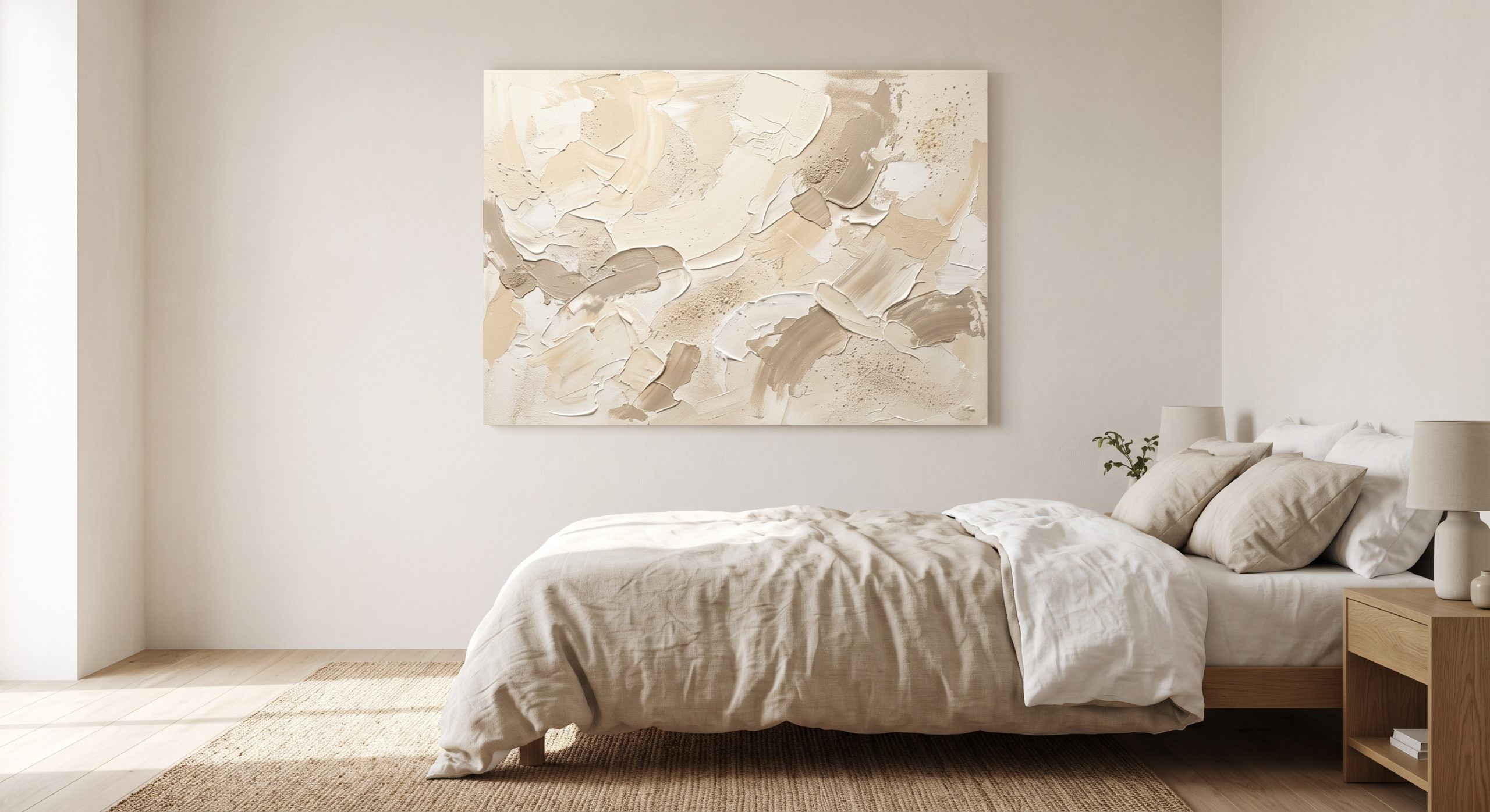
A widely used guideline is that art hung above furniture works best when it spans roughly two-thirds to three-quarters of the furniture’s width. That is a starting point rather than a rule, but it prevents the most common error: hanging something too small.
Some further principles:
- A single large piece usually looks more confident than several small ones scattered widely.
- A small piece can be lovely on a narrow wall, a shelf or a quiet corner.
- Leave breathing room around the piece. The empty wall is part of the composition.
- As a rough guide, hang art so its centre sits near eye level, often cited as around 145 to 150 cm from the floor. Lower it slightly over furniture so it feels connected to it.
Step 5: Choose Your Level of Texture
Flat, smooth abstract work and textured, dimensional work create different experiences.
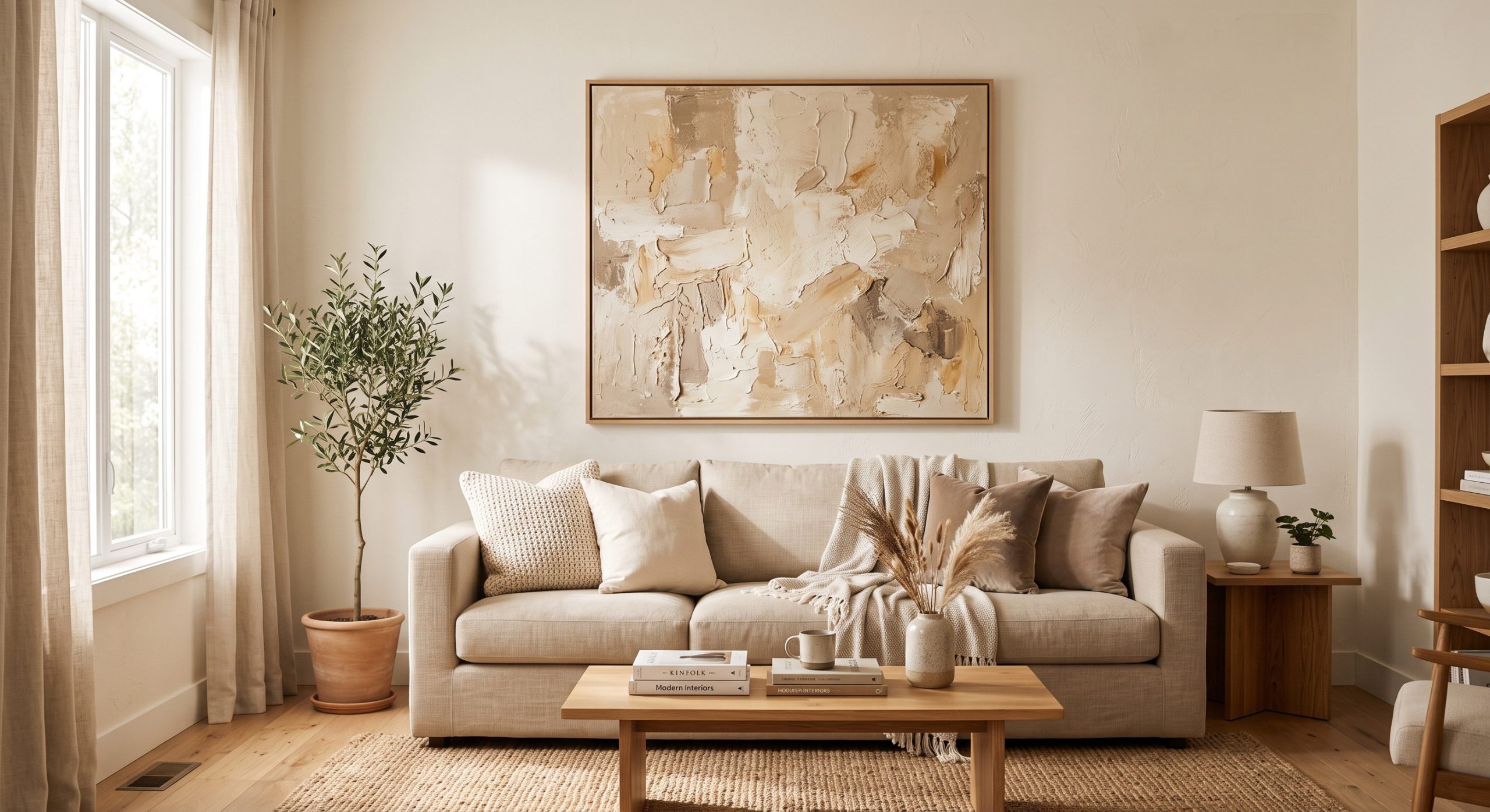
Flat pieces are quieter and easier to place in a room that already has plenty going on. Textured originals respond to light throughout the day: a low winter sun catches every ridge, and the piece reads as more sculptural. Prints can suggest that depth visually, although their surface stays flat. Read our guide to textured abstract art if you are considering this route.
Step 6: Check the Composition
Once a piece passes the first five steps, look at it for longer than a glance.
- Where does your eye go first, and where does it go next?
- Does the piece settle, or does your eye keep searching? (See understanding balance in abstract art.)
- Is there enough empty space for the marks to breathe? (See negative space in abstract art.)
A piece that feels resolved is far easier to live with over years than one that keeps demanding your attention.
Step 7: Consider Orientation and Grouping
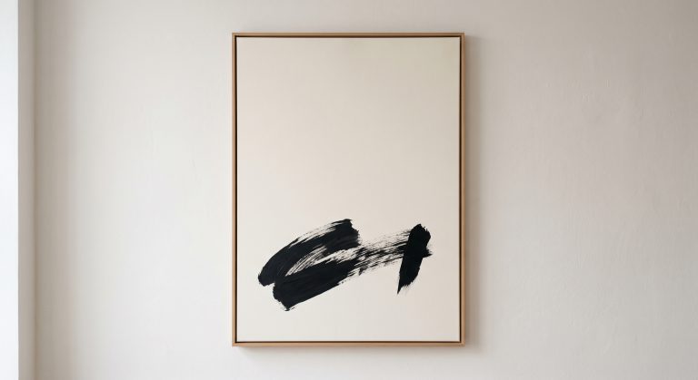
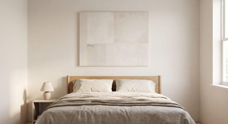
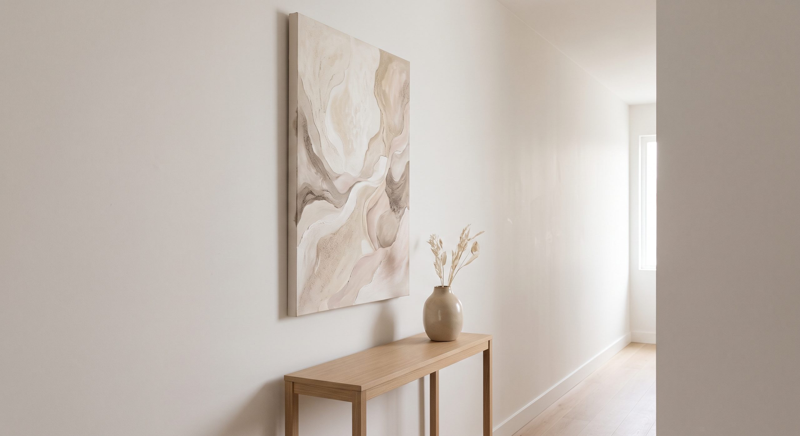
Vertical pieces draw the eye upward and suit narrow walls and tall spaces. Horizontal pieces work well above sofas, beds and consoles. Square pieces feel balanced and calm. The same principles apply when combining several pieces; see gallery wall ideas for a modern home.
If you are considering a pair or a set, choose pieces that share a palette or a way of making marks, rather than matching them exactly. Repetition creates cohesion, and variation keeps it interesting.
Step 8: Think About Format and Budget
Abstract art is available as originals, limited editions, open-edition prints and printable downloads. Each has a place.
Originals offer physical texture and uniqueness. Prints offer accessibility and flexibility, and good paper, careful printing and a well-chosen frame make a large difference to how a print looks. Decide which suits your space and budget before falling for a specific piece.
Step 9: Trust Your Instinct, Then Test It
By this point you should have a shortlist. The last decision is usually instinctive: which piece do you keep returning to?
Then test it. Cut a piece of paper to the same size and tape it to the wall for a day or two. It sounds basic, but it is one of the best ways to check scale and placement before you commit.
A Quick Checklist
- What feeling should this wall create?
- Does the piece speak the same visual language as the room, or is it a deliberate contrast?
- Does the palette work in my actual lighting?
- Is it the right scale for the wall or furniture?
- Flat or textured?
- Does the composition feel resolved?
- Have I left enough space around it?
Common Mistakes
- Buying from a small online image without considering size
- Hanging art too high or too small
- Matching every colour in the room
- Choosing something purely on trend
- Crowding the piece with furniture and objects
Final Thoughts
Choosing abstract art is not about finding the “right” answer. It is about matching a feeling to a space, and then checking that scale, colour and composition support it.
Take it in order: mood, room, palette, scale, texture, composition. And when you find the piece you keep noticing, hang it with room to breathe. This process is part of our complete guide to choosing artwork for your home, if you would like to see it alongside every other part of the process.