How Colour Changes the Feeling of Abstract Art
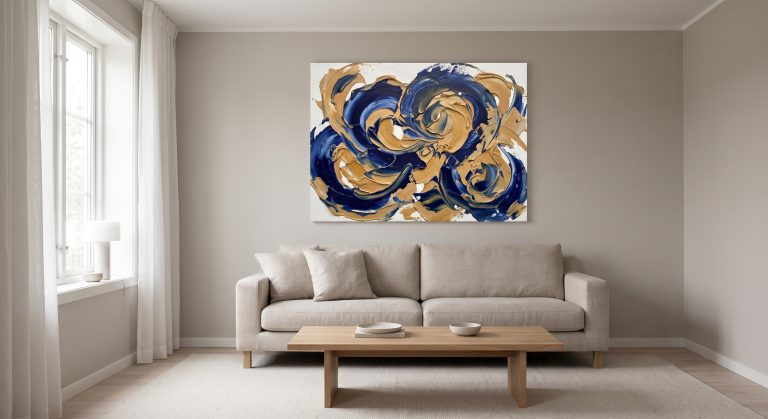
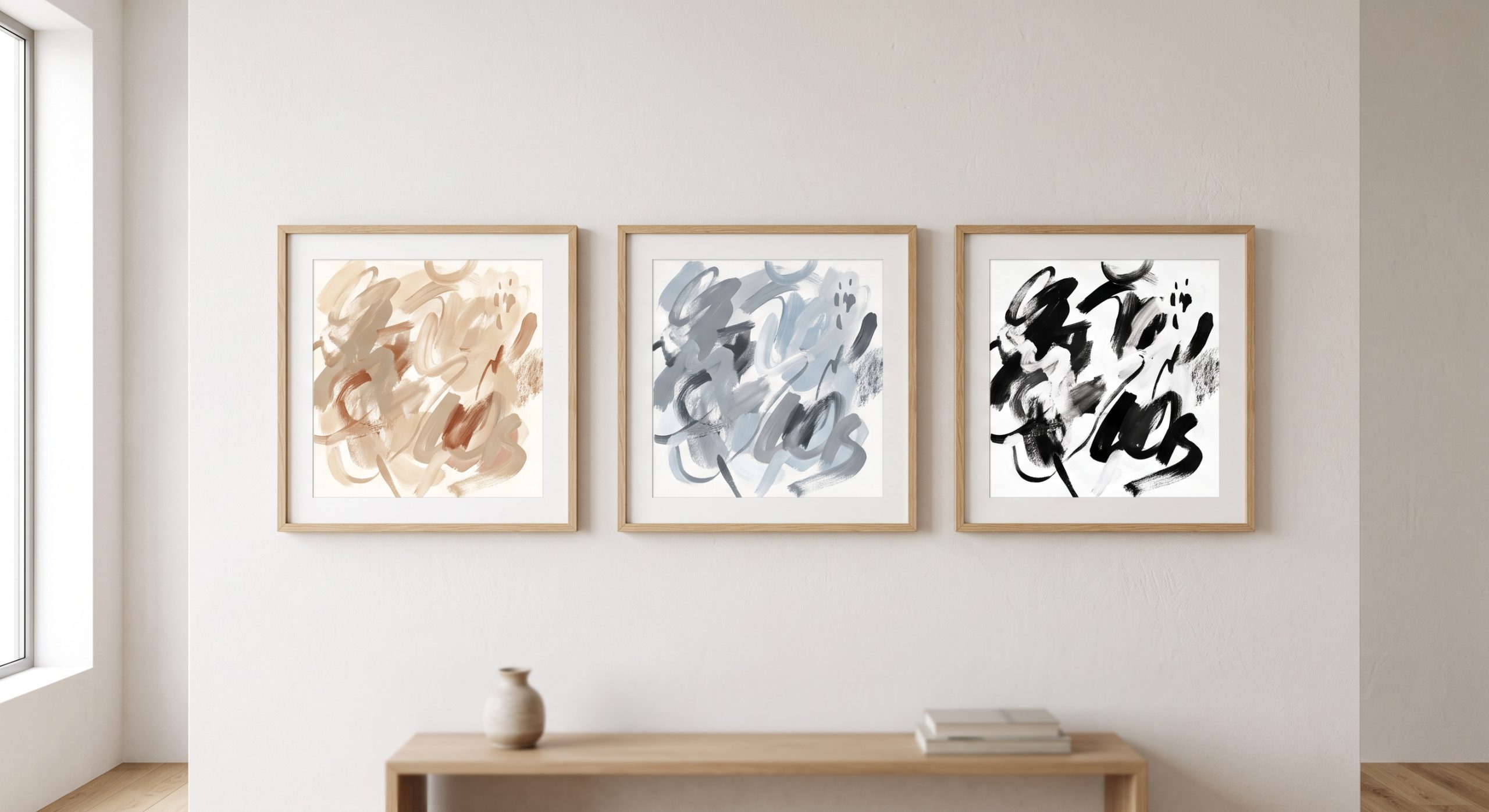
Take one abstract composition and paint it three times: once in sand and cream, once in grey and pale blue, once in black and white. The shapes are identical. The gestures are identical. The feeling in the room is completely different.
That is how much work colour does in abstract art. When there is no face, landscape or object to hold your attention, colour steps forward and carries much of the mood by itself.
This guide looks at how different palettes change the feeling of an abstract artwork, why undertones and proportions matter as much as the colours themselves, and how to choose a palette that suits the room it will live in. If you’re new to the subject, our pillar guide to what abstract art is is a useful starting point.
Why Colour Matters More in Abstract Art
In representational art, colour supports a subject you already recognise. A blue sky is a sky; the colour describes it.
In abstract art there is no such anchor. Colour is not describing anything. It simply is the experience.
Some of the artists who pushed abstraction furthest treated colour as a subject in its own right. Wassily Kandinsky wrote about the emotional effects of colour in Concerning the Spiritual in Art, and Josef Albers spent years demonstrating, through his Homage to the Square series and his book Interaction of Color, that a colour looks different depending on what sits next to it.
That second idea is the most practical one for choosing art. A colour is never seen alone. It is always seen in relation to something else.
Warm Neutrals: Grounded and Calm
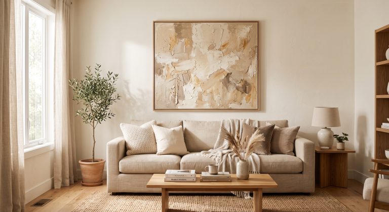
Ivory, cream, sand, beige, clay and taupe form the backbone of many calm interiors.
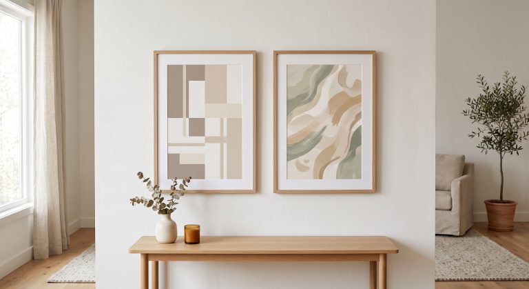
Warm neutrals tend to feel grounded and settled. They echo natural materials such as limestone, linen, oak and plaster, which is why they sit so comfortably in organic modern and Japandi rooms.
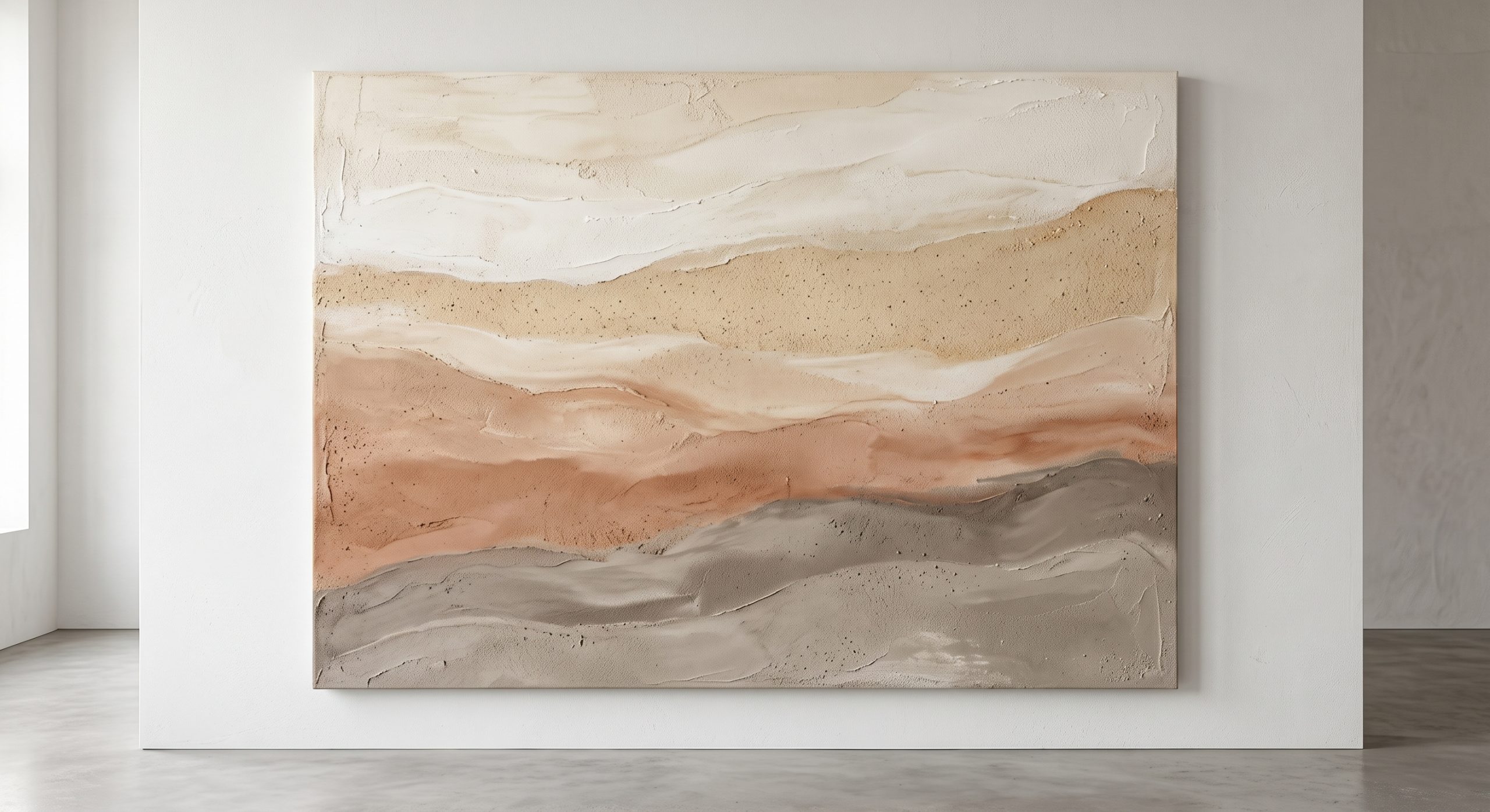
They also rarely date. A sandstone-toned piece bought today is likely to feel as right in ten years as it does now.
The risk is monotony. An all-neutral piece can become flat if nothing in it changes, which is why texture and tonal variation matter so much. We explore that in beige abstract art for calm contemporary interiors.
Cool Tones: Quiet and Composed
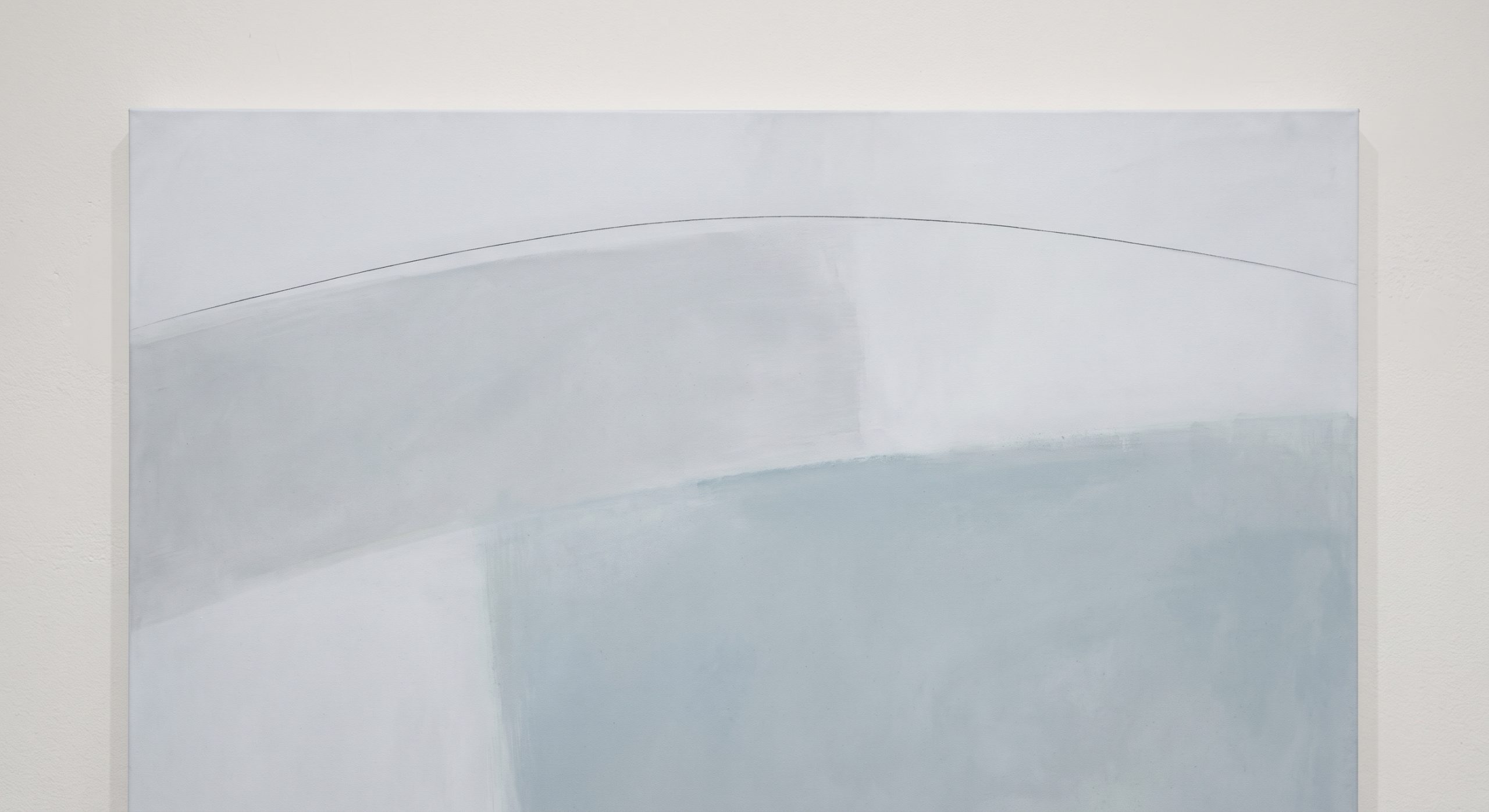
Greys, soft blues, cool whites and mineral tones create a quieter, more architectural atmosphere.
Where warm neutrals feel cosy, cool tones tend to feel composed. They suit rooms with clean lines, glass, steel or pale Scandinavian-style woods, and rooms that receive a lot of warm sunlight, where a cooler artwork can provide balance.
In a north-facing room with cool daylight, very cool artwork can feel distant. A touch of warmth in the piece usually helps.
High Contrast: Black, Charcoal and White
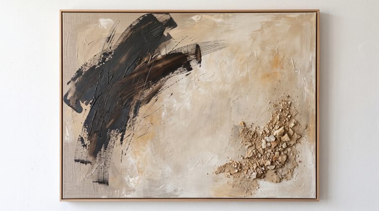
Strong contrast pulls the eye quickly. A charcoal mark on a pale ground is immediately legible, even from across a room.
High-contrast work is excellent as a focal point. It is less suited to repetition, because several high-contrast pieces competing for attention can make a space feel restless rather than curated.
One useful approach is to let the contrast live in a single element, such as a dark line, rather than covering the whole surface. A small amount of a darker tone can have far more impact than a large area of strong colour.
Muted Accents: Sage, Clay, Dusty Rose and Aged Gold
A restrained accent colour inside a largely neutral piece can look far more sophisticated than the same colour at full strength.
- Muted sage connects with plants and natural materials
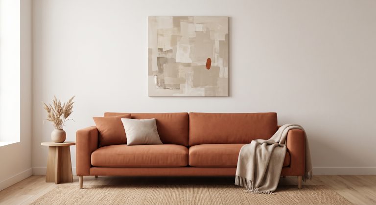
- Clay and terracotta tones add warmth without shouting
- Dusty rose softens without becoming sweet
- Aged gold or bronze adds a quiet glow
The word that matters is muted. Desaturated colours behave like neutrals with a hint of personality, so they combine easily with the rest of a room.
Undertones: The Detail That Decides Whether It Works
Two beige artworks can look completely different on the same wall because of undertone.
A warm beige leans towards yellow, peach or pink. A cool beige leans towards grey or green. Put a pink-toned beige next to a green-toned beige and one of them will look wrong, even though both are technically “beige”.
A simple test: hold the artwork, or a sample of it, against your walls, sofa and flooring. If the undertone feels like it belongs to the same family, the pairing usually works. If one looks muddy or dirty beside the other, the undertones are fighting.
Proportion: How Much of Each Colour
The amount of a colour matters as much as the colour itself.
A composition that is mostly calm cream with a small area of deep clay reads as controlled and confident. The same clay covering half the surface reads as a bolder statement. Neither is wrong, but they create very different rooms.
Generally, a dominant colour, a supporting colour and a small accent create a balanced result. This overlaps with how weight is distributed across a composition, which we look at in understanding balance in abstract art.
Light Changes Colour
The colours in an artwork are not fixed. They shift with the light in your room.
Morning daylight is usually cooler and cleaner. Evening lamplight is usually warmer and yellower. A cream that looks bright in a product photograph can look yellow under warm bulbs, or grey in a shaded room.
Before committing to a piece, consider where it will hang and what the light is like there at different times of day. If possible, hold up a sample at the intended spot and look at it in the morning and in the evening.
Colour and Texture Work Together
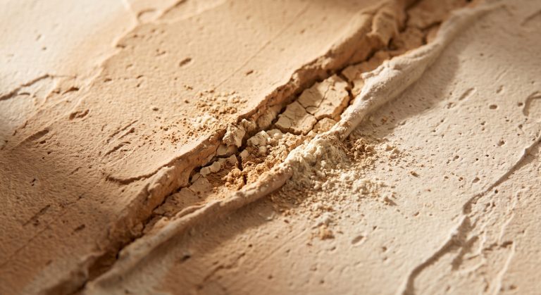
Texture changes how colour behaves. Raised areas catch light and look lighter. Recessed areas fall into shadow and look darker.
This means a textured neutral artwork contains many more tones than its flat description suggests. A single cream plaster surface can appear to contain ivory, sand and soft grey depending on the angle of light. It is one reason textured work holds interest so well in a restrained palette, and it’s explored further in our guide to textured abstract art.
Choosing a Palette for Your Room
Start with the mood you want, not the colour you like.
- Bedroom or reading corner: warm neutrals or soft cool tones, low contrast
- Living room: a supporting palette that echoes your flooring, textiles or wood, with one stronger element
- Hallway or entrance: higher contrast works, because you pass through rather than sit
- Home office: calm, not too stimulating, with a single focal mark
Then look for relationships rather than exact matches. A sandy piece can echo a wooden floor. A charcoal line can echo a window frame. A muted green can quietly connect to a plant. For a fuller walk-through, see how to choose abstract art for your home.
Common Colour Mistakes
- Choosing artwork colours only from a small online photo
- Matching every colour in the room exactly, which can make a space feel over-coordinated
- Ignoring undertones
- Putting several high-contrast pieces together
- Forgetting that warm lighting shifts pale colours
Final Thoughts
Colour is the fastest way an abstract artwork speaks to you, and the fastest way it can go wrong in a room.
Pay attention to undertone, proportion and light, and choose the feeling first. The right palette will not necessarily be the most striking one. Often it is the one that makes everything around it look a little calmer and a little more considered.