How to Mix Different Shades of Neutral Artwork
Hang two beige artworks side by side and sometimes they look perfect together. Other times one looks pink, the other looks green, and the wall feels strangely off. Nothing is wrong with either piece. The shades simply do not agree.
Mixing neutrals is one of the most useful skills in styling art, and one of the least understood. The rules are simple once you know what to look for: undertone, value, texture and proportion.
This guide explains how to combine different shades of neutral artwork so they look layered and intentional rather than accidental. For the fundamentals, see what neutral wall art is.
Step 1: Read the Undertone
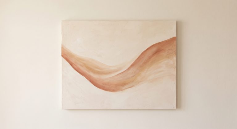
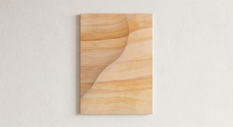
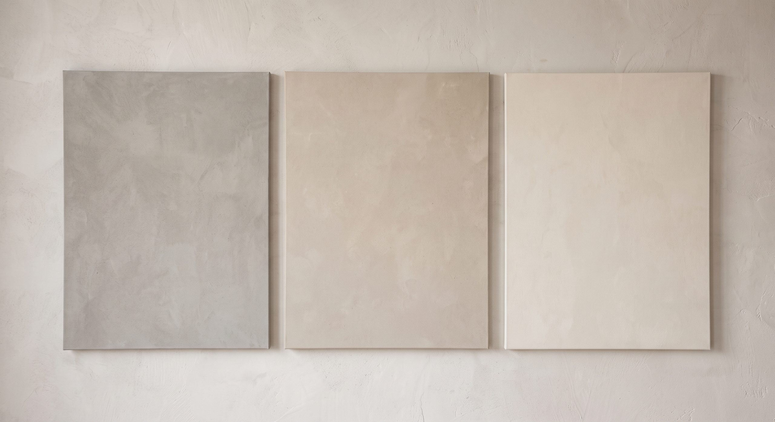
Undertone is the hidden colour bias inside a neutral. Warm neutrals lean yellow, peach or red. Cool neutrals lean blue, green or grey.
To see it, hold each artwork (or a printed sample) against a sheet of plain white paper in daylight. The undertone usually becomes obvious: one looks creamy, another slightly grey, another faintly pink.
Step 2: Choose a Dominant Undertone
Pieces from the same family combine easily. The simplest approach is to pick one dominant undertone, warm or cool, and choose nearly all your pieces from it.
You can add a small amount of the opposite undertone for interest. Keep it as the minority, so the group still feels coherent.
Step 3: Vary the Value
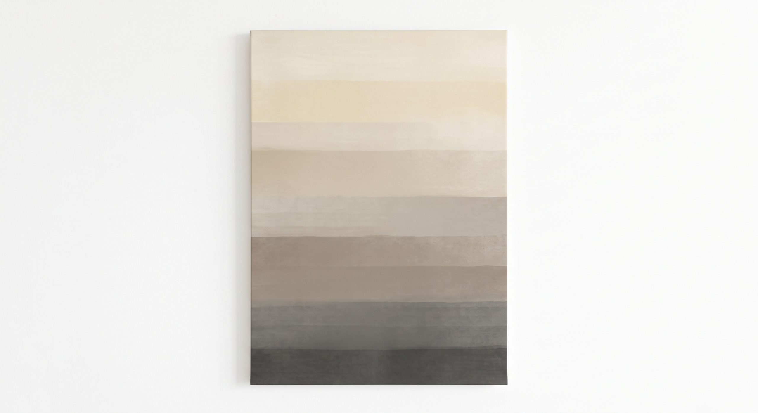
Value means how light or dark a tone is. A group of neutrals with the same value tends to look flat, even if the colours differ slightly. Contrast in value brings life.
A useful test: photograph your group in black and white, or squint at it. If everything blends into one grey blur, add a lighter or darker piece.
Step 4: Use a Bridge Shade
If you want to mix warm and cool neutrals deliberately, a bridging shade helps. Greige, a blend of grey and beige, is the classic bridge. Taupe and mushroom tones can do the same job.
Repeat the bridge shade in more than one piece, in a frame, or in an accessory nearby, and it ties the warm and cool sides together.
Step 5: Repeat and Proportion
Repetition creates cohesion. Use a shade at least twice: in two artworks, or in an artwork and a nearby object.
A common design guideline is roughly 60% dominant shade, 30% supporting shade and 10% accent. It is a starting point, not a law, but it prevents groups from feeling evenly split and undecided.
Step 6: Vary Texture
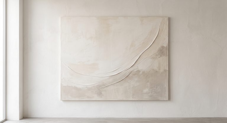
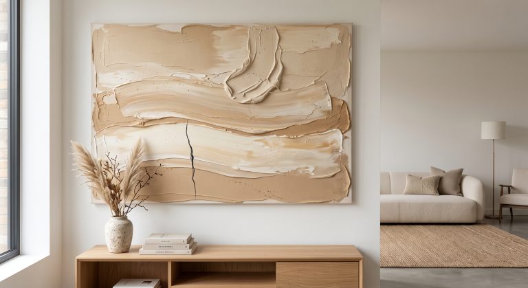
When colours are close, texture does the differentiating. A smooth paper print beside a plaster-toned piece, or a soft photograph beside a rough-surfaced abstract, gives depth without adding colour. See textured abstract art.
Step 7: Add a Darker Anchor
One darker piece, or a piece with a fine charcoal line, anchors a group of light neutrals. Without it, the wall can float. See minimalist line art for elegant ways to add a dark note.
Step 8: Unify With Frames and Spacing
Frames can hold different shades together. A consistent frame colour, such as pale oak or slim black, makes varied art feel like a set. Even spacing helps too. Let sizes vary, but keep the gaps consistent.
Three Neutral Combinations That Work
The warm ladder
Ivory, oatmeal, sand and warm taupe, with a chocolate or espresso accent. Cosy and easy. See warm neutral wall art.
The cool family
Warm white, pale stone, ash grey and soft charcoal. Crisp and calm, suited to architectural rooms.
The bridged mix
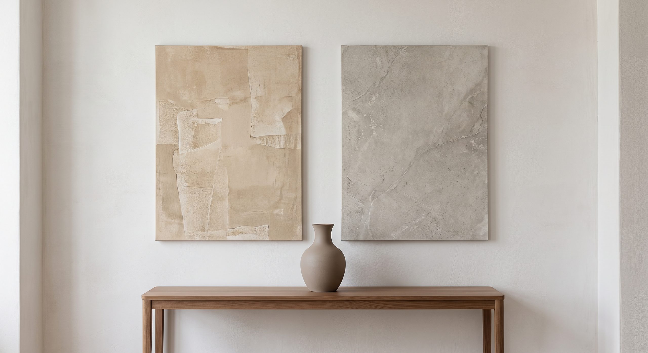
Warm beige and cool grey joined by greige, with a shared taupe accent. Layered and more sophisticated, but requires care.
Test Before You Hang
- Lay the pieces on the floor and view them together in daylight and lamplight.
- Cut paper templates and tape them to the wall for a day.
- Photograph the arrangement and look at it on a screen.
- Check it from across the room, not only close up.
Common Mistakes
- Combining a pink-toned beige with a green-toned one
- Choosing pieces of identical value, so the group looks flat
- Too many shades, with no dominant one
- Ignoring the wall colour behind the art
- Checking in one type of light only
For how neutrals behave in specific spaces, see neutral wall art ideas for every room, and for palettes in general, how colour changes the feeling of abstract art.
Final Thoughts
Mixing neutrals is really about agreement. Decide on a dominant undertone, vary the light and dark, repeat a shade and add a little texture.
Do that, and a wall of many quiet tones stops looking like a coincidence and starts looking like a composition.