The Different Types of Abstract Art Explained
“Abstract art” is not one style. It is a very large family of approaches that can look almost nothing alike.
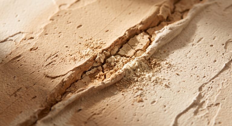
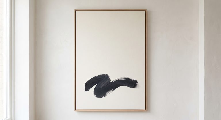
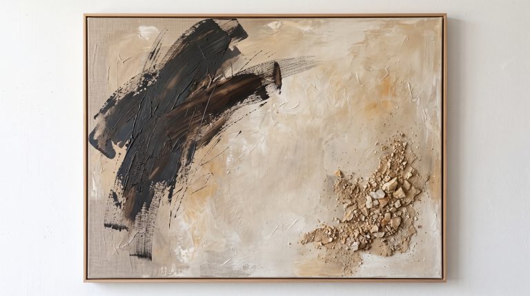
A grid of precisely painted rectangles is abstract. So is a wall of loose, dragged black ink. So is a soft field of sand-coloured plaster with a single fracture running through it.
Once you know the main types, something useful happens: you stop asking “do I like abstract art?” and start asking “which kind of abstraction do I respond to?” That is a much easier question to answer, and a much better one to take into a room you’re trying to style.
If you’d like the wider picture first, our pillar guide to what abstract art is covers the basics and the history. This article goes deeper into the individual styles.
Why There Is No Official List
It’s worth saying up front that there is no single agreed list of abstract art types. Art historians, galleries and artists all divide the territory slightly differently, and plenty of artworks sit between categories.
What follows is a practical grouping: the approaches you are most likely to meet when looking at abstract work for a home. Think of them as useful labels for what you’re seeing, not strict boxes.
Two Quick Questions That Sort Almost Any Abstract Piece
Before the styles, two questions that make identifying them much easier.
Is it built from precise or loose marks?
Sharp edges, measured spacing and clean shapes point towards geometric or minimalist work. Visible movement, drips, drags and energy point towards gestural work.
Is the surface the subject, or is the colour?
If your attention keeps going to the physical surface (ridges, cracks, layers), you are probably looking at textured abstraction. If it keeps going to large areas of colour and how they sit together, you are closer to colour field.

Geometric Abstraction
Geometric abstraction is built from clearly defined shapes: squares, circles, rectangles, lines and grids.
It tends to feel ordered, deliberate and architectural. Edges matter. Spacing matters. Nothing looks accidental.
Early twentieth-century painters such as Piet Mondrian and Kazimir Malevich are among the best-known names associated with geometric approaches to abstraction.
In an interior: geometric pieces suit rooms with strong structure already in place, such as clean lines, built-in shelving or a rectilinear layout. They can also give a softer, more organic room a needed sense of order.
Organic Abstraction
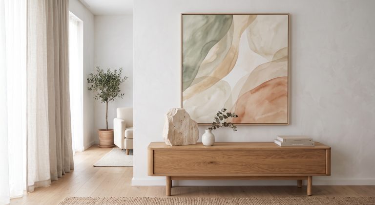
Organic abstraction draws its shapes from the natural world without depicting anything literally. The forms might suggest:
- pebbles and river stones
- water and ripples
- eroded cliffs
- shells and seed pods
- clouds and horizon lines
Corners are rare. Edges tend to curve, drift or dissolve. The whole composition often feels as though it could continue beyond the frame.
In an interior: this is often the easiest type to live with. It softens hard architecture and pairs naturally with wood, linen, stone and ceramics, which is why it sits so easily in Japandi art. We look at why it reads as so restful in organic abstract art and why it feels so calm.

Gestural Abstraction
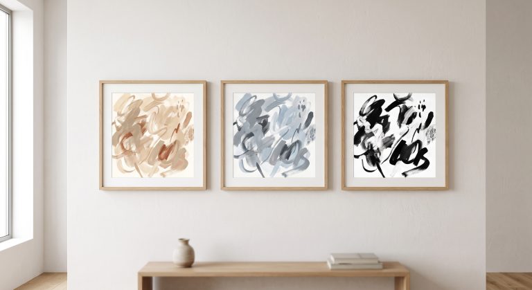
Gestural abstraction puts the physical act of making at the centre of the work. Brushstrokes, drips, drags and sweeping marks stay visible, so you can often sense the speed and direction of the hand that made them.
Abstract Expressionist painters such as Jackson Pollock and Franz Kline are the classic reference points for this approach.
The mood is energetic and expressive. Even when the palette is restrained, a gestural piece tends to feel alive.
In an interior: gestural work makes a strong focal point. In a calm, neutral room, a single gestural piece can act as deliberate tension. Several of them together can become busy quickly.
Colour Field Abstraction
In colour field work, colour itself is the subject. Large, carefully judged areas of colour sit beside or float over one another, and the atmosphere comes almost entirely from how those colours relate.
Mark Rothko and Helen Frankenthaler are commonly associated with this approach, though their methods were quite different. Rothko built soft-edged, layered rectangles, while Frankenthaler stained thinned paint into raw canvas.
In an interior: colour field pieces are quietly powerful. Because they lean on colour rather than detail, choosing the right palette matters even more. Our guide to how colour changes the feeling of abstract art is a good companion to this style.
Minimalist Abstraction
Minimalist abstraction reduces the work to very few elements: a line, a shape, one or two tones, a lot of empty space.
That does not make it simple to do well. When there is almost nothing on the surface, every decision is exposed. Placement, proportion and the amount of empty space carry the whole piece.
Artists such as Agnes Martin are often associated with this restrained end of abstraction, though she herself resisted labels.
In an interior: minimalist abstraction is probably the most versatile type. It rarely competes with furniture, and it suits small rooms, hallways and bedrooms particularly well (see also minimalist artwork for small spaces). The role of empty space is explored in negative space in abstract art.

Textured Abstraction
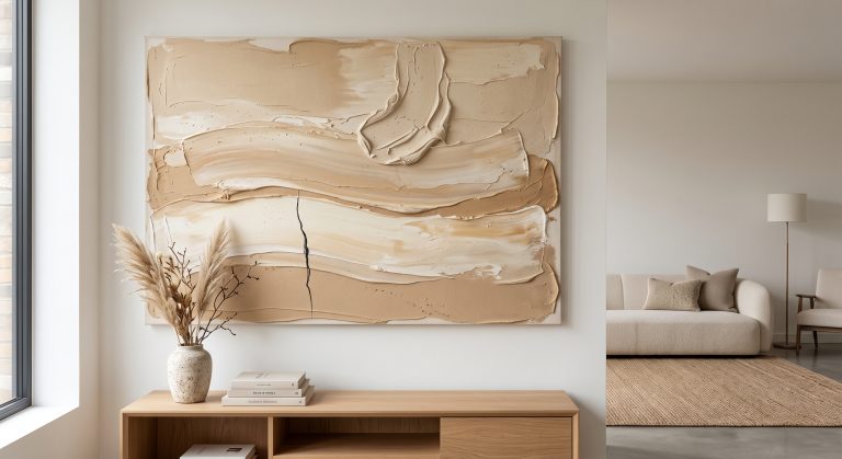
Textured abstraction treats the physical surface as part of the artwork. Plaster, sand, pigment, raised ridges, cracks and layered materials create depth that colour alone cannot.
Twentieth-century artists such as Antoni Tàpies, who worked with materials like sand and marble dust, and Alberto Burri, known for cracked and burned surfaces, are often cited as examples of material-led abstraction.
In an interior: textured pieces change through the day as light moves across them. They are especially effective in neutral rooms, where subtle surface variation stops a restrained palette from feeling flat. See our full guide to textured abstract art.
Contemporary Abstraction: Where the Types Blend
Most abstract work being made today does not sit neatly in one category. A single piece might combine an organic form, a minimalist amount of empty space and a heavily textured surface.
That blending is normal, and often where the most interesting work happens. If you’re unsure how “contemporary” relates to “abstract”, we untangle the two terms in abstract art vs contemporary art.
A Quick Way to Recognise Each Type
- Geometric: clean shapes, sharp edges, visible structure
- Organic: soft curves, natural-feeling forms, no hard corners
- Gestural: visible movement, energetic marks, spontaneity
- Colour field: large areas of colour as the main event
- Minimalist: very few elements, generous empty space
- Textured: raised, recessed or layered surface
Which Type Suits Which Room?
There are no rules, but there are useful tendencies.
A bedroom or reading corner usually benefits from organic or minimalist work, because both lower the visual temperature of a room. A hallway or entrance can carry more contrast and energy, since you pass through rather than linger. A living room often has room for one confident piece, whether that is a large textured work or a strong gestural mark, supported by quieter neighbours.
If you are building a wall of several pieces, choosing one dominant type and letting the others support it is a more reliable approach than mixing everything equally. For a step-by-step approach to choosing, see how to choose abstract art for your home.
Final Thoughts
Learning the types of abstract art is less about memorising names and more about training your eye.
Next time you look at an abstract piece, ask what it is doing. Is it organising? Flowing? Moving? Glowing? Reducing? Building a surface?
Once you can answer that, you can start to notice which kind of abstraction you keep returning to, and that is usually the best guide to what belongs on your wall.