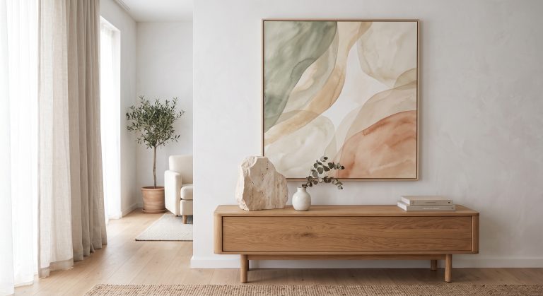
Beige Abstract Art: Ideas for Calm Contemporary Interiors
Beige has a reputation problem. Say the word and many people picture a builder-white hallway or a tired carpet: safe in the least exciting sense.
Beige abstract art is something else entirely. The secret is variety within the palette rather than added colour. The best pieces layer several nearby shades, such as ivory over sand over soft taupe; use texture, real or visual, to catch the light; add one darker mark for the eye to land on; and leave generous empty space. Choose a piece whose undertone matches your room, warm with warm and cool with cool, and size it generously, and warm neutrals become some of the most sophisticated colours a room can hold.
Below, you will find what beige actually covers, why it works so well in abstract art, how to read undertone, and ideas by interior style and room. If you are new to the subject, our pillar guide to what abstract art is is a helpful starting point.
What “Beige” Actually Covers
Beige is not one colour. It is a family, and the differences inside it matter.
- Ivory and cream: the lightest, softest end, close to off-white
- Sand and oatmeal: mid-light, slightly earthy
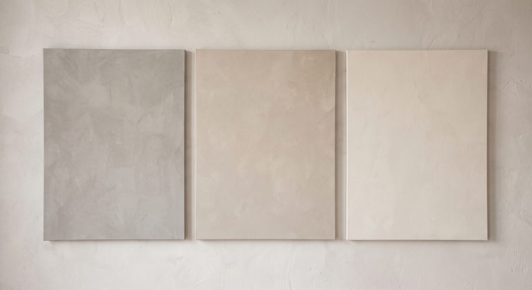
- Stone and limestone: slightly cooler, mineral in feel
- Greige: a blend of grey and beige that sits between warm and cool
- Taupe and mushroom: deeper, with a brown or grey-brown character
- Clay and camel: the warmest, closest to terracotta and tan
Most good beige abstract artwork uses several of these together rather than a single flat tone. That is where the depth comes from. For beige art beyond abstract painting, including line art, photography and botanicals, see beige wall art ideas for a sophisticated home.
Why Beige Works So Well in Abstract Art
Warm neutrals feel grounded and settled. They echo natural materials such as limestone, plaster, linen, oak and unglazed ceramics, which is why they sit so comfortably in organic modern and Japandi rooms. For the full warm neutral palette, see warm neutral wall art. We look at how palettes shape mood in how colour changes the feeling of abstract art.
Beige also does something practical: it rarely clashes. It sits alongside most flooring, textiles and wall colours without competing, which makes it one of the easier palettes to live with over the long term.
And because it is quiet, the other qualities of an artwork have room to show. Composition, texture, edge quality and empty space all become more visible when colour is not shouting.

What Stops Beige Abstract Art From Feeling Flat
The real risk with beige is monotony. A piece that is neutral but visually inert will simply disappear into the wall. The strongest beige abstract work avoids this by creating variety inside the palette, rather than by introducing a new colour.
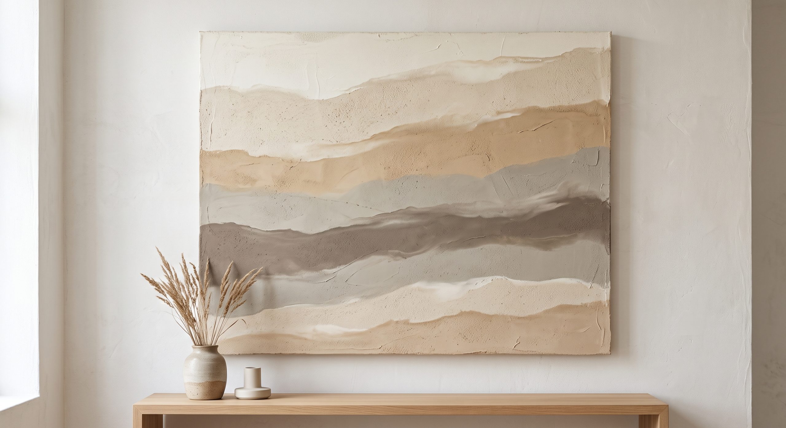
Tonal layering
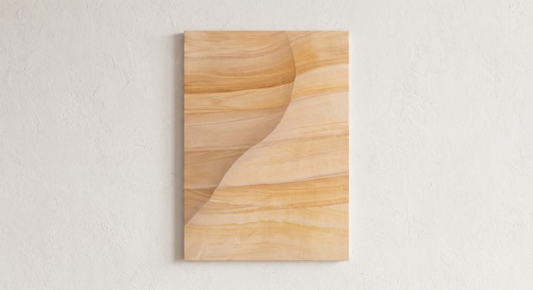
Several nearby shades, such as cream over sand over soft taupe, create depth even without contrast in hue. The eye reads the differences between them as form, much as it reads the gentle steps of colour in a sandbank. Our own Gilded Strata shows how little it takes: smooth, wavy bands flow diagonally across a pale cream, plaster-like surface, and the soft shading between them is enough to read as form. The relief is suggested by that shading; the print itself is flat.
Texture
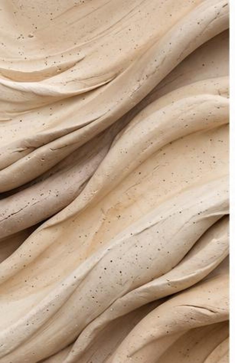
On an original, raised and recessed areas catch light differently, so a single beige surface can hold pale highlights and soft shadows at the same time. A print can suggest the same effect visually, although its surface is flat. This is one of the main reasons textured abstract art and neutral palettes go so well together.
One darker or cooler mark
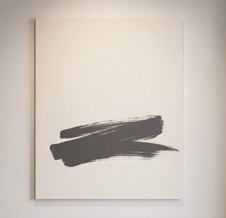
A single charcoal line, a shadowed crack or a small area of deep clay gives the eye somewhere to land. A little contrast goes a long way against a gentle ground.
Negative space
Generous empty areas stop a neutral composition from feeling heavy. They also make the marks that are there look more deliberate. See negative space in abstract art for more.
Surface finish
Matte surfaces feel calm and stone-like. A hint of sheen, such as a burnished pigment or a slightly reflective gold-toned accent, adds a soft glow.
Warm Beige or Cool Beige? Read the Undertone
Two beiges can look completely different side by side because of undertone.
A warm beige leans yellow, peach or pink. A cool beige leans grey or green. Placed together, they can make one another look muddy.
Before choosing, compare the artwork with your wall colour, sofa and flooring. If the undertones belong to the same family, the pairing tends to work. If one looks dull or dirty against the other, the undertones are clashing.
Beige Abstract Art by Interior Style
Warm minimalist
Smooth, restrained pieces with soft tonal shifts and plenty of empty space suit clean, pared-back rooms where the artwork should feel calm rather than sculptural.
Organic modern and Japandi
Beige with visible texture, such as plaster-like surfaces, subtle cracking or softly eroded edges, works particularly well beside natural wood, linen and stone. Curved, organic forms strengthen the effect, as explored in organic abstract art and why it feels so calm.
Traditional and transitional
Softer, more painterly beige abstraction with gentle tonal blending can soften a more traditional room without introducing anything sharply geometric.
Beige Abstract Art Room by Room
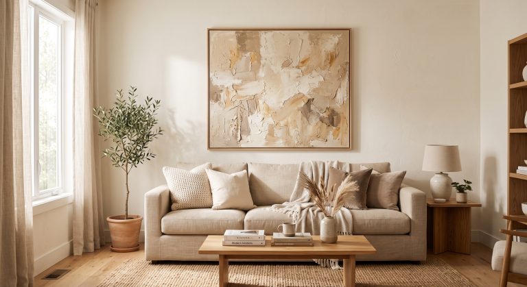
- Living room: a large, textured piece above the sofa can become the anchor of the whole scheme.
- Bedroom: low-contrast, softly layered work supports a restful mood.
- Hallway: a slightly stronger mark or deeper tone helps the piece read in passing.
- Home office: calm neutrals with a single focal mark keep the space focused rather than stimulating.
Colours That Pair Well With Beige
- Charcoal or black: crisp contrast and structure
- Muted sage: a natural, plant-like counterpoint
- Clay and terracotta tones: warmth and depth
- Soft white: lightness and air
- Aged gold or bronze: a subtle glow
Keep accents muted. Desaturated colours behave like neutrals with a little personality, so they combine easily.
Beige Art on Beige Walls
It is worth trying, and it can look very good, but it needs a difference in value (lightness or darkness) or in texture. A slightly darker or more textured artwork against a lighter wall creates a gentle tonal contrast. An identical beige on an identical beige will simply vanish.
Common Mistakes
- Choosing from a small online photograph without checking undertone
- Picking a completely flat piece for a completely flat room
- Ignoring how warm evening light shifts pale colours towards yellow
- Making everything the same shade rather than layering tones
- Hanging a piece too small for the wall, which loses the effect. See how to choose abstract art for your home for guidance on scale.
Final Thoughts
Beige is not the absence of colour. It is a range of soft tones that reward attention.
Choose an artwork with genuine variation in tone and texture, check that its undertone belongs with your room, and give it some space. Done well, beige abstract art does not feel plain. It feels calm, considered and quietly expensive.
To see these ideas in practice, explore our neutral abstract printable wall art collection, six stone- and sand-inspired prints in layered warm neutrals.