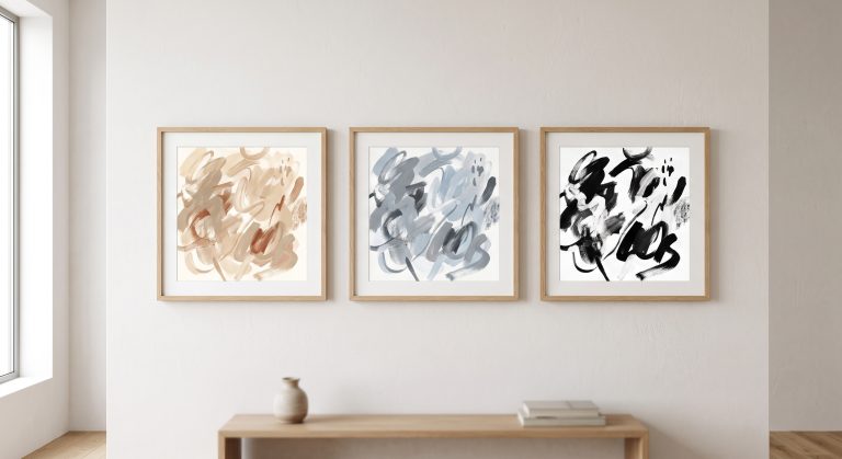
Understanding Negative Space in Abstract Art
It is easy to think of empty space as the part of an artwork where nothing is happening. In strong abstract art, it is often doing more work than the marks.
It frames them. It gives them room to breathe. It tells your eye where to rest and where to travel. And it is frequently the difference between a composition that feels calm and one that feels crowded.
This guide explains what negative space is, how it works in abstract art, how it changes the feeling of a room, and how to use it when you choose and hang art. If you’re new to the subject, our pillar guide to what abstract art is is a helpful starting point.
What Is Negative Space?
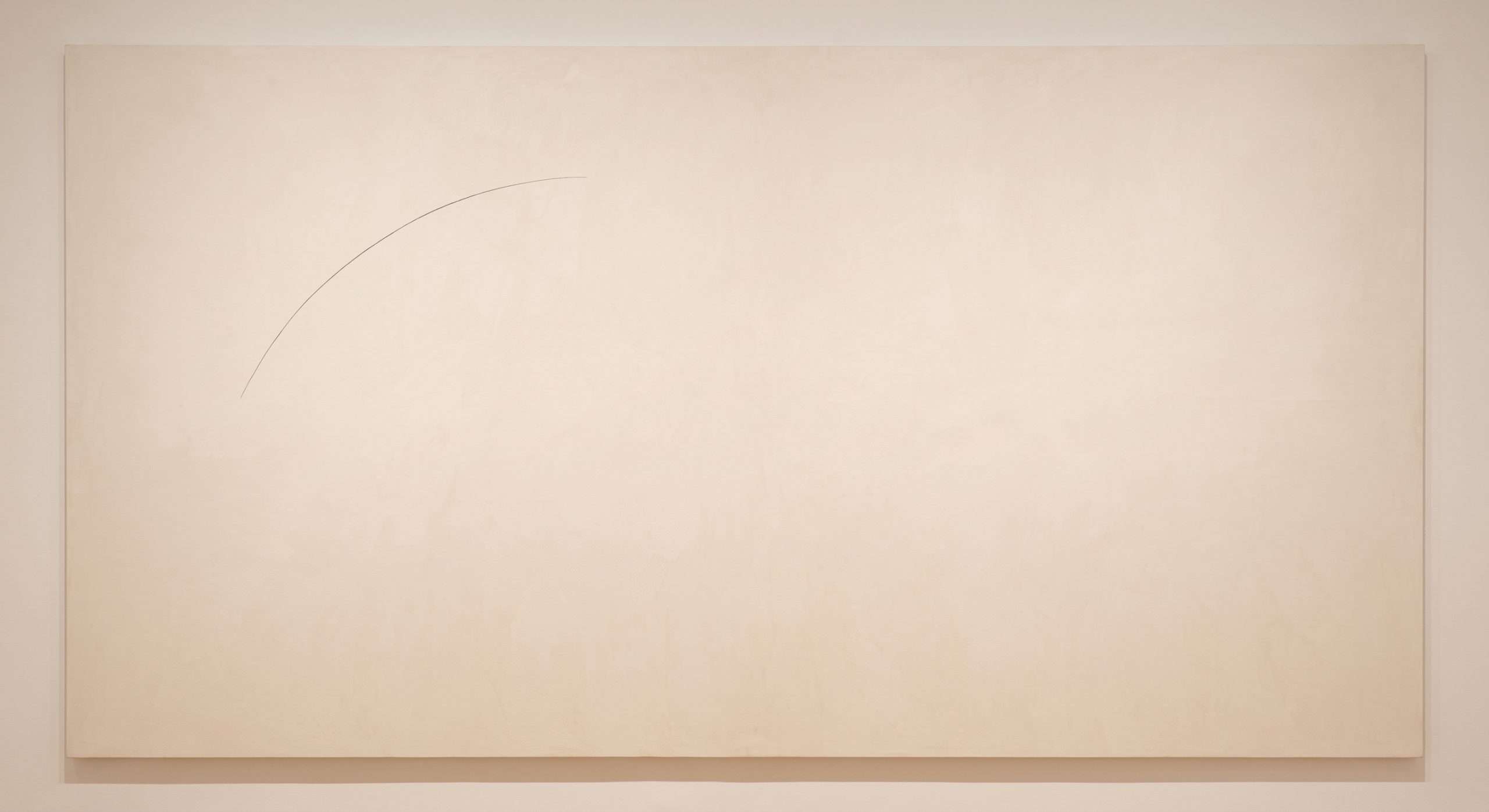
Negative space is the empty or unoccupied area around and between the main elements of a composition. The marks, shapes and textures are often called the positive space.
In abstract art, negative space is not a leftover. It is a deliberate part of the design, with as much intention behind it as the gesture it surrounds.
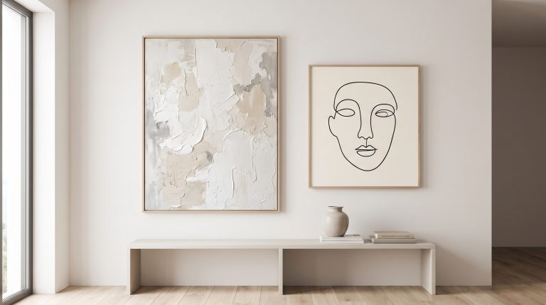
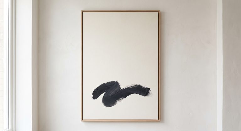
A helpful way to picture it is to think of a single dark line on a large pale surface. The line is the positive space. Everything else is the negative space. Take away the pale surface, and the line loses most of its power.
Why It Matters So Much in Abstraction
Without a recognisable subject to anchor the eye, abstract art relies on composition to guide attention. Negative space is one of the strongest tools available for doing that.
It does three main things.
It creates calm
Generous empty areas give the eye somewhere to rest between points of interest. That is a large part of why minimalist and organic pieces feel restful compared with densely worked ones.
It creates emphasis
The more space you leave around a mark, the more powerful the mark becomes. A single gesture in a quiet field reads as confident and deliberate. The same gesture in a busy composition can vanish.
It creates movement
Space is not only still. The shape of the empty areas guides the eye from one element to another, so the negative space itself becomes a route.
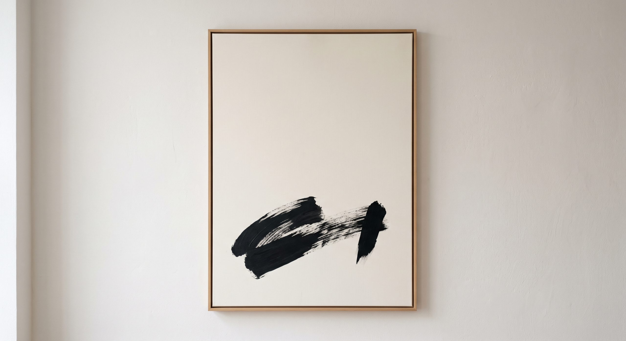
Figure and Ground: How the Eye Reads Space
Artists and designers talk about “figure” and “ground”. The figure is the thing you notice, and the ground is the space behind and around it.
In abstract work, these can trade places. A well-known example is the vase-and-faces illustration, where you can see either a vase or two profiles depending on what your eye treats as the figure. In abstract art, the same effect can make empty areas feel like shapes in their own right.
This is one reason negative space is worth looking at directly. Try looking at the shapes the empty areas make, rather than at the marks. You will often find that they are carefully designed.
Negative Space Across Styles
Different types of abstraction use space differently, as explored in our guide to the different types of abstract art.
- Minimalist work often leaves most of the surface open, so each mark carries a great deal.
- Organic work uses flowing space that feels natural and unforced.
- Gestural work can use open areas to give energetic marks somewhere to land.
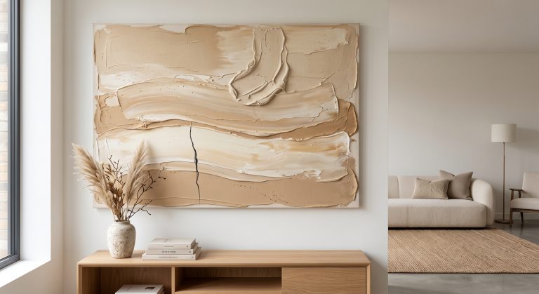
- Textured work uses smooth areas to make rough passages look intentional. See textured abstract art.
A Note on “Ma”
In Japanese aesthetics, the concept of ma (間) is often described as the meaningful interval or pause between things. It is frequently cited in discussions of Japanese design, architecture and art as an expression of the idea that emptiness has its own value.
You do not need to study it to benefit from the idea. It is a useful reminder that a pause in a composition is not the absence of design. It is part of it. You can see the idea at work throughout Japandi art.
Negative Space in Your Room
The principle does not stop at the edge of the artwork. The wall around a piece is part of the composition too.
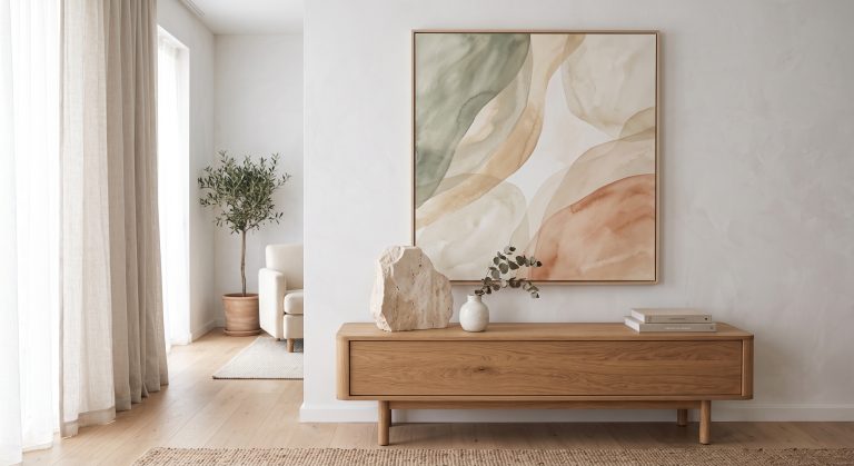
- A single artwork with generous empty wall around it feels calm and gallery-like.
- The same piece crowded by shelves, frames and objects loses impact.
- A room already full of pattern and objects benefits from a piece with a lot of internal space.
- A very spare room may want a piece with slightly more going on inside it, so that the wall does not feel like an extension of the emptiness.
For placement and scale, see how to choose abstract art for your home.
Negative Space and Balance
Empty areas carry visual weight. A large open area can counterbalance a small intense one, which is often what gives an asymmetrical composition its tension and poise. We look at this relationship in understanding balance in abstract art.
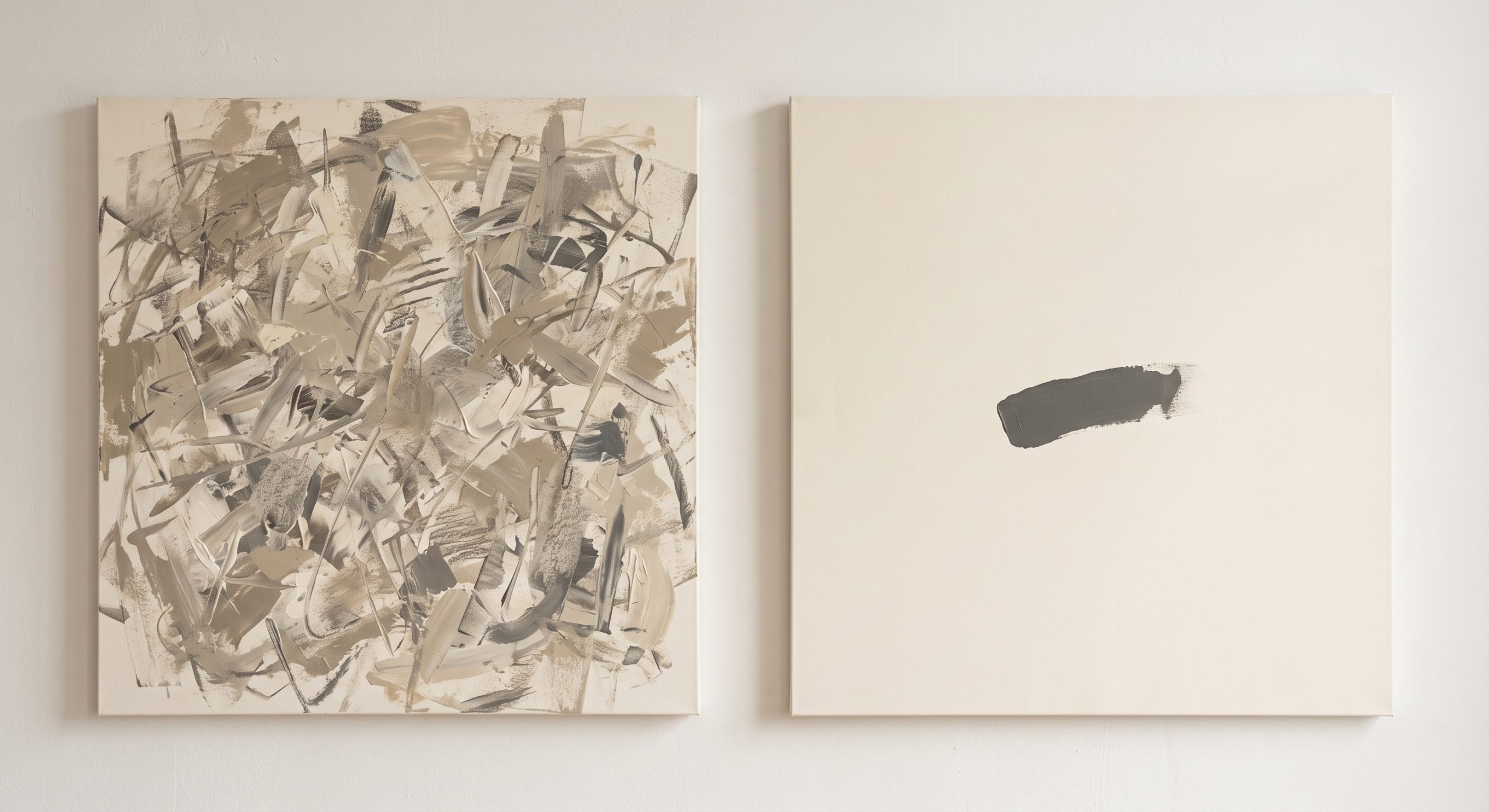
How to Judge Negative Space in a Piece
- Look at the empty areas first. Are their shapes interesting, or arbitrary?
- Check for breathing room. Do the marks have space around them, or do they feel squeezed?
- Look for contrast between quiet and active. Good pieces usually have both.
- Notice where your eye rests. If it never can, there may be too little space.
Common Misunderstandings
- “It looks unfinished.” Empty space is often the most deliberate part of a piece.
- “More detail is better value.” Restraint is harder than filling a surface.
- “White space is wasted space.” It is doing structural work.
Final Thoughts
Empty space is not the absence of composition. It is composition.
Next time you look at an abstract piece, look at the spaces first. You may find that the calm you feel, or the attention you give a single mark, has more to do with what has been left out than what has been put in. For more on what makes art feel restful, see calm artwork ideas for a peaceful home.